 Polaris
Modal
Modals are overlays that require merchants to take an action before they can continue interacting with the rest of Shopify. They can be disruptive and should be used thoughtfully and sparingly.
Deprecated
This component is no longer supported. Please use the App Bridge Modal API instead.
Modal component examples
Use as the default option for a modal.
import {Button, Frame, Modal, TextContainer} from '@shopify/polaris';
import {useState, useCallback} from 'react';

function ModalExample() {
  const [active, setActive] = useState(true);

  const handleChange = useCallback(() => setActive(!active), [active]);

  const activator = <Button onClick={handleChange}>Open</Button>;

  return (
    <div style={{height: '500px'}}>
      <Frame>
        <Modal
          activator={activator}
          open={active}
          onClose={handleChange}
          title="Reach more shoppers with Instagram product tags"
          primaryAction={{
            content: 'Add Instagram',
            onAction: handleChange,
          }}
          secondaryActions={[
            {
              content: 'Learn more',
              onAction: handleChange,
            },
          ]}
        >
          <Modal.Section>
            <TextContainer>
              <p>
                Use Instagram posts to share your products with millions of
                people. Let shoppers buy from your store without leaving
                Instagram.
              </p>
            </TextContainer>
          </Modal.Section>
        </Modal>
      </Frame>
    </div>
  );
}
Best practices
Use modals for confirmations and conditional changes. They should be thought of as temporary and not be used for information or actions that need to live on in the UI in a persistent way. Don’t use modals to display complex forms or large amounts of information.
Modals should:
- Require that merchants take an action.
- Close when merchants press the X button, the Cancel button, the Esc key, or when merchants click or tap the area outside the modal.
- Not have more than two buttons (primary and secondary) at the bottom. This prevents unclear action hierarchy and crowding on mobile screens. Since modals are for focused tasks, they should have focused actions. In some cases however, a tertiary action may be appropriate.
Content guidelines
Title
Modal titles should:
- Use a clear {verb}+{noun} question or statement
- Follow the content guidelines for headings and subheadings
- Edit email address
- Delete customer?
- Discard unsaved changes?
- Edit the email address for this order
- Are you sure you want to delete customer?
- Discard?
Body content
Body content should be:
- Actionable: start sentences with imperative verbs when telling a merchant what actions are available to them (especially something new). Don’t use permissive language like "you can".
- Notification emails will be sent to this address.
- This can’t be undone.
- You can edit the email address where emails will be sent.
- Are you sure you want to delete the variant Dark Blue Tee/Small/Silk? You cannot reverse this.
- Structured for merchant success: always put the most critical information first.
- Clear: use the verb “need” to help merchants understand when they’re required to do something.
- To buy a shipping label, you need to enter the total weight of your shipment, including packaging.
- To buy a shipping label, you must enter the total weight of your shipment, including packaging.
Primary and secondary actions
Actions should be:
- Clear and predictable: merchants should be able to anticipate what will happen when they click a button. Never deceive a merchant by mislabeling an action.
- Create order
- Buy shipping label
- New order
- Buy
- Action-led: actions should always lead with a strong verb that encourages action. To provide enough context to merchants use the {verb}+{noun} format on actions except in the case of common actions like Save, Close, Cancel, or OK.
- Activate Apple Pay
- View shipping settings
- Try Apple Pay
- View your settings
- Scannable: avoid unnecessary words and articles such as the, an, or a.
- Add menu item
- Add a menu item
Tertiary actions
Tertiary actions should:
- Only be used when the action requires the context of the content in the modal
- Never be used to dismiss the modal
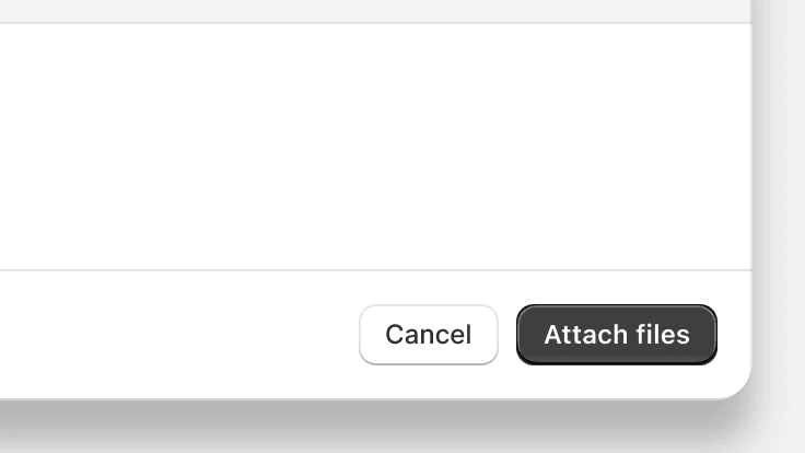
Use a plain button for a tertiary action if needed
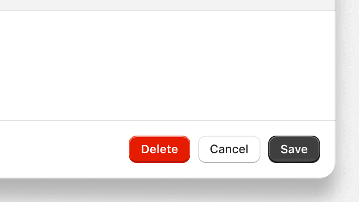
Use a tertiary action for a destructive action
Footer
Body content should be:
- Actionable: start sentences with imperative verbs when telling a merchant what actions are available to them (especially something new). Don’t use permissive language like "you can".
- Notification emails will be sent to this address.
- You can edit the email address where emails will be sent.
- Structured for merchant success: always put the most critical information first.
- Clear: use the verb “need” to help merchants understand when they’re required to do something.
- To buy a shipping label, you need to enter the total weight of your shipment, including packaging.
- To buy a shipping label, you must enter the total weight of your shipment, including packaging.
Related components
- To present large amounts of additional information or actions that don’t require confirmation, use the collapsible component to expand content in place within the page
- To present a small amount of content or a menu of actions in a non-blocking overlay, use the popover component
- To communicate a change or condition that needs the merchant’s attention within the context of a page, use the banner component
Accessibility
- Modals use ARIA role=”dialog” to convey to screen reader users that they work like native dialog windows.
- If you set the title prop to give the modal component a heading, then the title is used to label the dialog element with aria-labelledby. This helps to convey the purpose of the modal to screen reader users when it displays.
- After a modal is closed, in order to return focus to the button that launched it, pass the button to the modal as an activator.
- To ensure that Toasts are read out by a screen reader when a Modal is open, apps should be wrapped in a Frame component.
Keyboard support
- When a modal opens, focus moves automatically to the modal container so it can be accessed by keyboard users
- While the modal is open, keyboard focus shouldn’t leave the modal
- Merchants can dismiss the modal with the keyboard by activating the X button, the Cancel button if one is provided, or by pressing the Esc key
- After a modal is closed, focus returns to the button that launched it