Link
Links take users to another place, and usually appear within or directly following a sentence.
Link component examples
Use for text links inside a paragraph or for standalone text. Default links open in the same browser tab.
import {Link} from '@shopify/polaris';
import React from 'react';

function LinkExample() {
  return <Link url="https://help.shopify.com/manual">fulfilling orders</Link>;
}
Props
- id?string
ID for the link.
- url?string
The url to link to.
- children?React.ReactNode
The content to display inside the link.
- external?boolean
Makes the link open in a new tab.
Deprecateduse `target` set to `_blank` instead.- target?Target
Where to display the url.
- monochrome?boolean
Makes the link color the same as the current text color and adds an underline.
- removeUnderline?boolean
Removes text decoration underline to the link.
- onClick?() => void
Callback when a link is clicked.
- accessibilityLabel?string
Descriptive text to be read to screenreaders.
- dataPrimaryLink?boolean
Indicates whether or not the link is the primary navigation link when rendered inside of an `IndexTable.Row`.
Best practices
Buttons versus links
Links are used primarily for navigation, and usually appear within or directly following a sentence.
Buttons are used primarily for actions, such as “Add”, “Close”, “Cancel”, or “Save”. Plain buttons, which look similar to links, are used for less important or less commonly used actions, such as “view shipping settings”.
The HTML that renders for the Button and Link components carries meaning. Using these components intentionally and consistently results in:
- a more inclusive experience for assistive technology users
- a more cohesive visual experience for sighted users
- products that are easier to maintain at scale
Open a new tab only when necessary
Use default links whenever possible to avoid disorienting merchants and causing accessibility problems by opening a new tab.
External links should be used when merchants are:
- Performing a task or workflow, like creating a product
- Navigating to a page outside of the Shopify admin
No icon
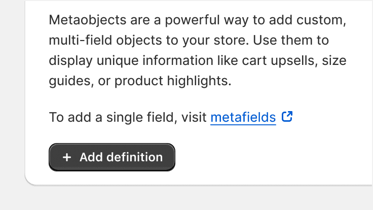
Avoid using the external icon, as it can add unnecessary visual load inside a sentence or when accompanied by other content. Instead, add clarity to external links through clear link text and predictable placement of the link in a merchant’s workflow.
Edge cases: External icons should not be used to indicate a new tab or window is being opened. However, they may be used sparingly in features where symbols help merchants scan and pick from a list of several kinds of navigation options, like the admin's global search results.
Instead of using an external icon, consider using an icon with more meaning to strenghten your message

Avoid using the icon beside link text
Unstyled links
If the existing link styles don’t meet the needs of your project, then use the UnstyledLink component to create a custom link style.
Content guidelines
The link component should follow the content guidelines for links.
Related components
- For actions that don’t appear within or directly following a sentence, use the button component
Accessibility
Use the url prop to give the link component a valid href value. This allows the element to be identified as a link to assistive technologies and gives it default keyboard support.
The Link component is underlined to give interactive elements a shape. This allows links to not rely on color from being the only way users can tell if an element is interactive.
- Remove the link underline when link is repeated in a list or navigation
- Use underlines for links when used inline content
<p>
  Learn more about <Link>Fraud Protect</Link>.
</p>- Remove underlines when the user cannot determine it's interactivity
<Link removeUnderline>Learn more about Fraud Protect.</Link>Submitting data
Merchants generally expect links to navigate, and not to submit data or take action. If you need a component that doesn’t have a URL associated with it, then use the button component instead.
Labeling
Give links text that clearly describes their purpose.
The accessibilityLabel prop adds an aria-label attribute to the link, which can be accessed by assistive technologies like screen readers. Typically, this label text replaces the visible text on the link for merchants who use assistive technology.
To provide consistency and clarity:
- Use the same text for links that navigate to the same content
- Use different text for links that navigate to different content
<Link url="https://help.shopify.com/manual">fulfilling orders</Link><Link>fulfilling orders</Link>/* Somewhere in the code: */
<Link url="https://help.shopify.com/manual">fulfilling orders</Link>
/* Elsewhere in the code: */
<Link url="https://help.shopify.com/manual">fulfilling orders</Link>/* Somewhere in the code: */
<Link url="https://help.shopify.com/manual">fulfilling orders</Link>
/* Elsewhere in the code: */
<Link url="https://help.shopify.com/manual">order fulfillment section</Link>Keyboard support
Links use browser defaults for keyboard interaction.
- Give links keyboard focus with the tab key (or shift + tab when tabbing backwards)
- Activate links with the enter/return key