 Polaris
Layout and structure
Layout is the arrangement of elements on a page. A good layout helps merchants understand and find information to complete their goals. To learn more, visit the Layout documentation.
Layout primitives
All layouts and spacing should be handled using layout primitives. This keeps our components simple, flexible and composable. Our component naming conventions follow web standards for logical properties and values.
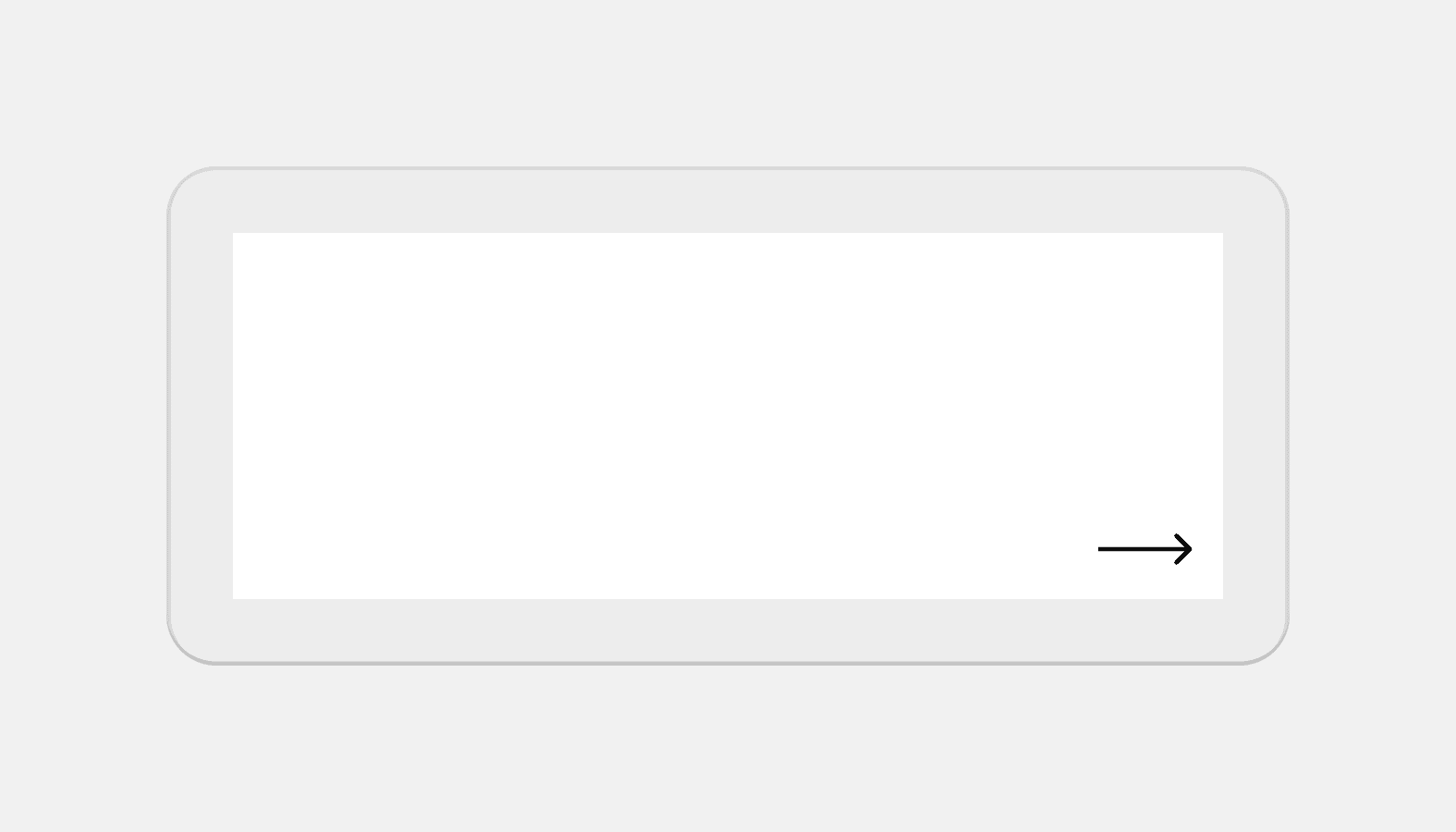
Bleed
Applies negative margin to a layout, extending it to the edge of the screen on small screens.
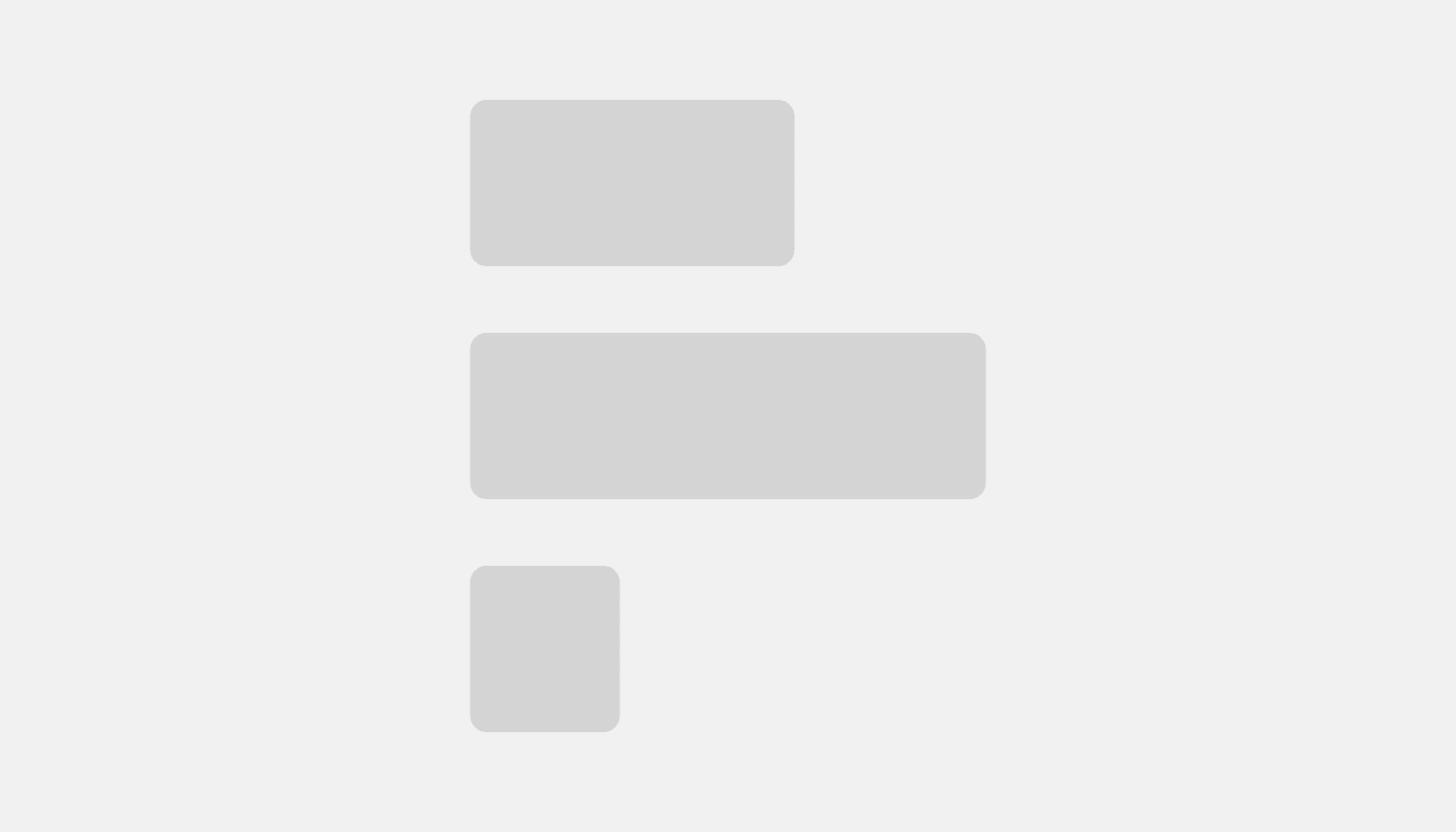
Block stack
Use to display children vertically and horizontally with full width by default. Based on CSS Flexbox.
Box
Box is the most primitive layout component. It’s a way to access Polaris design tokens.
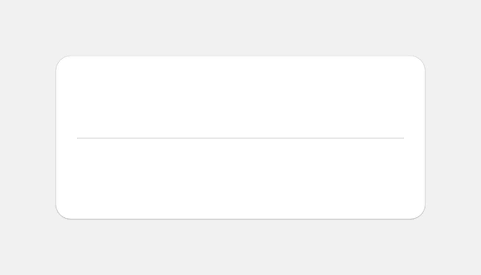
Divider
Use to separate or group content.
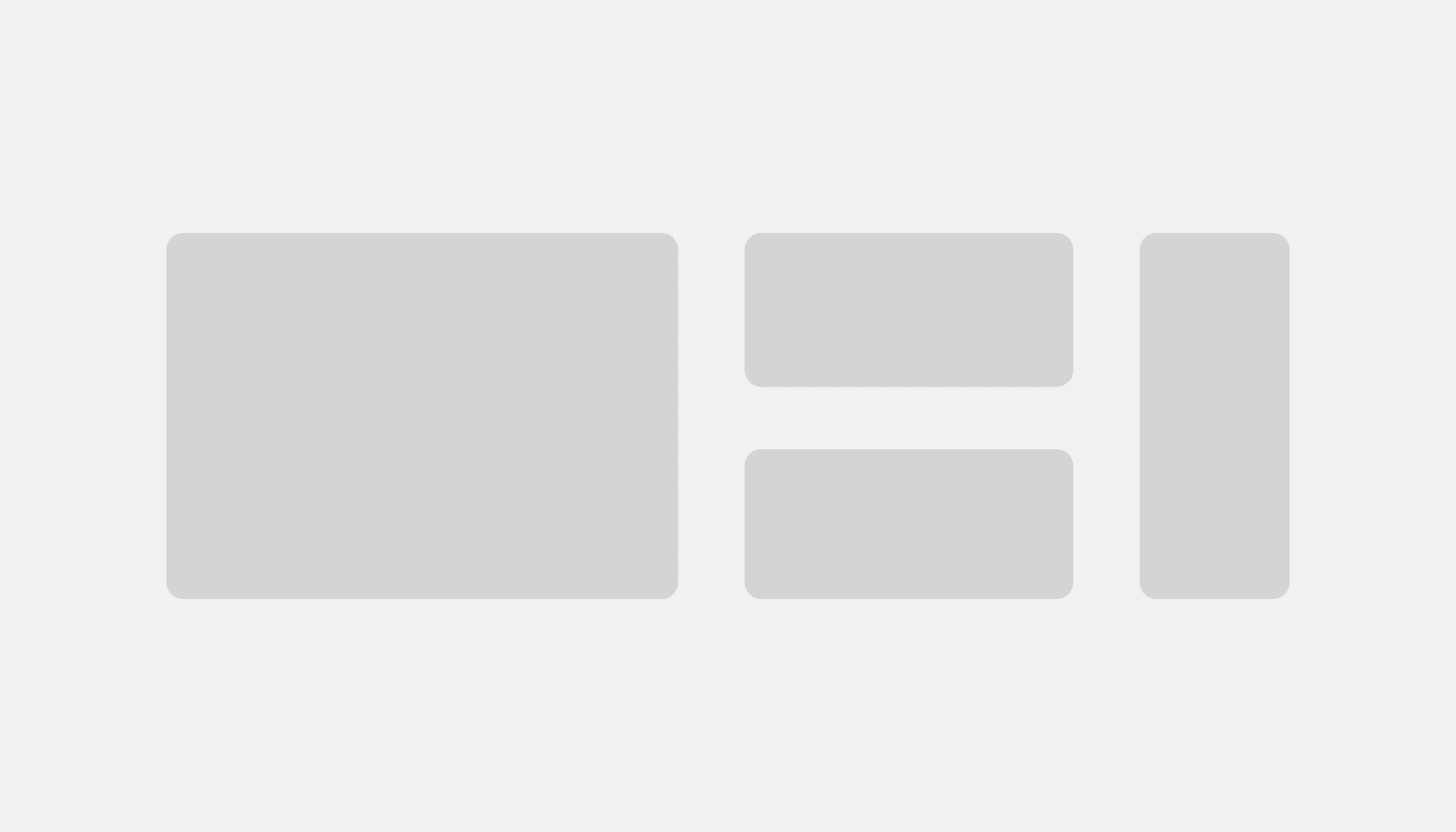
Grid
Create complex layouts based on CSS Grid.
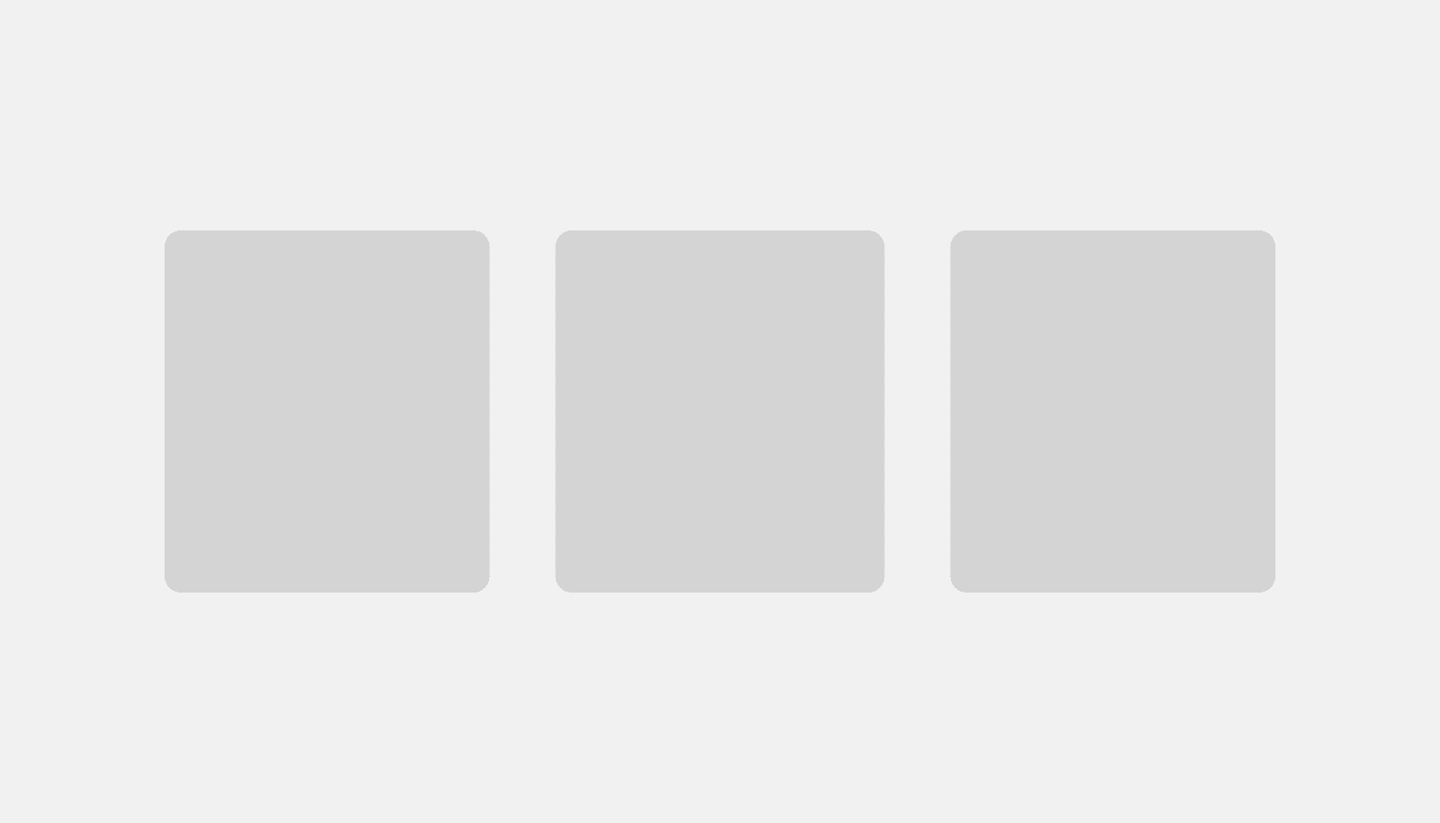
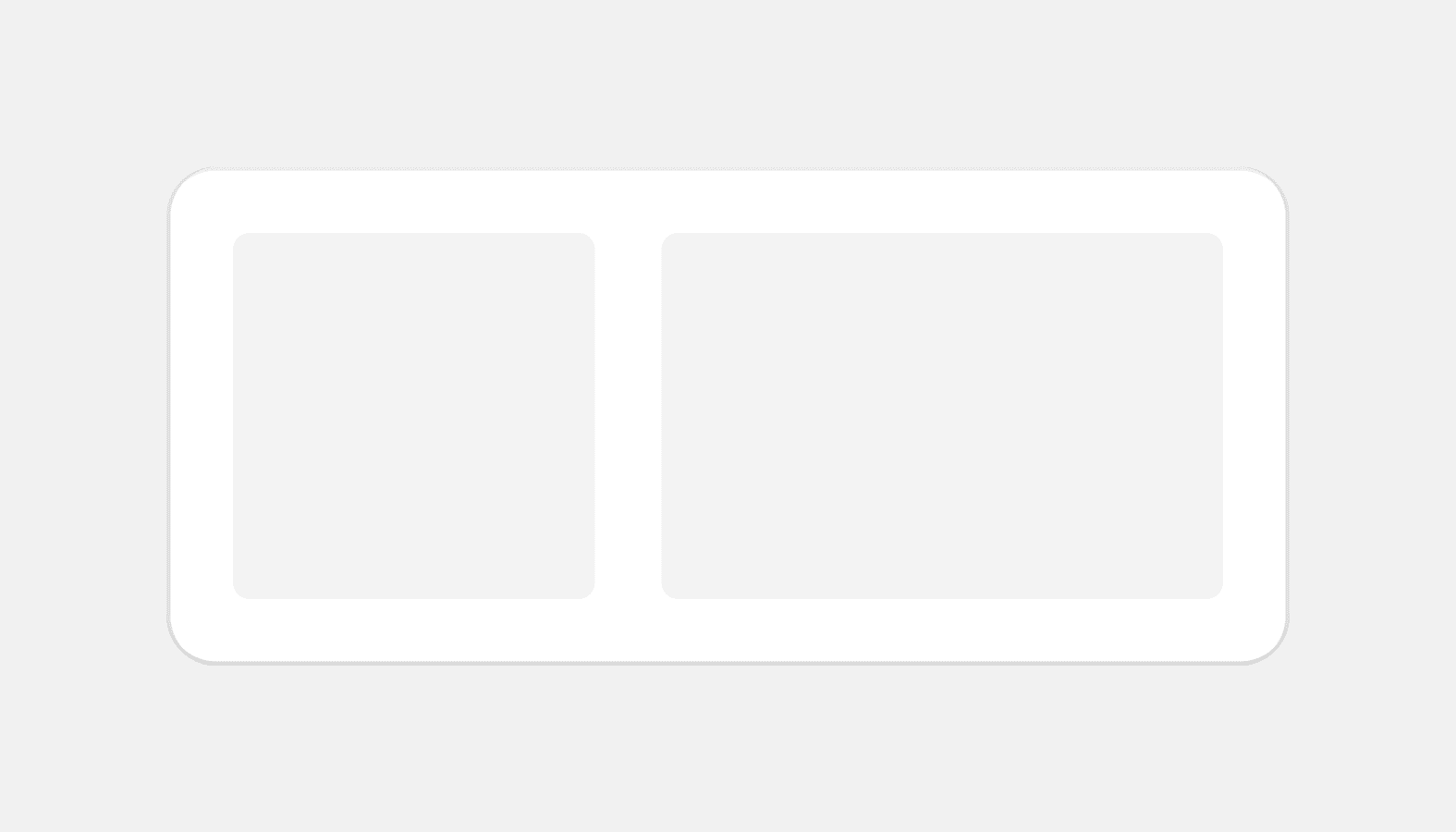
Inline grid
Use to lay out children horizontally with equal gap between columns. Based on CSS Grid.
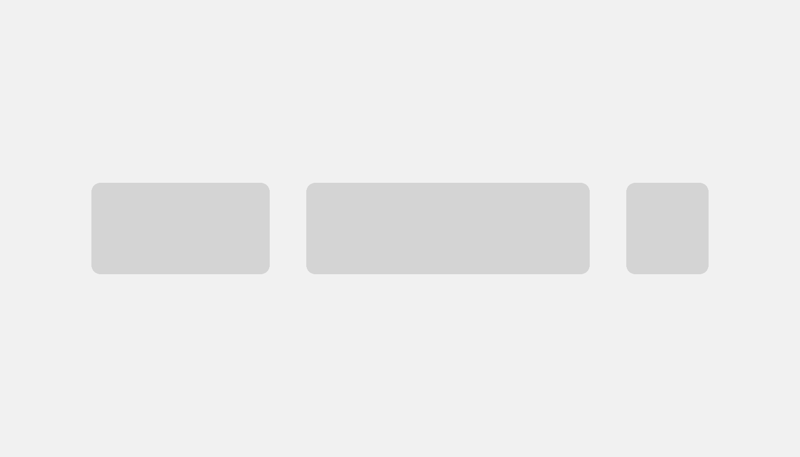
Inline stack
Use to display children horizontally in a row. Based on CSS Flexbox.
Tip
Layout primitives allow you to specify values for different screen sizes. Check out the layout primitives for information on how responsive props apply to each component.
Layout compositions
Layout compositions are built with layout primitives. Use these components to build common layouts in the admin with the help of sensible defaults.
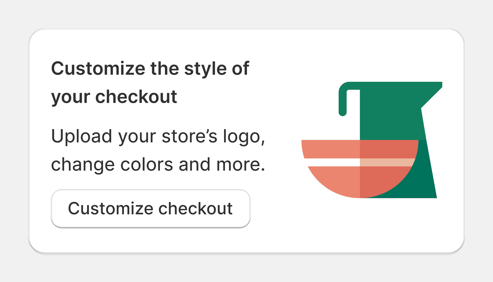
Callout card
Callout cards are used to encourage merchants to take an action related to a new feature or opportunity. They are most commonly displayed in the sales channels section of Shopify.
Card
Used to group similar concepts and tasks together for easier scanning and reading.
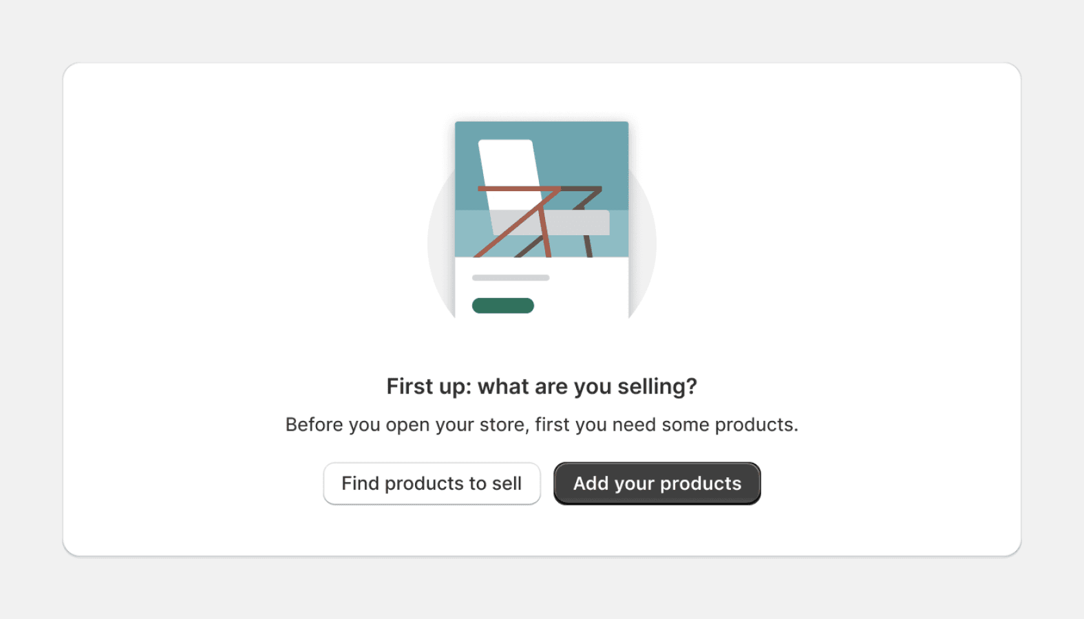
Empty state
Empty states are used when a list, table, or chart has no items or data to show. This is an opportunity to provide explanation or guidance to help merchants progress. The empty state component is intended for use when a full page in the admin is empty, and not for individual elements or areas in the interface.

Form layout
Manages the layout of all forms and fields within it. Used for the layout of new forms and managing the layout of all forms.
Layout
A structural component used to group other components. Creates consistent spacing and helps layout stack and scale responsively.
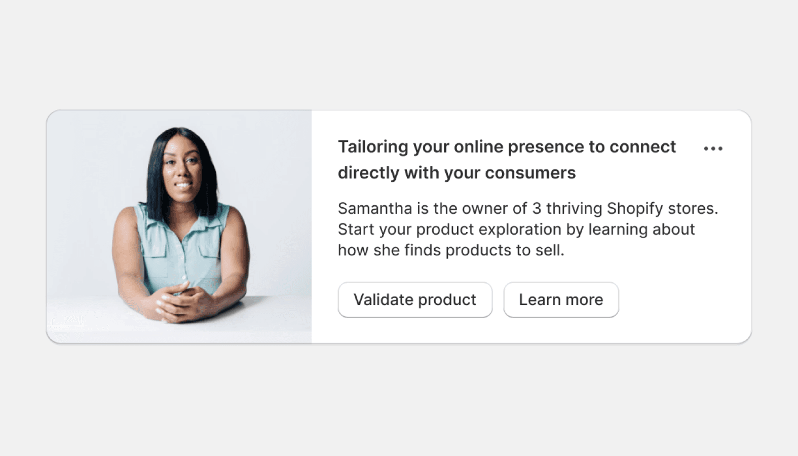
Media card
Provides a container for introductory or highlight information. Often used in a grid to present related content.
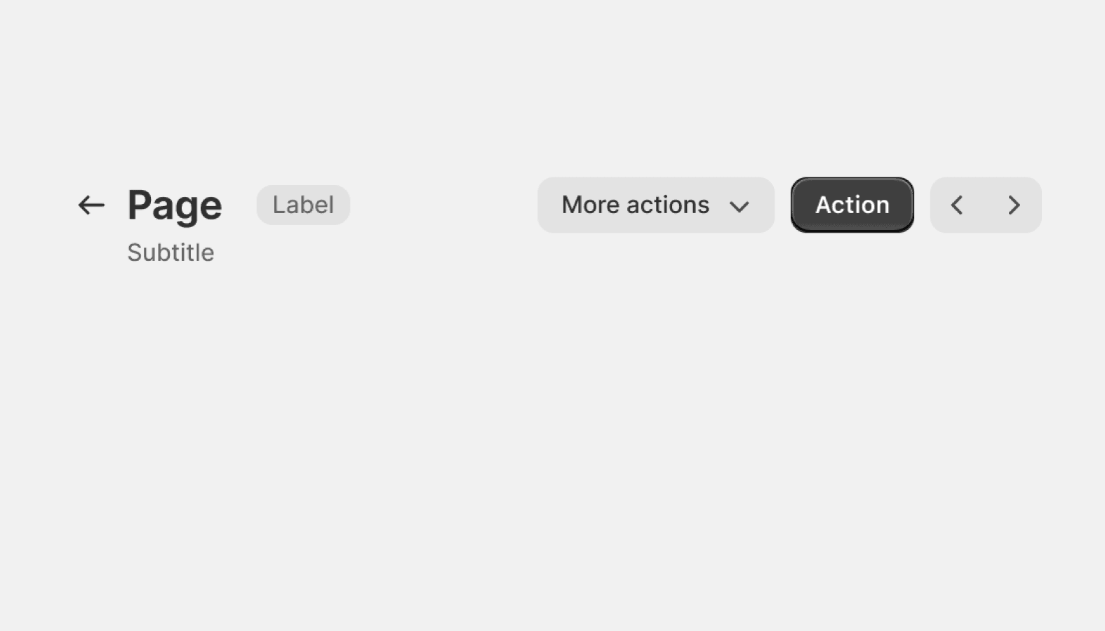
Page
Used to build the layout of a page in the Shopify admin. A flexible container for composing pages consistently.
Related Resources
- Read the Layout guidelines for information on layout behaviors, as well as examples.