 Polaris
Overlays
Display contextual elements on top of the main admin interface that provide additional information or functionality.
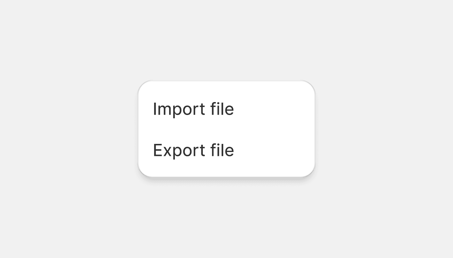
Popover
Small overlays that open on demand and close when the merchant interacts with any other part of Shopify. Used to surface secondary information or actions.
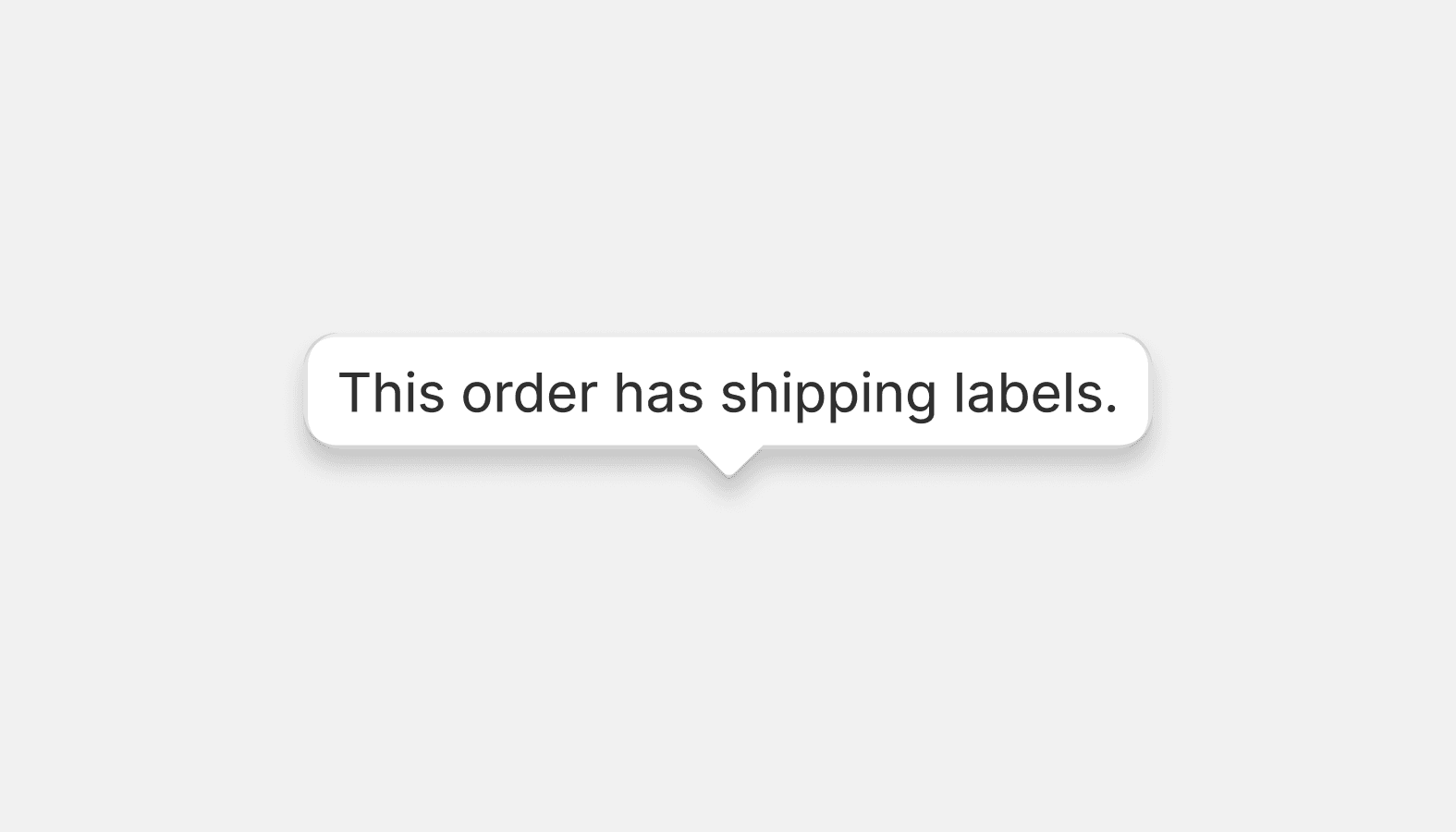
Tooltip
Tooltips are floating labels that briefly explain the function of a user interface element. They can be triggered when merchants hover, focus, tap, or click.