 Polaris
Images and icons
Represent visual content, such as avatars and thumbnails for images or video.
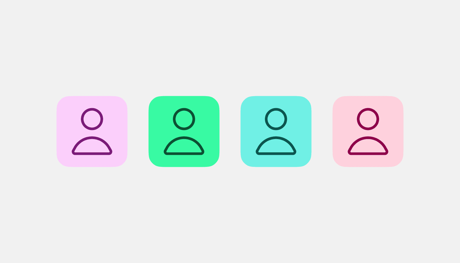
Avatar
Used to show a thumbnail representation of an individual or business in the interface.
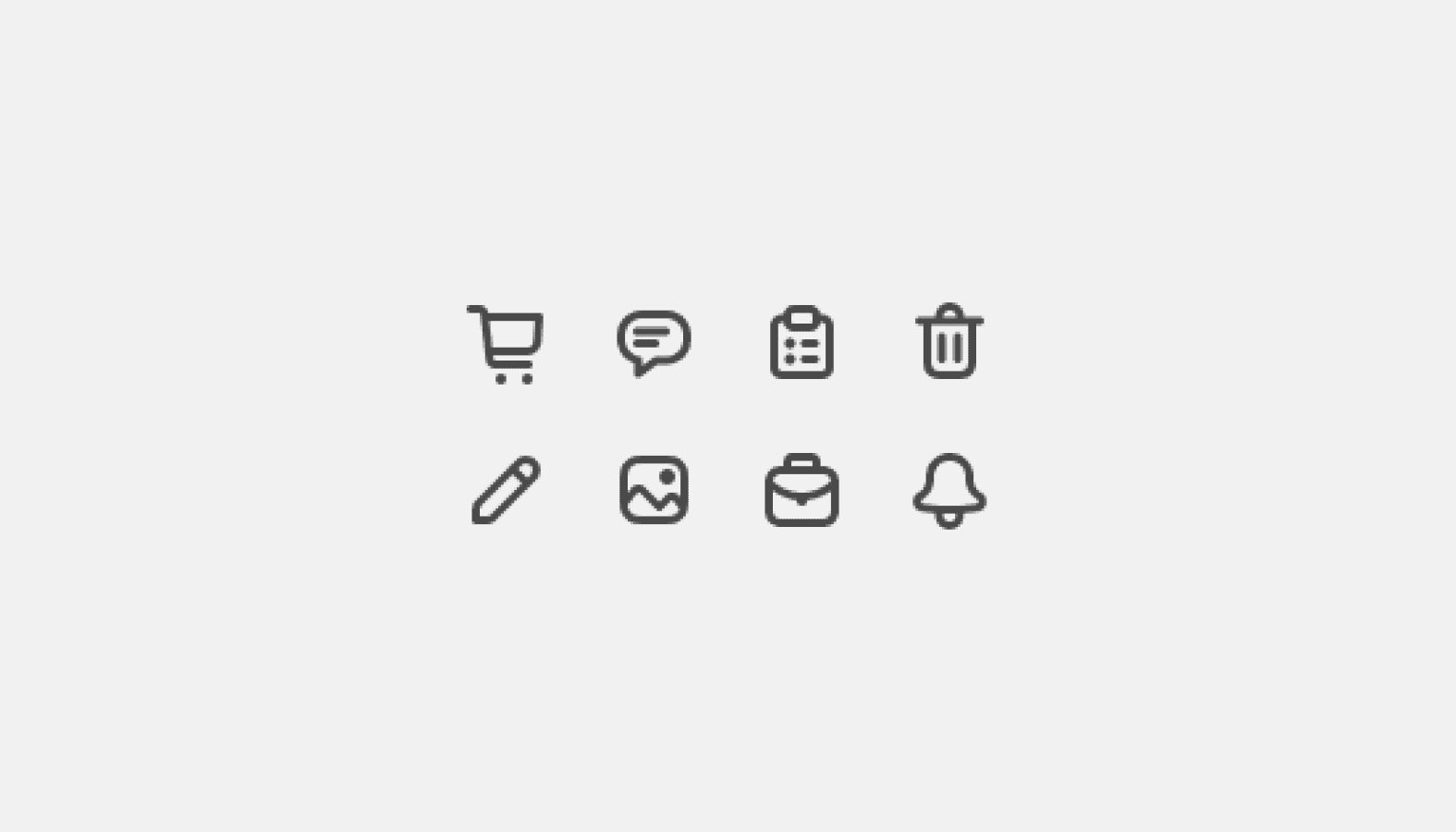
Icon
Used to visually communicate core parts of the product and available actions, acting as wayfinding tools.
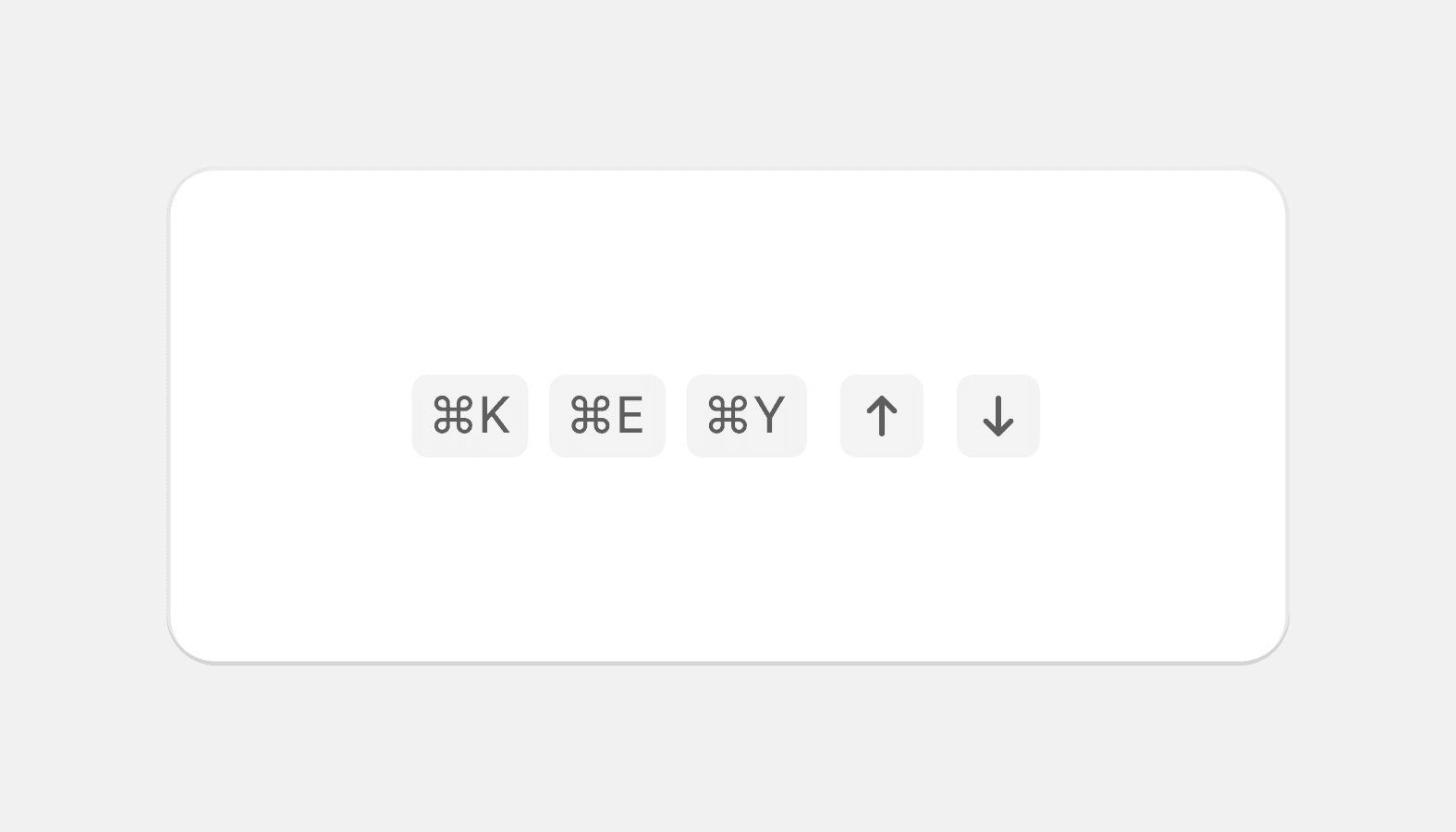
Keyboard key
Used to educate merchants about keyboard shortcuts.
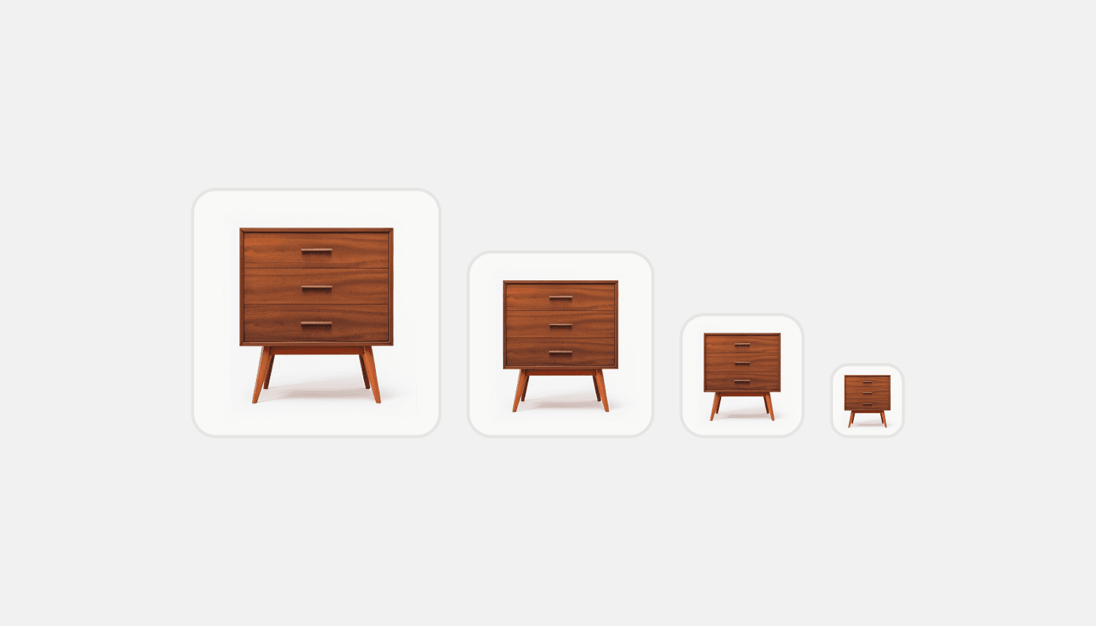
Thumbnail
Used as a visual anchor and identifier for an object, along with text to provide context.

Video thumbnail
A clickable placeholder image that opens a video player within a modal or full screen when clicked.