 Polaris
Skeleton display text
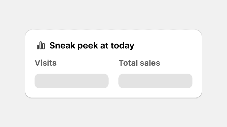
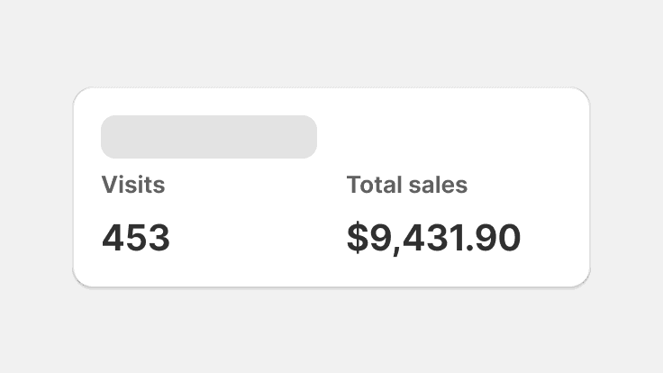
Skeleton display text is used to provide a low fidelity representation of content before it appears on the page, and improves load times perceived by merchants. Can be used for content in or outside of a card.
Skeleton display text component examples
Use this component to represent medium and large display text such as large metrics on the reports list page, or for page titles.
import {SkeletonDisplayText} from '@shopify/polaris';
import React from 'react';

function SkeletonExample() {
  return <SkeletonDisplayText size="medium" />;
}
Props
- size?'small' | 'medium' | 'large' | 'extraLarge'
Size of the text.
Defaults to 'medium'.
- maxWidth?`${number}ch` | `${number}%`
Maxium width of the text.
Defaults to '120px'.
Best practices
Skeleton display text component should:
- Give merchants an indication of what the page content will be once loaded
- Use real content for display text that never changes
Content guidelines
Skeleton display text
Show static display text that that never changes on a page. For example, keep page titles, such as Products on the product list page, but use skeleton loading for page titles that change on the product details page.
Show actual display text for static content and use skeleton display text for dynamic content.
Use skeleton display text for static content or placeholder content for dynamic content.
Show skeleton display text for dynamic page titles.
Related components
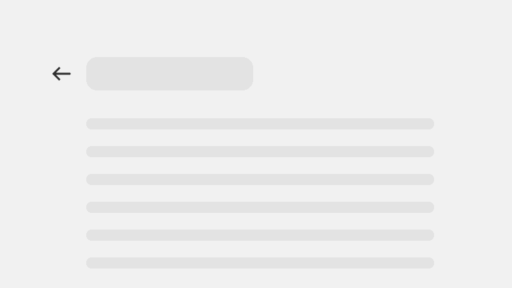
- Use this component with Skeleton page and Skeleton body text to represent the content of a page before it’s loaded.
- When giving feedback for in-context operations, use Progress bar or Spinner component.