 Polaris
Actions
Perform tasks or take actions within the Shopify admin.
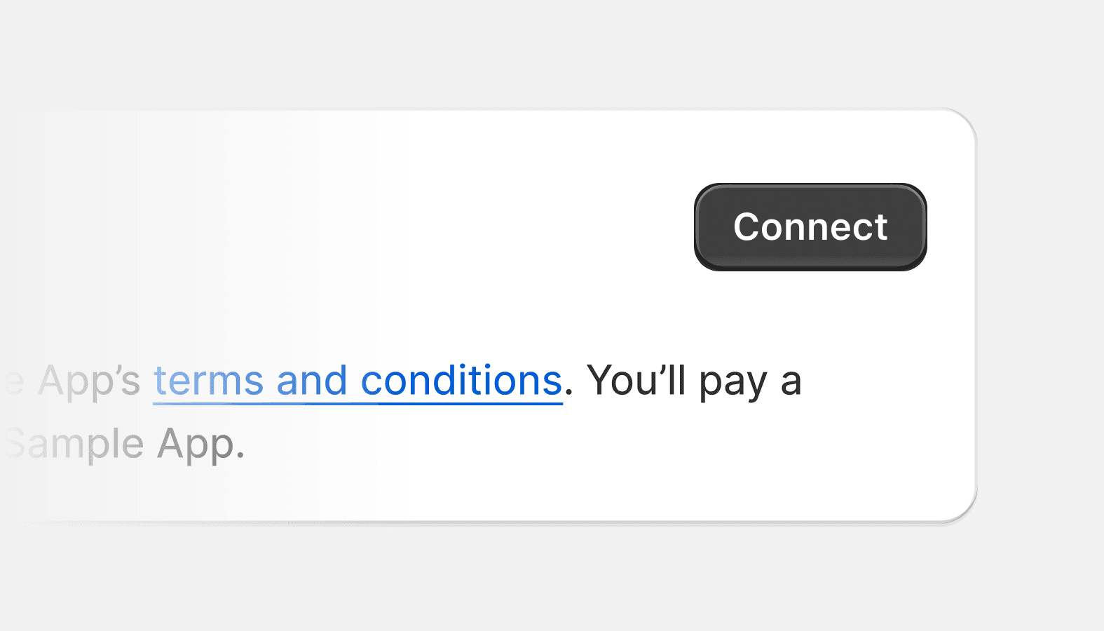
Account connection
Used for connecting or disconnecting a store to various accounts, like Facebook for the sales channel.
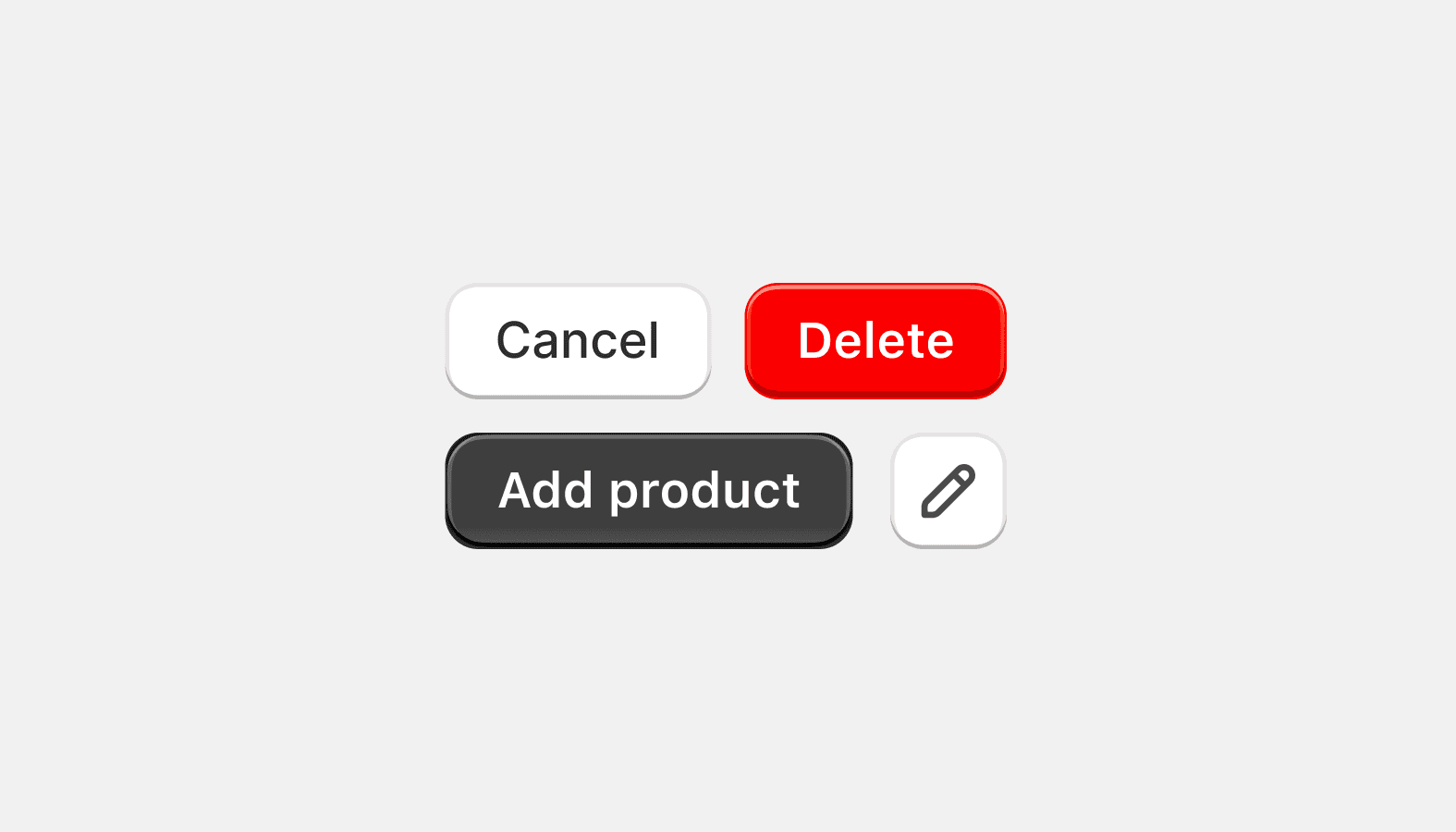
Button
Used primarily for actions like 'Add', 'Close', 'Cancel', or 'Save'. Plain buttons are used for less important actions.
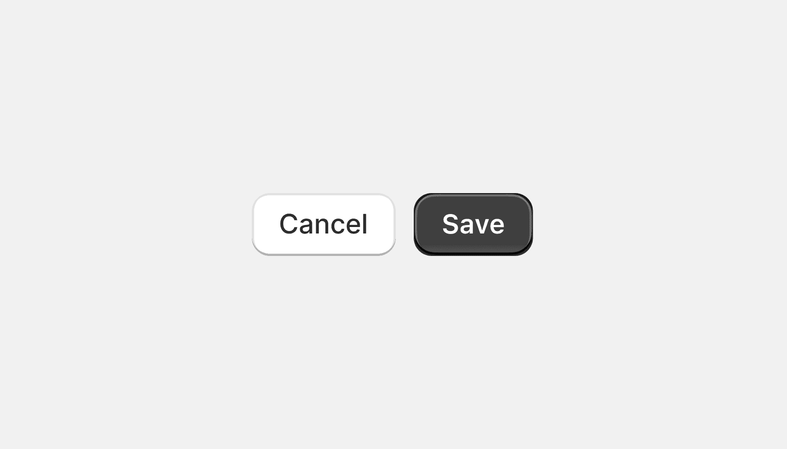
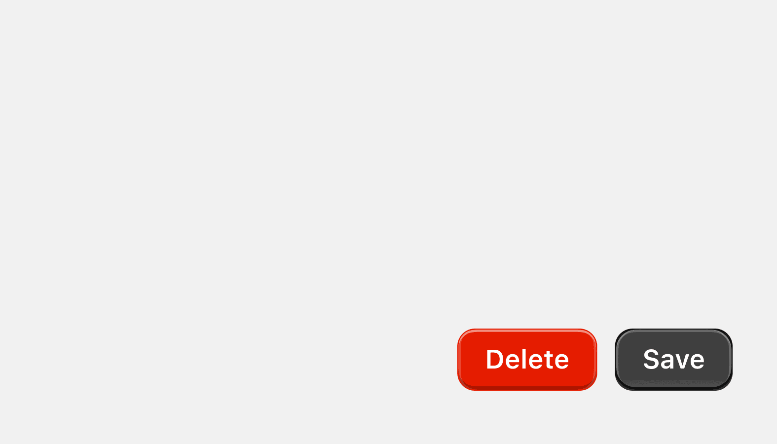
Button group
Displays multiple related actions stacked or in a horizontal row for arrangement and spacing.
Page actions
Allows merchants to take key actions at the bottom of specific pages in the interface.