 Polaris
Skeleton page
Skeleton page is used with other skeleton loading components to provide a low fidelity representation of the user interface (UI) before content appears on the page. It improves load times perceived by merchants.
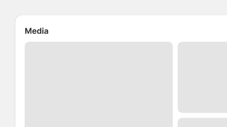
Skeleton page component examples
Use this component to compose a loading version of a page where the page title and header content are dynamic, meaning, the content changes.
import {
  SkeletonPage,
  Layout,
  LegacyCard,
  SkeletonBodyText,
  TextContainer,
  SkeletonDisplayText,
} from '@shopify/polaris';
import React from 'react';

function SkeletonExample() {
  return (
    <SkeletonPage primaryAction>
      <Layout>
        <Layout.Section>
          <LegacyCard sectioned>
            <SkeletonBodyText />
          </LegacyCard>
          <LegacyCard sectioned>
            <TextContainer>
              <SkeletonDisplayText size="small" />
              <SkeletonBodyText />
            </TextContainer>
          </LegacyCard>
          <LegacyCard sectioned>
            <TextContainer>
              <SkeletonDisplayText size="small" />
              <SkeletonBodyText />
            </TextContainer>
          </LegacyCard>
        </Layout.Section>
        <Layout.Section variant="oneThird">
          <LegacyCard>
            <LegacyCard.Section>
              <TextContainer>
                <SkeletonDisplayText size="small" />
                <SkeletonBodyText lines={2} />
              </TextContainer>
            </LegacyCard.Section>
            <LegacyCard.Section>
              <SkeletonBodyText lines={1} />
            </LegacyCard.Section>
          </LegacyCard>
          <LegacyCard subdued>
            <LegacyCard.Section>
              <TextContainer>
                <SkeletonDisplayText size="small" />
                <SkeletonBodyText lines={2} />
              </TextContainer>
            </LegacyCard.Section>
            <LegacyCard.Section>
              <SkeletonBodyText lines={2} />
            </LegacyCard.Section>
          </LegacyCard>
        </Layout.Section>
      </Layout>
    </SkeletonPage>
  );
}
Props
- title?string
Page title, in large type.
- fullWidth?boolean
Remove the normal max-width on the page.
- narrowWidth?boolean
Decreases the maximum layout width. Intended for single-column layouts.
- primaryAction?boolean
Shows a skeleton over the primary action.
- backAction?boolean
Shows a skeleton over the backAction.
- children?React.ReactNode
The child elements to render in the skeleton page.
Best practices
Skeleton page component should:
- Be used for pages where all content loads at the same time.
- Give merchants an indication of what the page layout will be once loaded. Do this by mimicking its layout similarly to the state that will be loaded.
Content guidelines
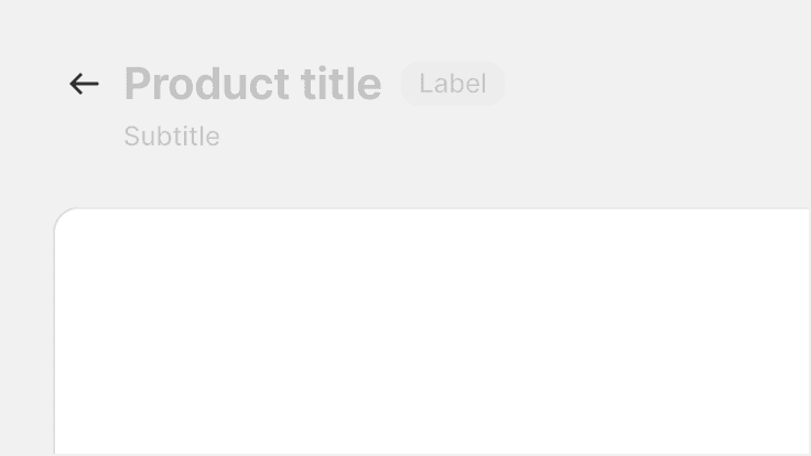
Show page titles that never change for a page. For example, keep the title “Products” on the product list page, but use skeleton loading for titles that change on the product details page. Don’t use placeholder content for titles that will change when the page fully loads.
Secondary actions are always represented with skeleton content. You can change the number of skeleton actions that best represent the number of actions once loaded.
Use skeleton loading for dynamic content, and use actual content for content that doesn’t change.
Use placeholder content that will change when the page fully loads. This will confuse merchants and create a jumpy loading experience.
Related components
- Use the Skeleton body text and Skeleton display text components to represent blocks of content.
- When giving feedback for in-context operations, use Progress bar or Spinner component.