 Polaris
Skeleton body text
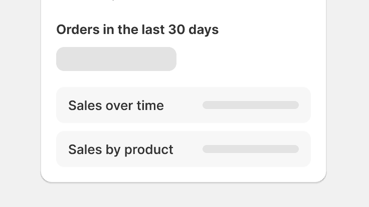
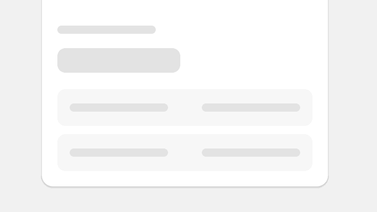
Skeleton body text is used to provide a low fidelity representation of content before it appears on the page, and improves load times perceived by merchants. Can be used for content in or outside of a card.
Skeleton body text component examples
Use this component to represent a block of content being loaded. For example, you could use it to represent an entire product description card on the product page.
import {SkeletonBodyText} from '@shopify/polaris';
import React from 'react';

function SkeletonExample() {
  return <SkeletonBodyText />;
}
Props
- lines?number
Number of lines to display.
Defaults to 3.
Best practices
Skeleton body text component should:
- Be used with Skeleton page when page content loads all at once. Together, these components give merchants an indication of what the page layout will be once loaded.
- Be used on its own, inside any content container component (like a card), and when content loads after the main page load.
- Try to match the number of lines to the content being loaded so it gives an accurate representation.
Content guidelines
Skeleton body text
Show static content that never changes on a page and use skeleton loading for dynamic content. Skeleton body text can sometimes be used to represent non-typographic content such as forms. Don’t use placeholder content that will change when the page fully loads.
Use skeleton body text for dynamic content.
Use skeleton body text for static content or use placeholder content for dynamic content.
Related components
- Use this component with Skeleton page and Skeleton display text to represent the content of a page while it’s loading.
- When giving feedback for in-context operations, use Progress bar or Spinner component.