Selection and input
Choose or enter information using elements like checkboxes, text fields, and more.
Autocomplete
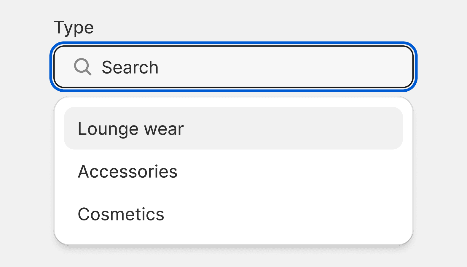
The autocomplete component is an input field that provides selectable suggestions as a merchant types into it. It allows merchants to quickly search through and select from large collections of options. It's a convenience wrapper around the Combobox and Listbox components with minor UI differences.
Checkbox
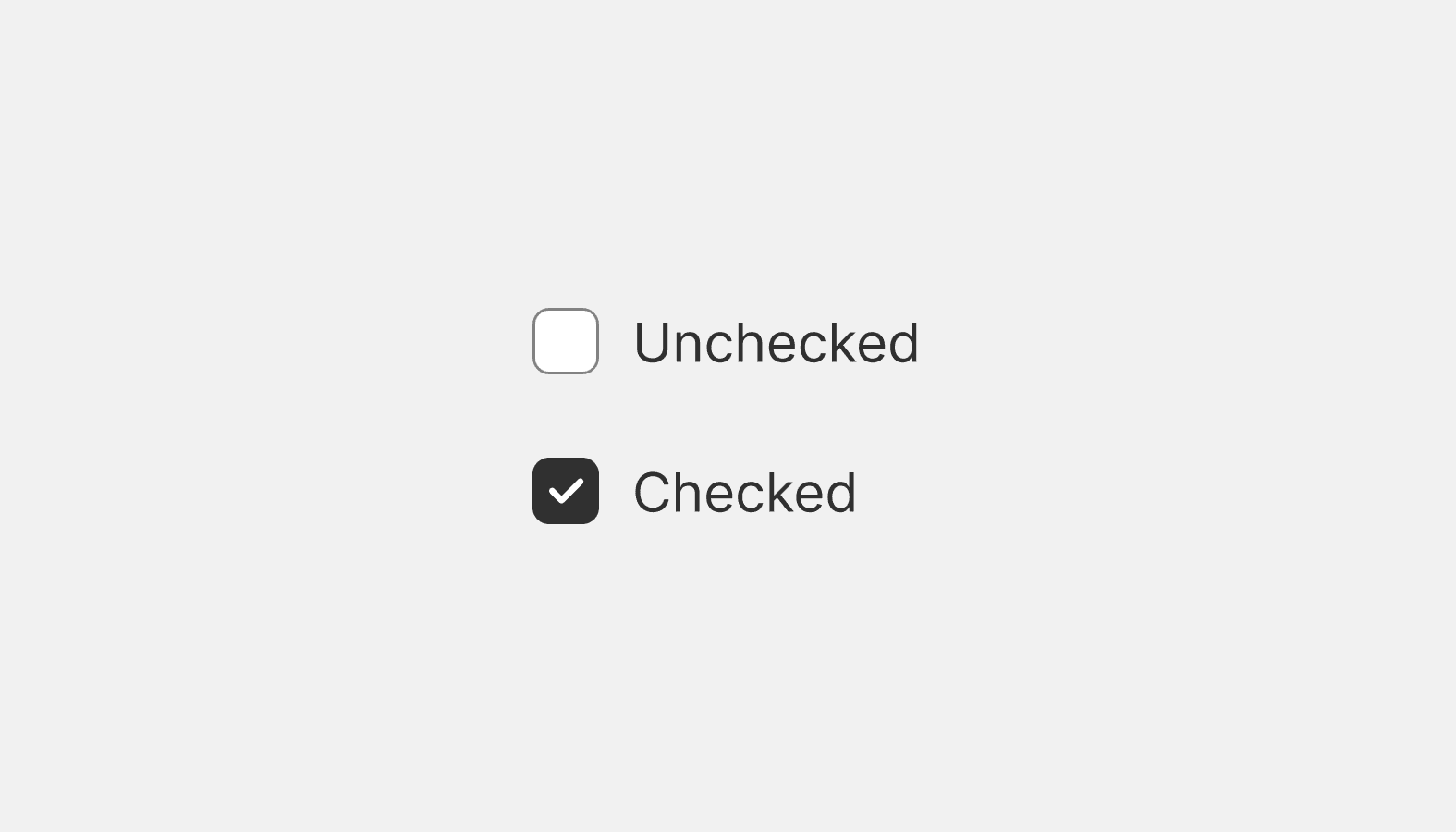
Checkboxes are most commonly used to give merchants a way to make a range of selections (zero, one, or multiple). They may also be used as a way to have merchants indicate they agree to specific terms and services.
Choice list
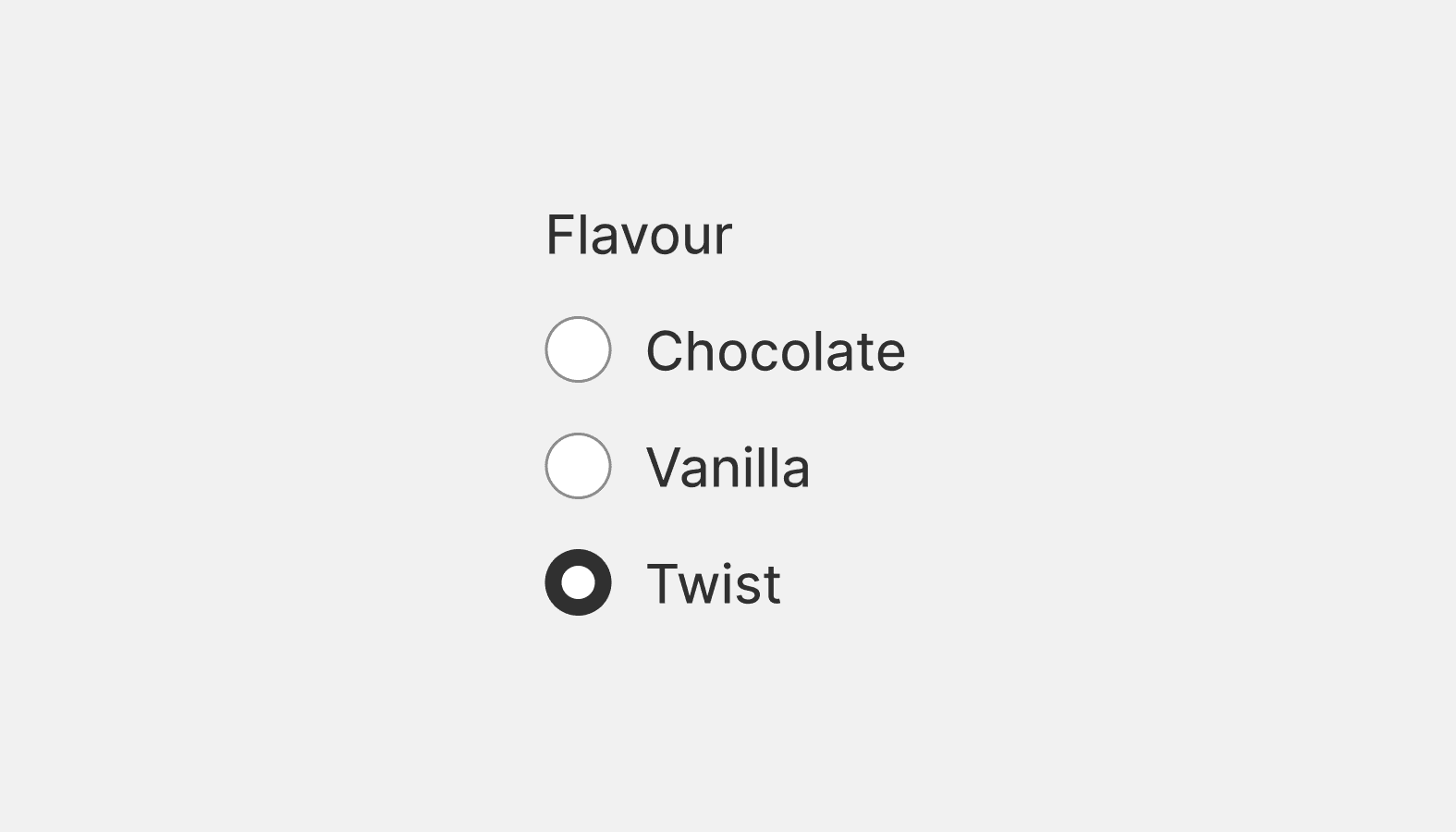
A choice list lets you create a list of grouped radio buttons or checkboxes. Use this component if you need to group together a related list of interactive choices.

Color picker
Allows merchants to choose a color visually, or by entering a hex value.
Combobox
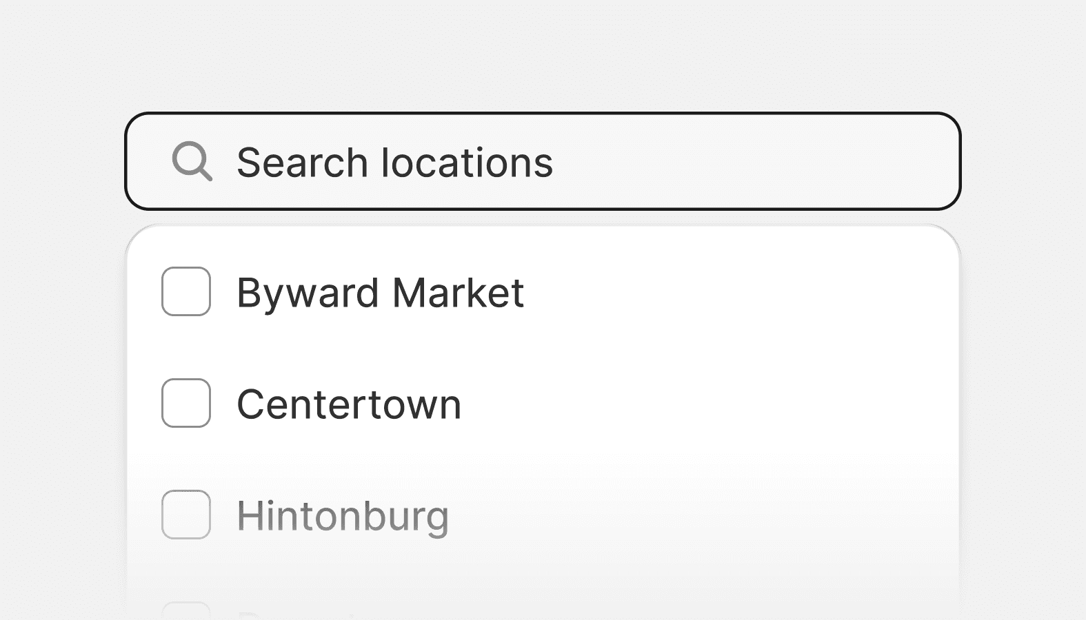
Combobox is an accessible autocomplete input that enables merchants to filter a list of options and select one or more values.
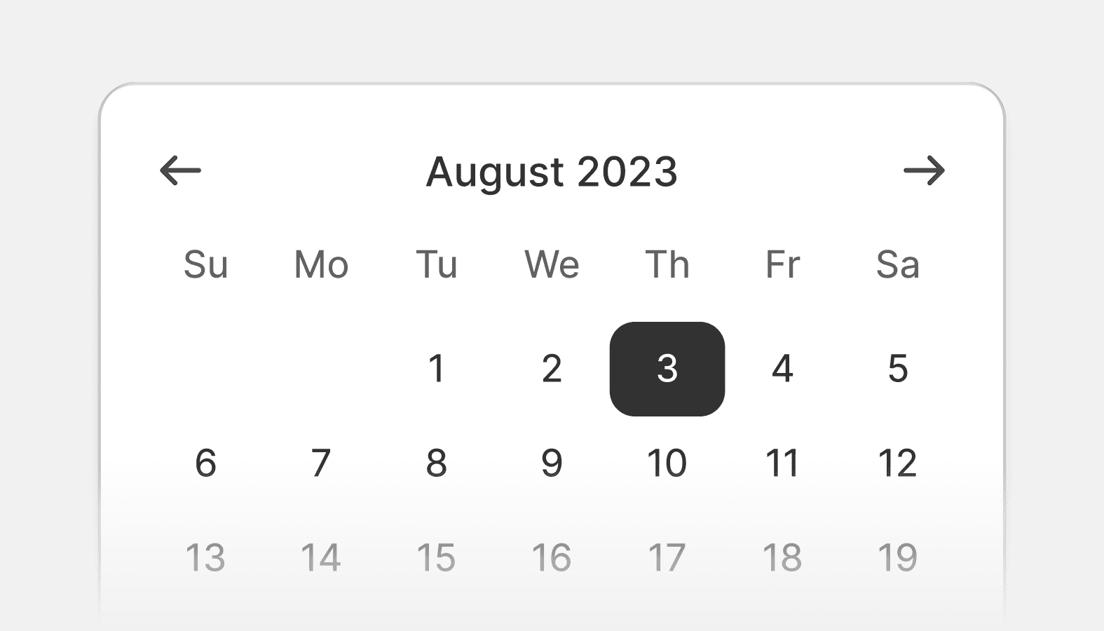
Date picker
Date pickers let merchants choose dates from a visual calendar that’s consistently applied wherever dates need to be selected across Shopify.
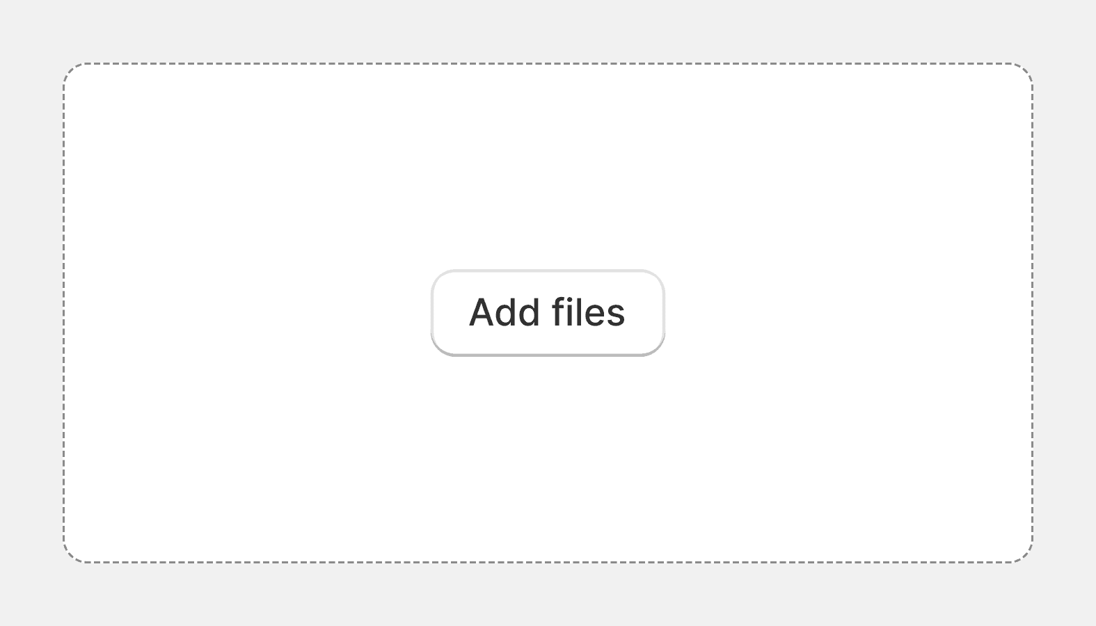
Drop zone
The drop zone component lets users upload files by dragging and dropping the files into an area on a page, or activating a button.
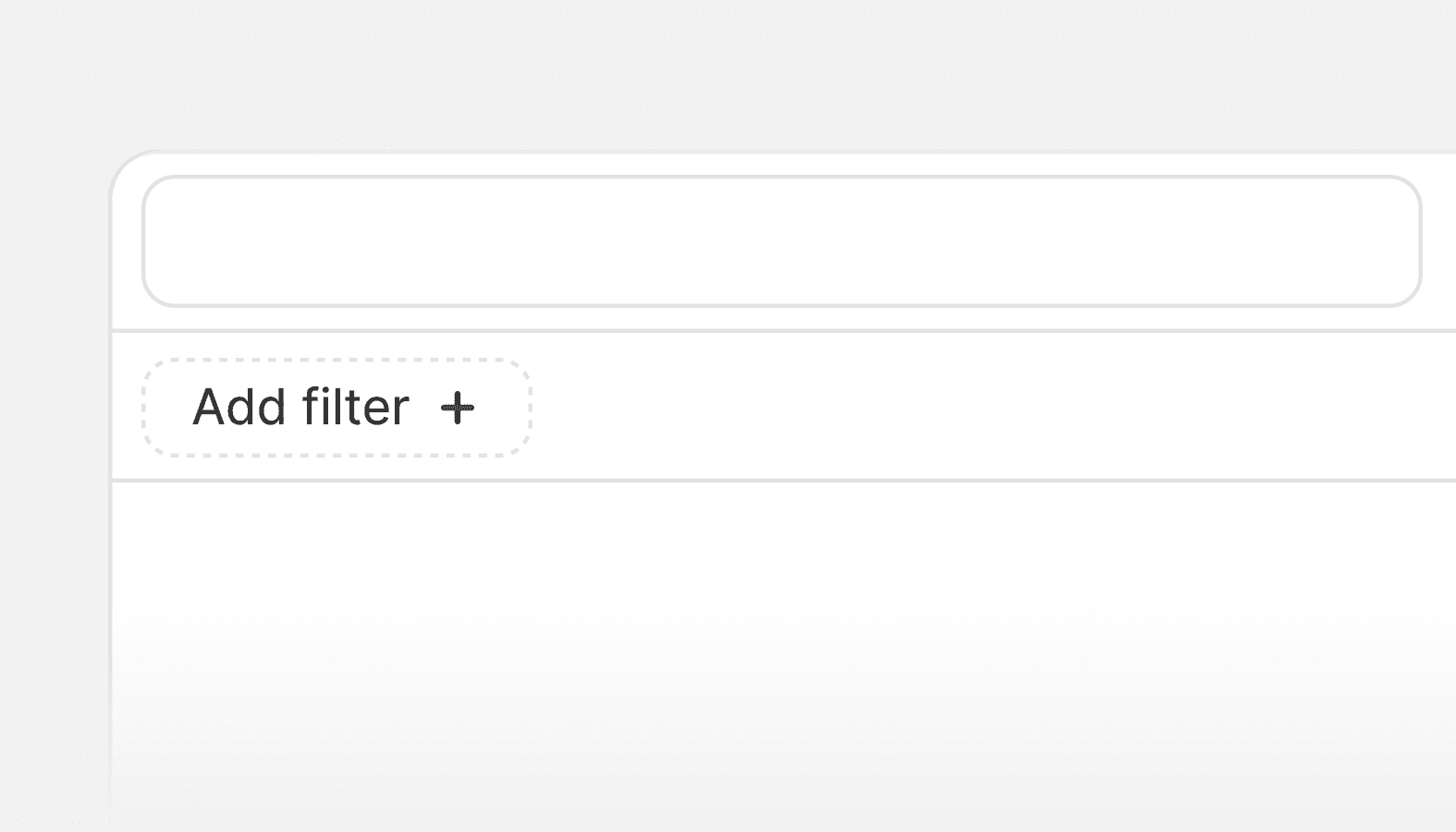
Filters
A composite component that filters the items of a list or table.
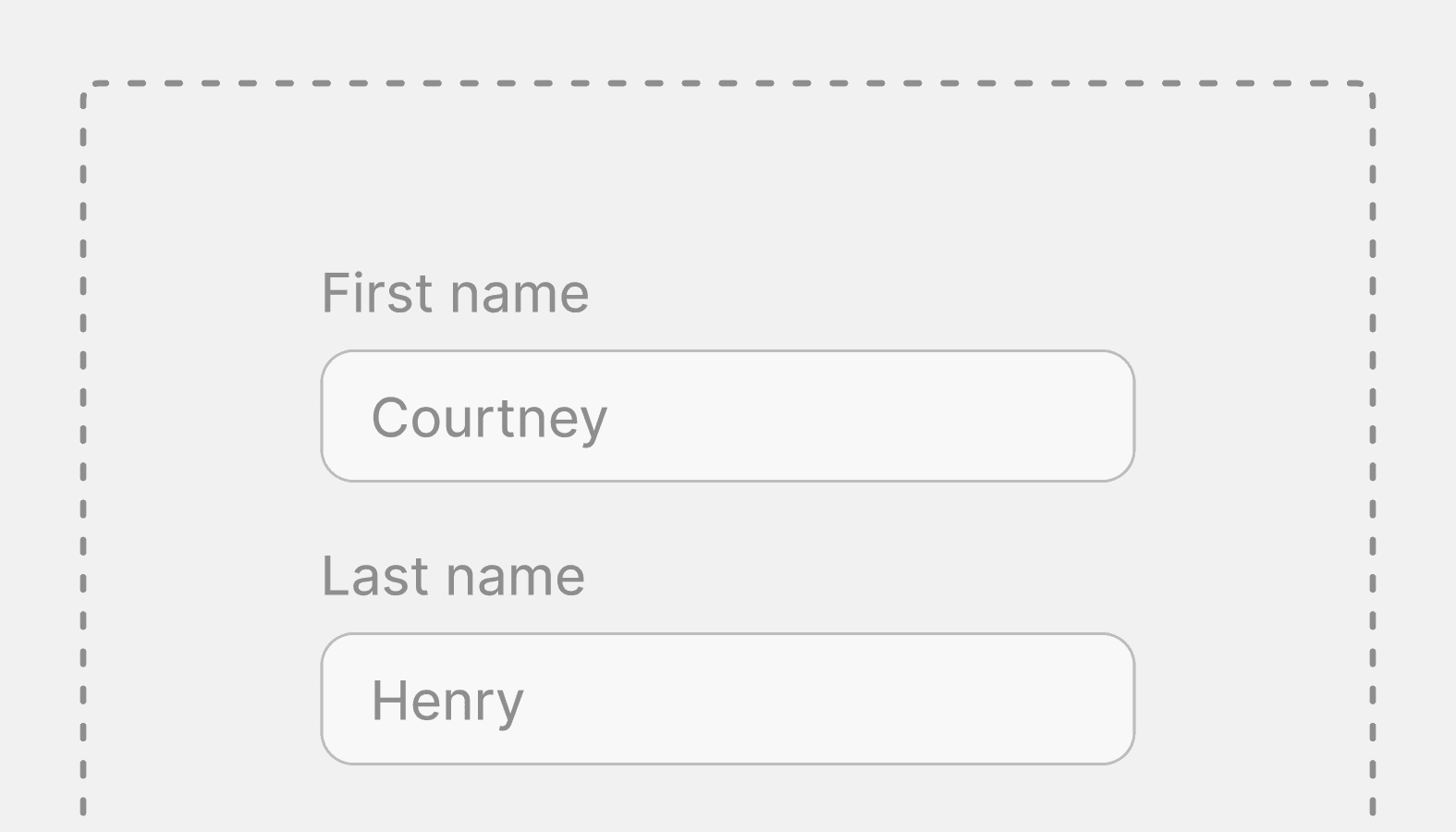
Form
A wrapper component that handles the submission of forms.
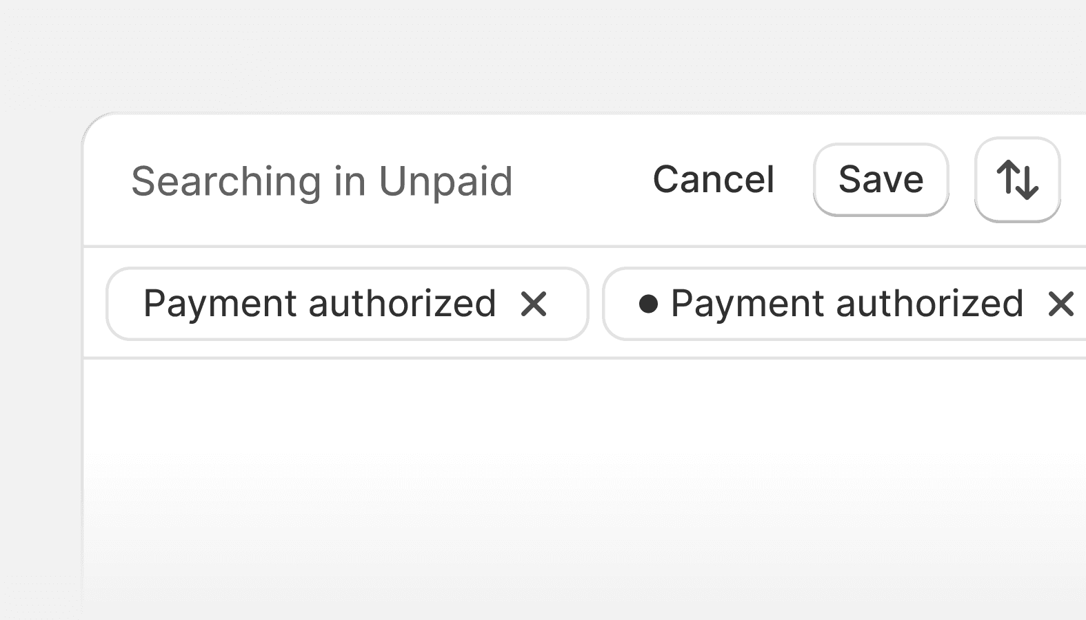
Index filters
Use index filters to allow merchants to filter, search, and sort their index table data and create unique saved views from the results.
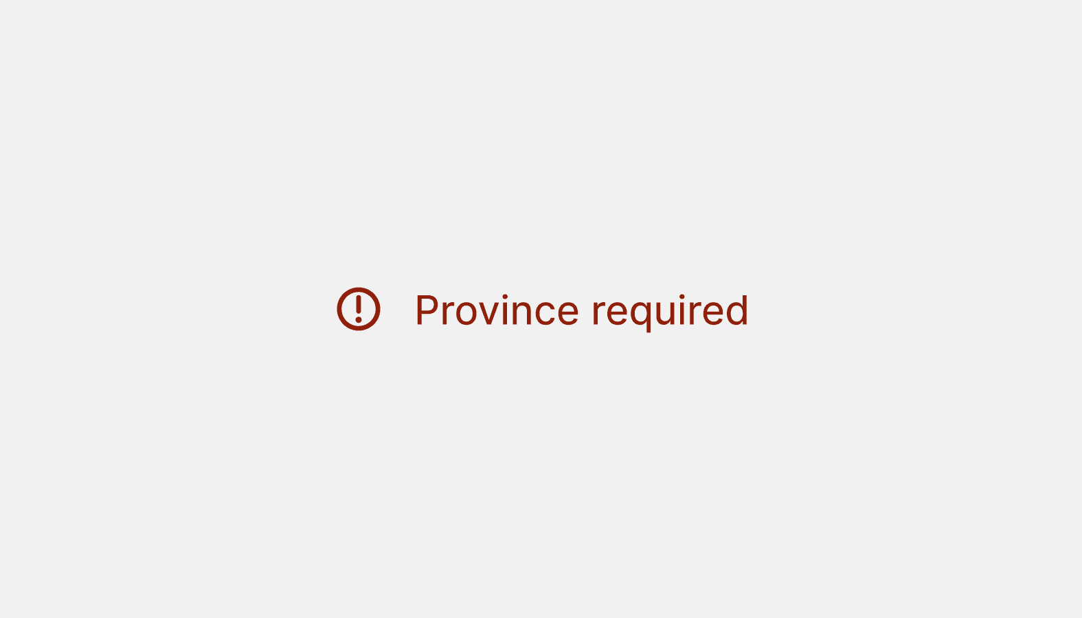
Inline error
Inline errors are brief, in-context messages that tell merchants something went wrong with a single or group of inputs in a form. Use inline errors to help merchants understand why a form input may not be valid and how to fix it.

Radio button
Use radio buttons to present each item in a list of options where merchants must make a single selection.
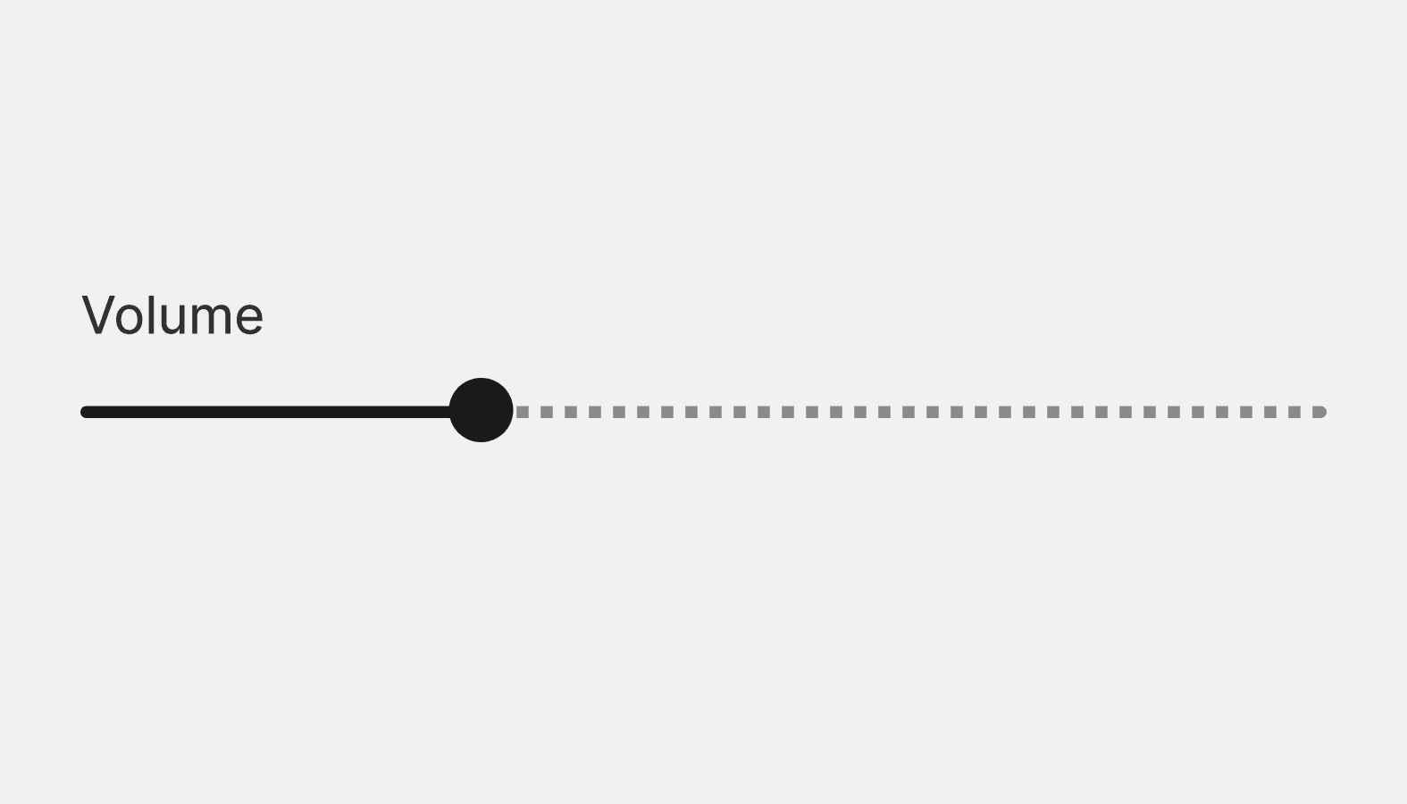
Range slider
A range slider is an input field that merchants can use to select a numeric value within a given range (minimum and maximum values).
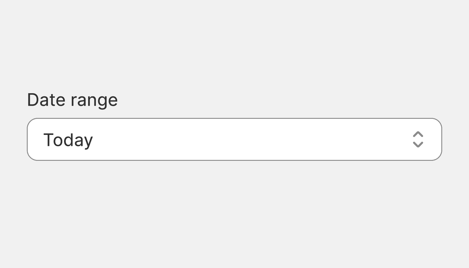
Select
Select lets merchants choose one option from an options menu. Consider select when you have 4 or more options, to avoid cluttering the interface.
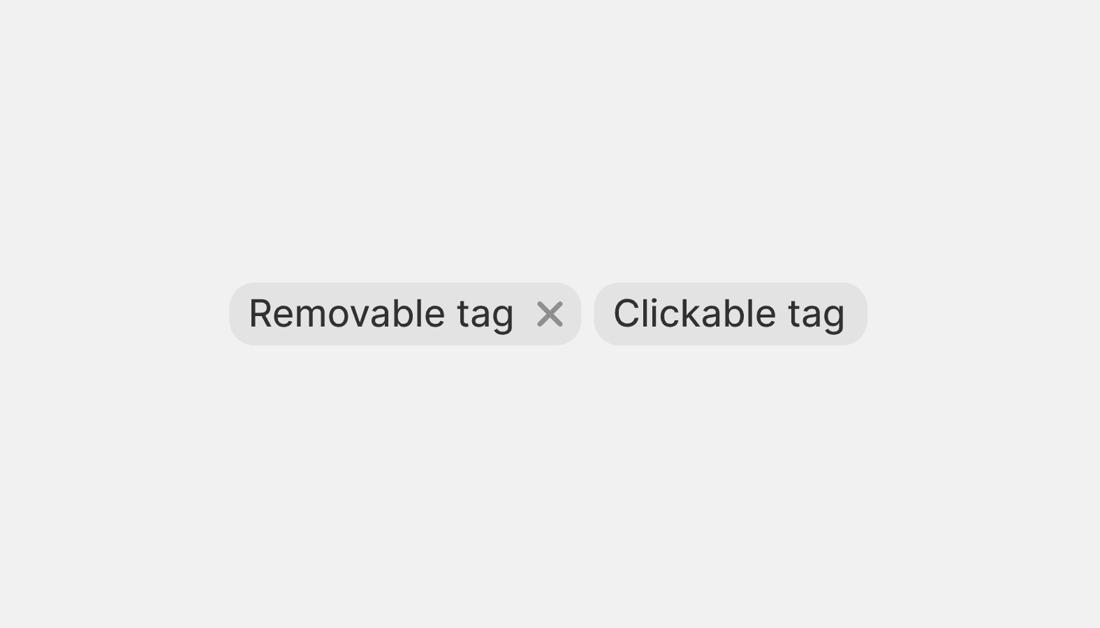
Tag
Tags represent a set of interactive, merchant-supplied keywords that help label, organize, and categorize objects. Tags can be added or removed from an object by merchants.
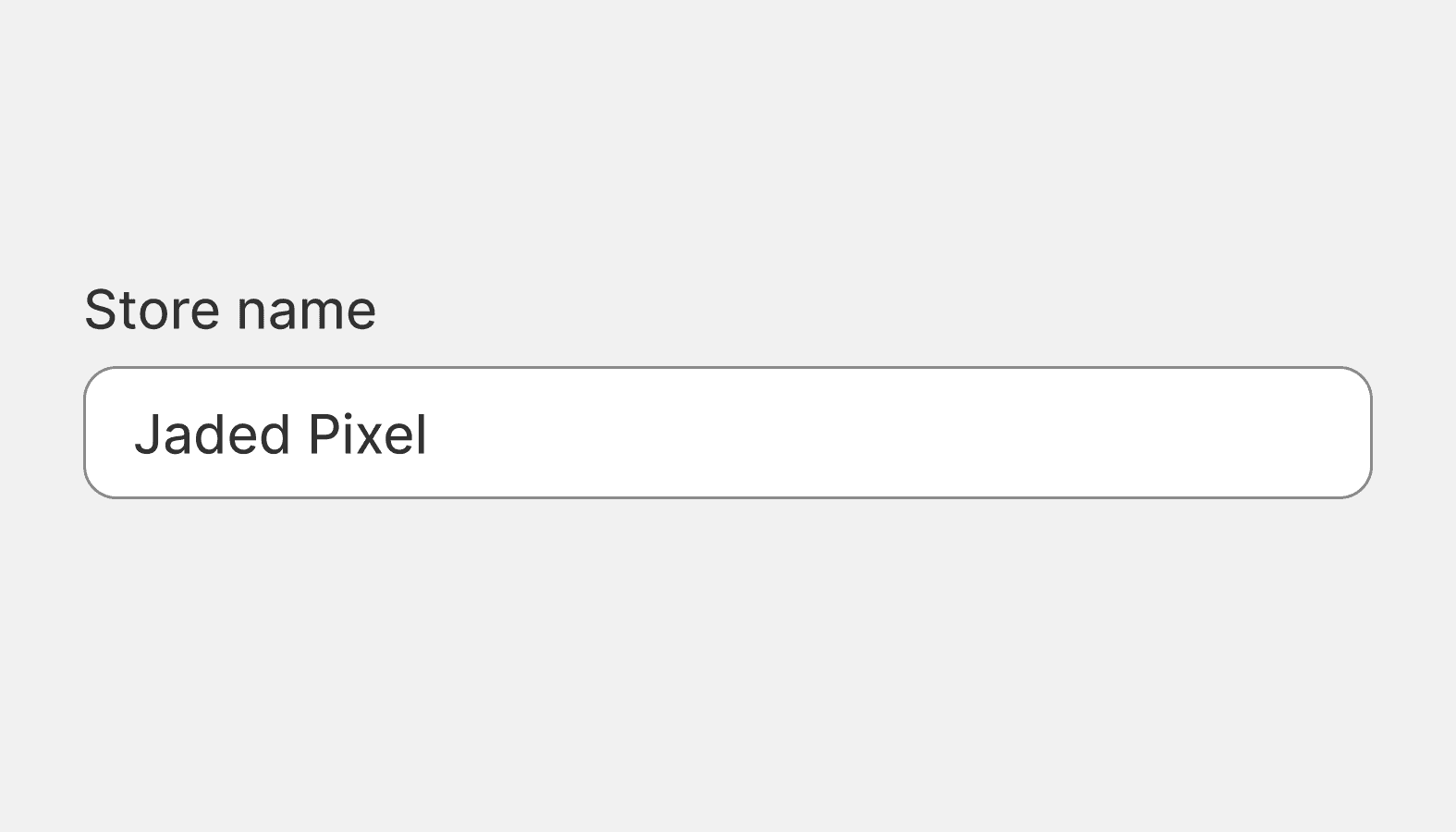
Text field
A text field is an input field that merchants can type into. It has a range of options and supports several text formats including numbers.