 Polaris
Utilities
Utilities are core tools for managing the structure of the admin and global settings.
App provider
App provider is a required component that enables sharing global settings throughout the hierarchy of your application.
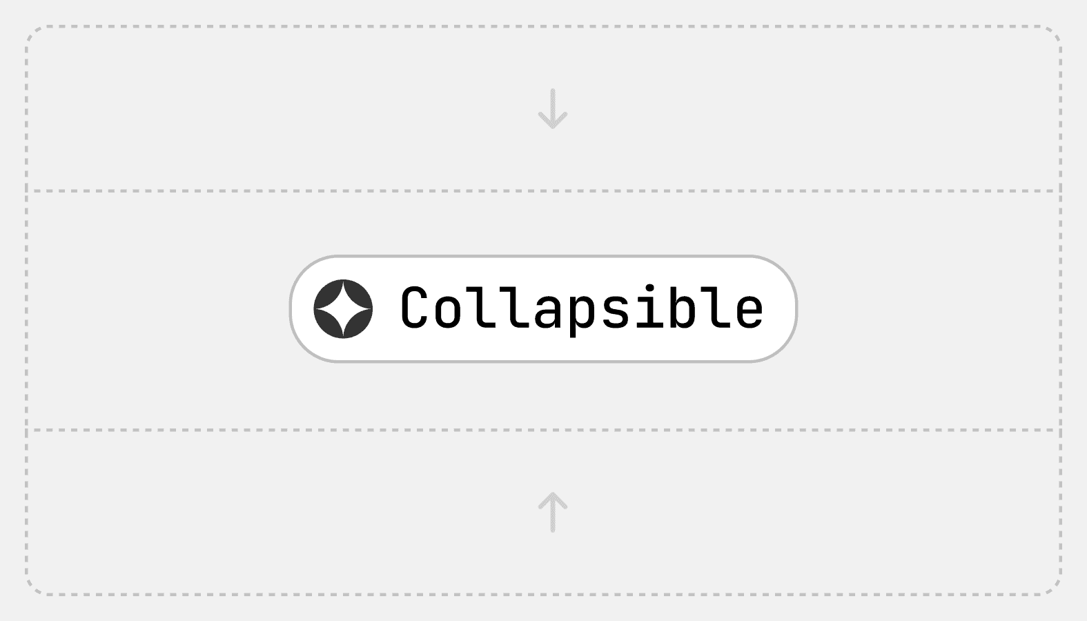
Collapsible
Hides content and allows merchants to expand it. Used to hide optional settings, information, and actions.
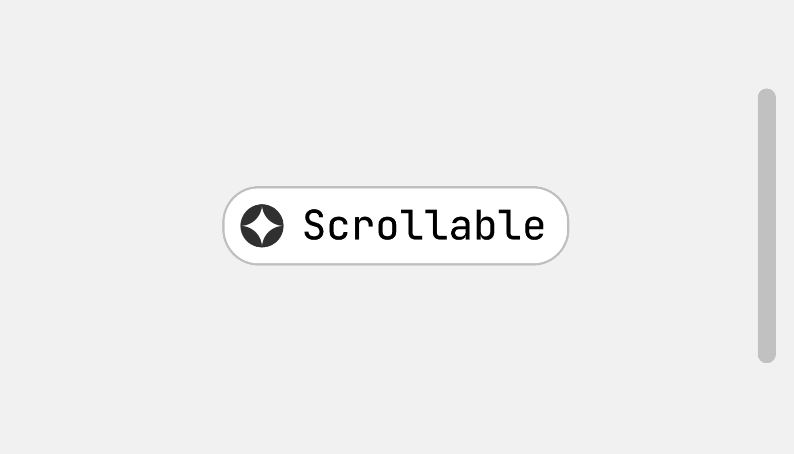
Scrollable
Used in components with too much content for the available vertical space. Embeds long-form content in components like modals and popovers.