 Polaris
Layout
Space defines proximity
Space plays a vital role in establishing connections between items. The principle of proximity states that the closer objects are, the stronger their perceived relationship.

Grouping similar items together helps merchants understand which elements are related and helps them make faster decisions.
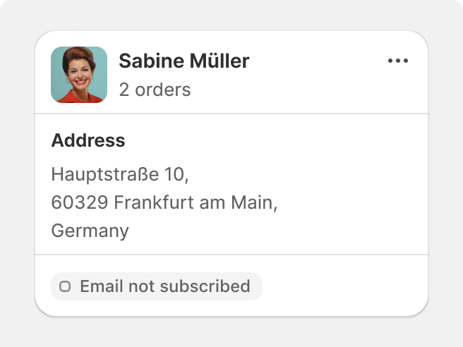
Group similar data points or tasks in the same card.
Nest inset shapes and surfaces.
Emphasis creates hierarchy
In the Shopify admin, larger, heavier, and contrasting elements attract attention and create visual rhythm.
Smaller, lighter, and more subtle elements are work-oriented and provide detailed information.
Use size, weight, and contrast to establish hierarchy in the admin. Divider lines are used to delimit rows of information in data and index tables, and rarely for dividing information elsewhere.
Use weight and contrast to introduce sections of the UI.
Use divider lines to create visual hierarchy or separation outside of indexes of tables.
Software, not website
Since the admin is more like software, rather than a website, elements need to be sized appropriately based on their job.

Compact elements add detail, and larger elements command more attention. Surfaces adapt to these components and offer an optimized view of the admin.

Create compact components for specialized, minute tasks.

Contradict the importance of a task with its size in the admin.