 Polaris
Typography
Typography is the art of arranging type in ways that provides innate hierarchy to UI.
Typography defines hierarchy
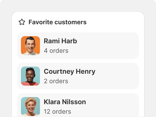
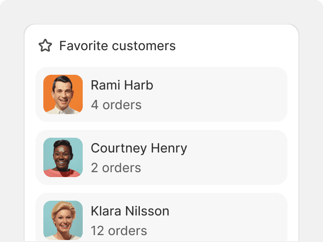
Typography plays a crucial role in defining hierarchy within design. Variable weights convey different levels of importance, where bolder weights indicate greater significance.
Good type positioning also establishes visual prominence and emphasizes key information.

Do
Use a combination of weight, size, color and positioning to define hierarchy.
Don't
Rely only on color to define hierarchy.
Typography defines purpose
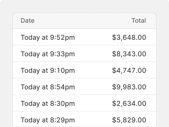
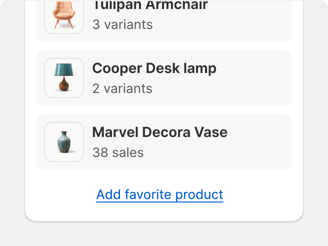
Polaris assigns meaning to type based on its usage. Mono is used for code; tabular number stylesets are employed for numbers and currency amounts; and typescales are designed with UI design in mind.

Do
Consistently style similar or repeating type in the UI.
Don't
Repurpose or reinterpret known patterns in typography, especially when it comes to interactions.