 Polaris
Depth
Hierarchy
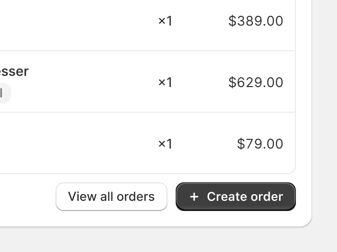
Depth can effectively establish visual hierarchy. The higher an element sits in the Z scale, the more important it will seem. This enables merchants to understand the importance of different elements and guides their navigation through the interface.
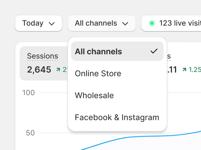
Use depth tactically, and to differentiate between primary and secondary elements.
Overuse depth, as it can lead to a cluttered and confusing interface. Too many elements pulling attention can disorient merchants.
Add unnecessary depth to an element. The depth of an element should always be related to its importance or interactivity.
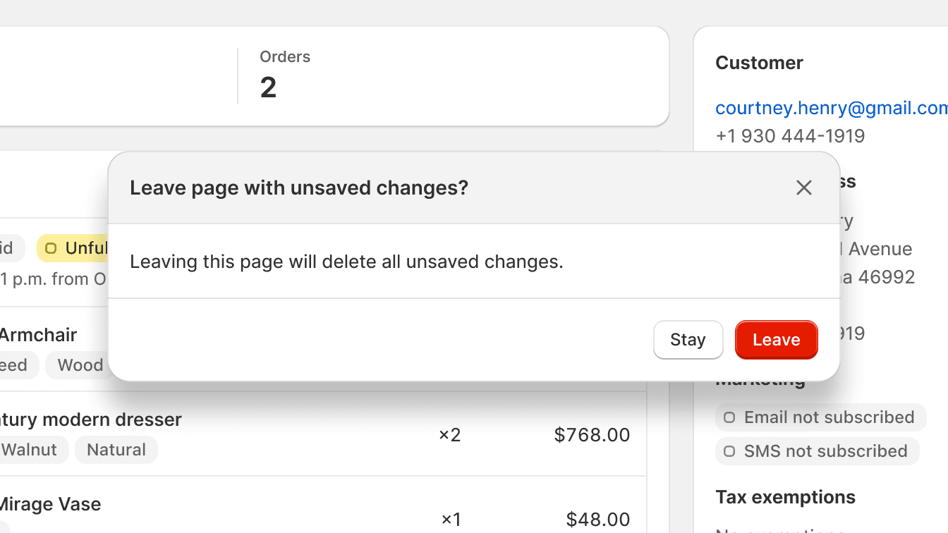
Allow elements to protrude outside of their parent containers. This disrupts the natural perception of depth and hierarchy, leading to a visually confusing interface. Instead, maintain the integrity of parent-child relationship in the layout for a cohesive depth perception.
Interactivity
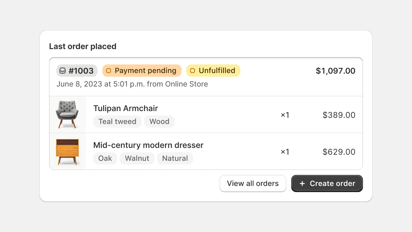
Depth indicates interactivity. Interactive elements, like buttons or cards, get more depth to signal to merchants that they can interact with such components.
Use depth to indicate interactive elements, so it’s obvious what elements merchants can interact with.
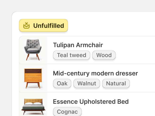
Give static elements unnecessary depth, as this can mislead merchants to think they’re interactive.
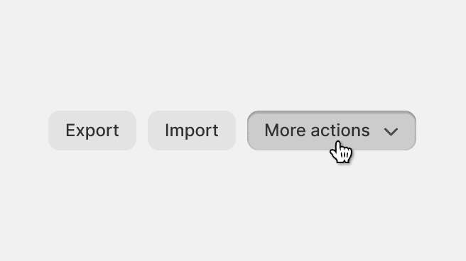
Apply intuitive changes to an element's perceived depth upon interaction, like pushing a button down. This provides visual feedback and intensifies the sense of tactility.
Apply unexpected changes to an element’s perceived depth. This causes disorientation and makes the interface feel ill-conceived.
Focus
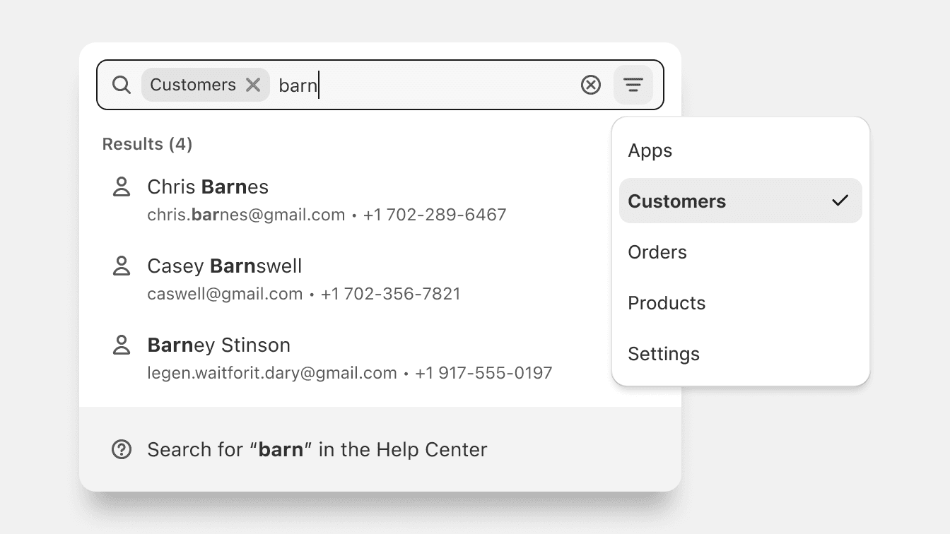
Depth helps to guide the merchant's focus. By giving more depth to an element, you can guide the merchant's attention towards it.
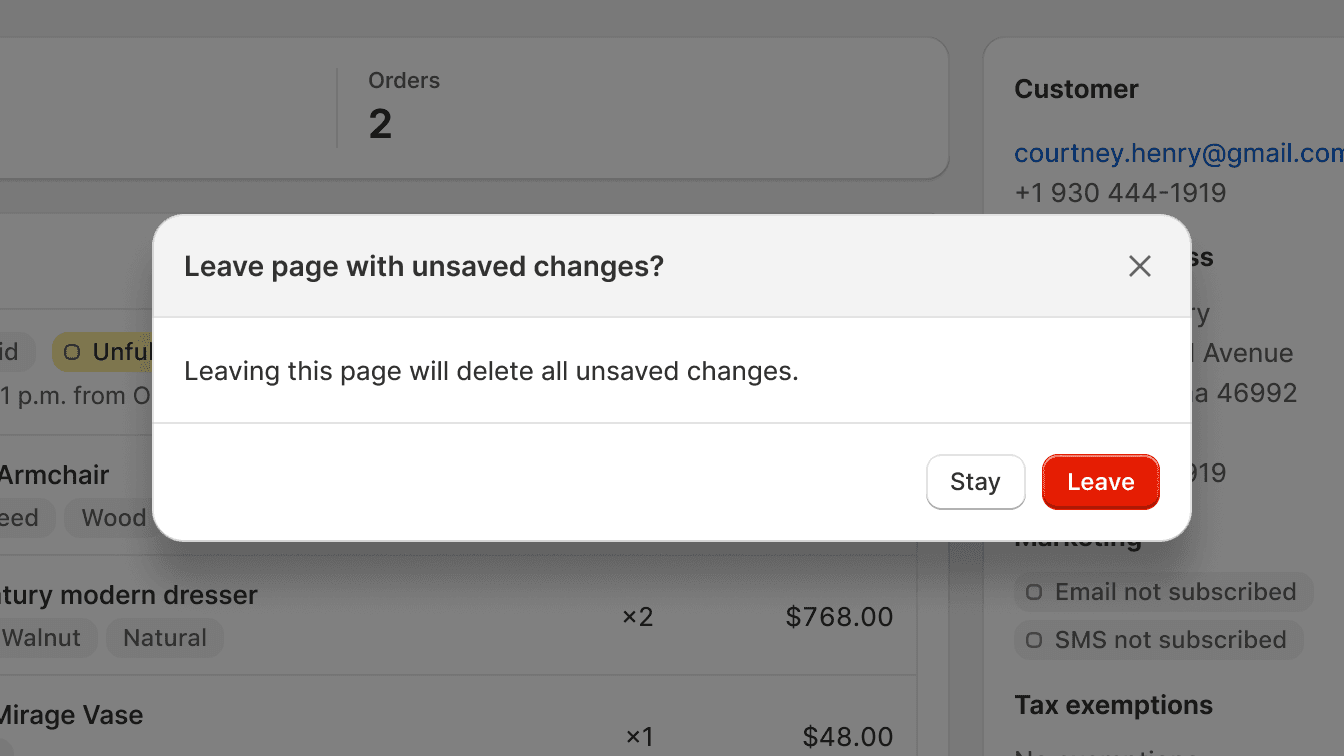
Use depth to highlight action and large pieces of information that overlay on top of other information, to ensure merchants see these first.
Rely solely on depth to create focus. Not all merchants perceive depth in the same way, so it's important to use a combination of techniques to ensure your design is accessible to everyone.