 Polaris
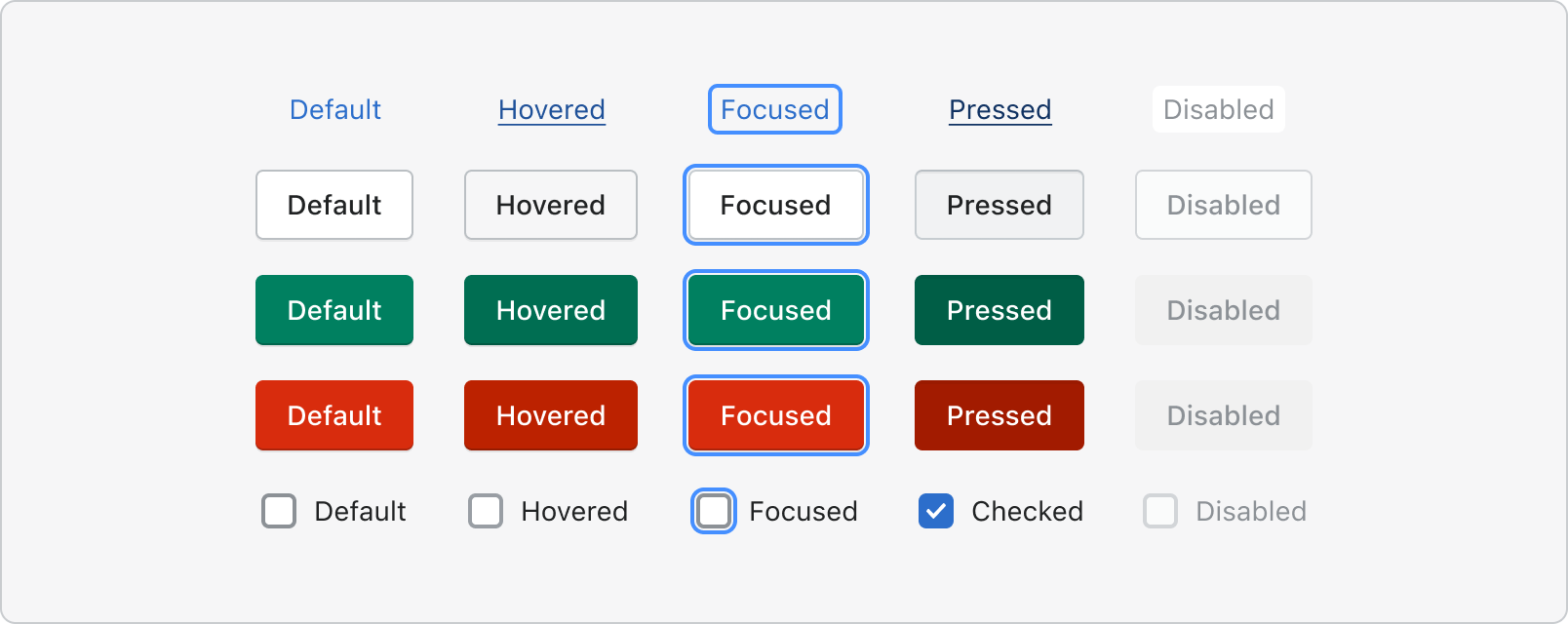
Interaction states
This section is currently being reworked to provide better guidance aligned with Polaris v12. Stay tuned!
Principles
Be subtle, but clear
Successful interaction feedback is informative, not decorative. Avoid elaborate transitions that create visual noise or intense color changes. Distracting animation can create disturbance and make an interface unpleasant to use.
Keep things consistent
Consistent treatments for interaction feedback create recognizable patterns. If an interaction produces different feedback across the Shopify admin, it deteriorates the integrity of the pattern and risks confusing merchants.
Designing interaction states
Keep in mind that merchants interact with interfaces differently depending which input device they’re using. Devices they may be using include:
Input devices to consider
- Mouse
- Touch screen
- Keyboard
- Voice
- Game controller
- Refreshable braille display
To learn more, check out the accessibility guidelines.
Use signifiers
Provide merchants with cues as to what the interface will do if they interact with it. By using signifiers we set expectations about what components can do, which creates a more intuitive interface that’s easier to use. The types of signifiers include:

Explicit, where content directs merchants to do the intended action, such as “Sort” or “Save.”

Hidden, where the clue isn’t revealed until the merchant interacts with it, such as hovering or using tab navigation to see if a button is clickable.

Negative, where the action appears inactive (like the button is grayed out and doesn’t respond to hover) because it isn’t available for the merchant to use.

Behavior
Use feedback indicators like the progress bar component or the spinner component to let them know that the interface received their request. If appropriate, you can also provide added information about what or how long it will take to complete.
For non-disruptive feedback on the outcome of an action, use the App Bridge Toast component.
For an unsuccessful completion that requires the merchant to take action, provide information about what prevented the action from completing successfully and what the merchant can do to fix the problem. For example, use the validation error state of the text field component.