 Polaris
Color
Color has purpose
The purpose of using color has to be clear. Color needs to support a message or status that needs to be easily identifiable by merchants.
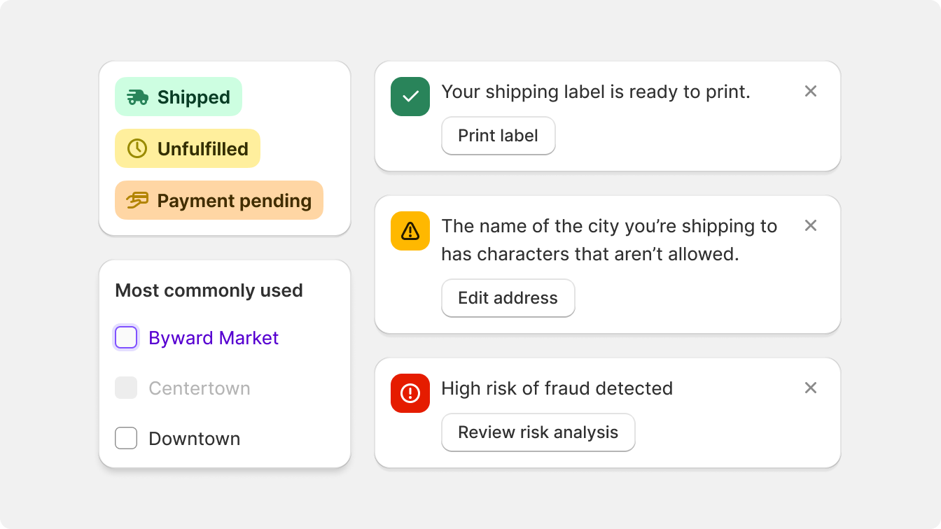
Each usage of color within the Shopify admin is purposefully tied to a specific meaning. For instance, red signifies critical errors, green represents success messages, and blue is used to draw attention to tips and offers. Using color as decoration is exclusive to illustration.
This deliberate color coding facilitates merchants in identifying which parts of the user interface require focus and distinguishes them from the default features provided by the Shopify admin.

Use color to support different states merchants need to be informed about.

Use color to decorate or to distract merchants from performing tasks.
Color has impact
The Shopify admin interface adopts a black and white color scheme, intentionally creating a neutral backdrop. By employing this monochromatic design, elements that incorporate color gain heightened visual impact and prominence.

The intentional design of the overall interface in black and white enables strategically positioned and carefully selected elements to grab merchants' attention. By utilizing color purposefully, the focus is directed towards crucial information, actions, and visual cues.
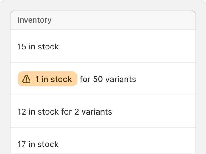
Create impact when using color by using appropriate shades to convey the importance of what is being communicated to merchants.
Use strong, vivid colors to grab attention to things that matter most.

Contradict or diminish messaging by using subdued colors or grayscale.
Color is accessible
Polaris offers consistent color palettes for each color role. This means that each color is assigned a specific relationship within the overall palette.
These color relationships ensure that color contrasts remain consistent across every application of color and ensure proper legibility and understanding when it comes to combining texts with color and interactive shapes with various backgrounds.

Colors are meant to be easily understood and read by all merchants. Sufficient contrast makes things easier to find, identify, and interact with.
Use color in conjunction with other discernible elements to amplify the message.

Use color alone to convey meaning