 Polaris
Color → Palettes and roles
Global palette
The Polaris color palette includes 12 colors, each with 16 shades. These colors are assigned different roles in the Shopify admin to convey specific meanings and serve distinct purposes.
The global palette is built using HSLuv Lightness values. HSLuv is a color space that stands for "Hue, Saturation, Lightness (L), and perceptual uniformity." It is designed to address the limitations of traditional color spaces, such as RGB and HSL, by providing more perceptually uniform and intuitive color representation. It aims to ensure that color transformations, such as lightening or darkening, are visually consistent and predictable to the human eye.
Considering this, the Polaris color palette maintains uniformity in shades within each hue. Consequently, colors like Red 12 and Blue 12 will have identical contrast ratios when paired with the same color, such as Gray 1. This simplifies the process of styling color roles by easily substituting hues as necessary.
Colors
Contrast ratio
—Color roles
A color role is composed of a collection of tokens that represent different parts of the UI. Each color role follows the same logic for all tokens, but not all tokens are defined for each color role.
Color roles like default will have all tokens defined, because the default color role offers the baseline color for all elements in the Shopify admin. Roles like critical or information will only have a selection of tokens defined, as these roles are usually applied to specific, smaller and more specialized components like badges or banners.
More information about tokens and their usage can be found under Using color.

Default
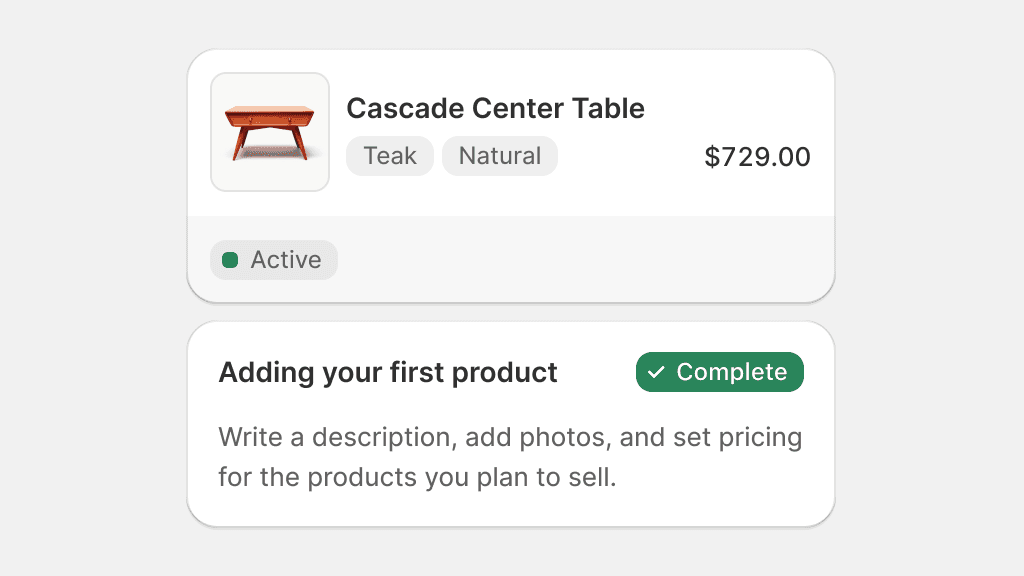
The default role is used to style the entire Shopify admin and is considered to be the baseline theme for all experiences. This role defines default, secondary and tertiary visual hierarchy for a variety of components and are used when communicating default statuses, neutral messaging and common merchant data.

Use the default role for the default admin experience and messaging. Use secondary and tertiary for any additional details.
Use secondary and tertiary tokens to style entire, complex surfaces.
Use secondary and tertiary colors to create visual separation within complex components.
Brand
Brand is used to pull additional focus on main actions in the UI. This role is used across the admin to guide merchants to the most intended interactions when many options are available.

Use brand color to guide merchants to a primary action, especially with default, secondary or tertiary roles.
Use multiple brand roles in the same area, this can confuse merchants as to which action is the most appropriate in the current context.
Info
Info is used to convey important bits of information in the admin. Info is the catch-all color role when it comes to giving more attention to information that can benefit the merchant, like tips, promotions, or incentives.

Use info to grab attention on information that is not part of the typical admin experience.
Use info on multiple elements that need attention in the same component. This dilutes attention on what matters most.
Success
Success is used to confirm that an action has been completed successfully. Success can also be used to convey confirmation messages or statuses that are positive and that do not require any immediate action from the merchant.

Use success to tell merchants that everything is OK.

Use success to entice merchants or to share special offers.
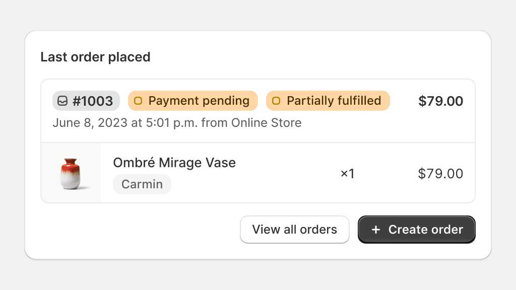
Caution
Caution is used to show information that does not need immediate attention from merchants, as well as incomplete or unstarted statuses. Caution is often used before a piece of information becomes more severe.

Use caution to share statuses that have stalled or have not started, but are not blocked due to errors.
Use caution for announcements.
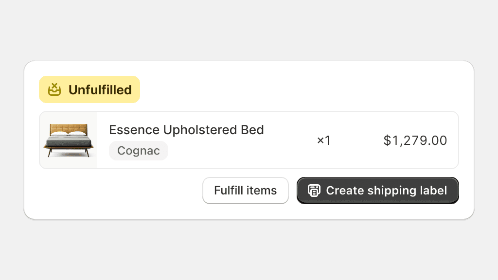
Warning
Warning is used to tell merchants that something needs their attention. Warning is also used to convey statuses that are in-progress, pending, or that could require merchant intervention. Warning is the strongest, non-blocking color role in the admin.

Use warning for elements that require merchant intervention.
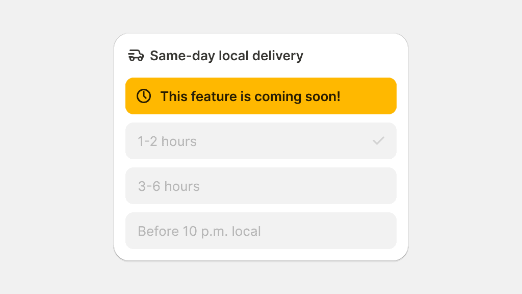
Use warning for “under construction” or “coming soon” messaging.
Critical
Critical is used as the color of highest importance. Elements using critical must convey messaging that implies that an action is impossible, blocked, or has resulted in an error.

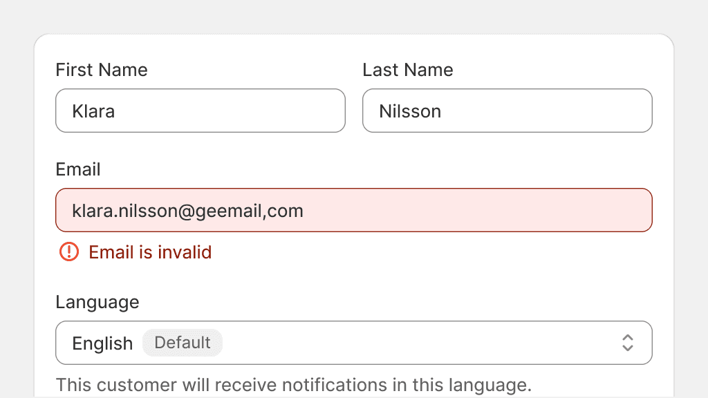
Use critical when the UI calls for immediate action or errors in the UI.
Use critical for less important, non-actionable or contradicting messaging.
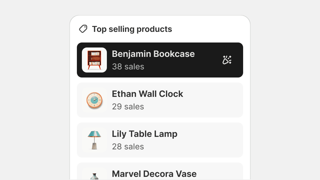
Magic
Magic is used on elements that denote the usage of artificial intelligence or any other type of automation technology that saves merchant’s time while performing tasks.

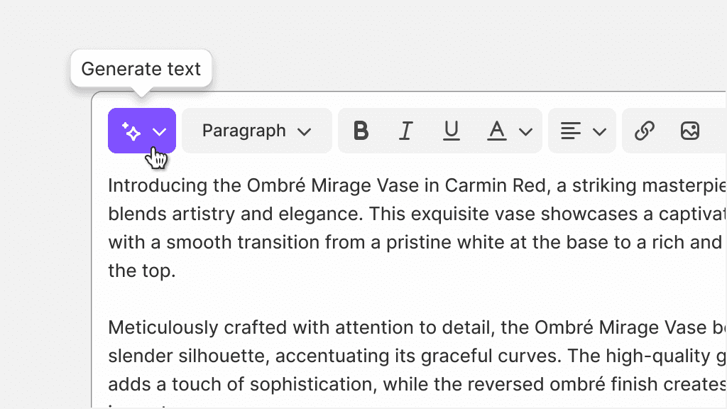
Use magic for UI like the Sidekick icon or the Shopify Magic indicator.
Use magic as a “pop of color” to differentiate elements in the admin, or to present new features.
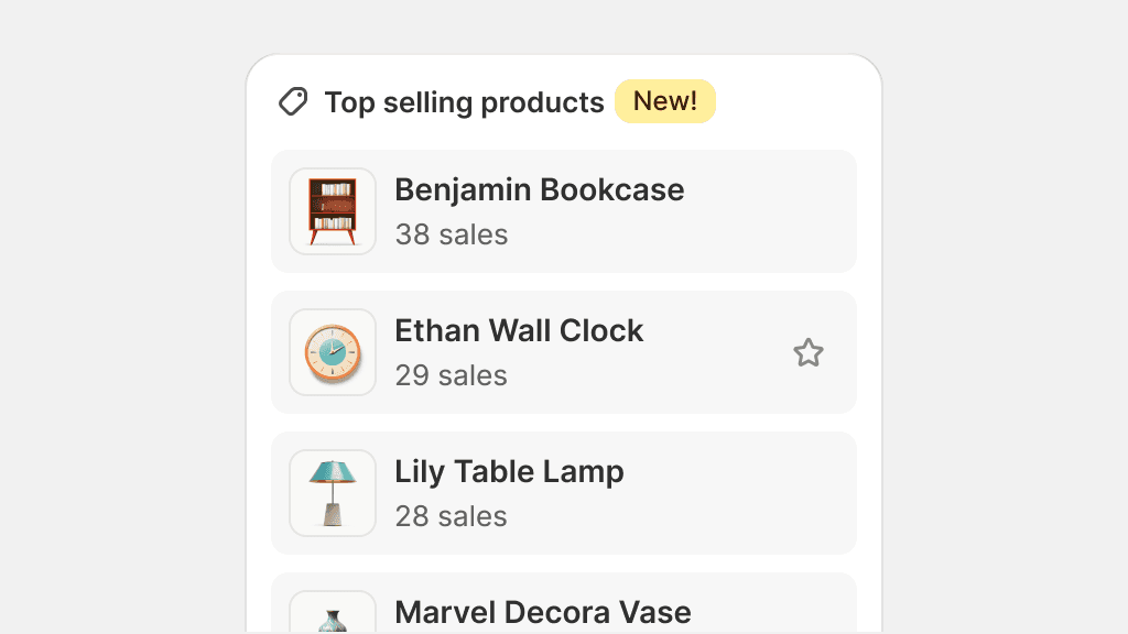
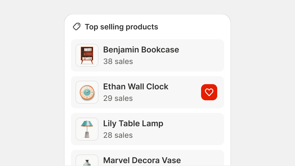
Emphasis
The emphasis color role is used to indicate areas of focus within the UI and to highlight active elements in editors.


Use emphasis to show merchants what is currently selected in editors like the theme editor.
Use emphasis to pivot a merchant’s attention to content that is not interactive.
Transparent
Transparent is used on elements that have low visual affordance, and to minimize visual noise in information-heavy interfaces. This color is mainly used on smaller elements that have secondary roles.

Use transparent on elements that are repeating across the admin, like edit buttons.
Use the transparent color role on elements that require higher affordances like buttons that have text labels.
Inverse
The inverse color role offers the possibility of styling elements in situations where a darker theme is necessary. Inverse is used sparingly in the admin, and on specific elements that frame the Shopify admin, like the top bar.

Use inverse on larger elements, like the top bar.
Use inverse to grab a merchant’s attention on a specific element.
Specialized roles
Specialized roles are used in specific components that require detailed visual distinctions for a variety of reasons, like accessibility and high complexity components.
Input
The input color role is reserved for form elements. Input ensures that form elements will adhere to WCAG color contrast accessibility standards and makes forms look uniform across the admin.

Use the input color role on form elements, or elements that behave like other form elements, like complex select boxes.
Use the input color role outside of a form. This can confuse merchants into thinking an element is part of a form when it isn’t.
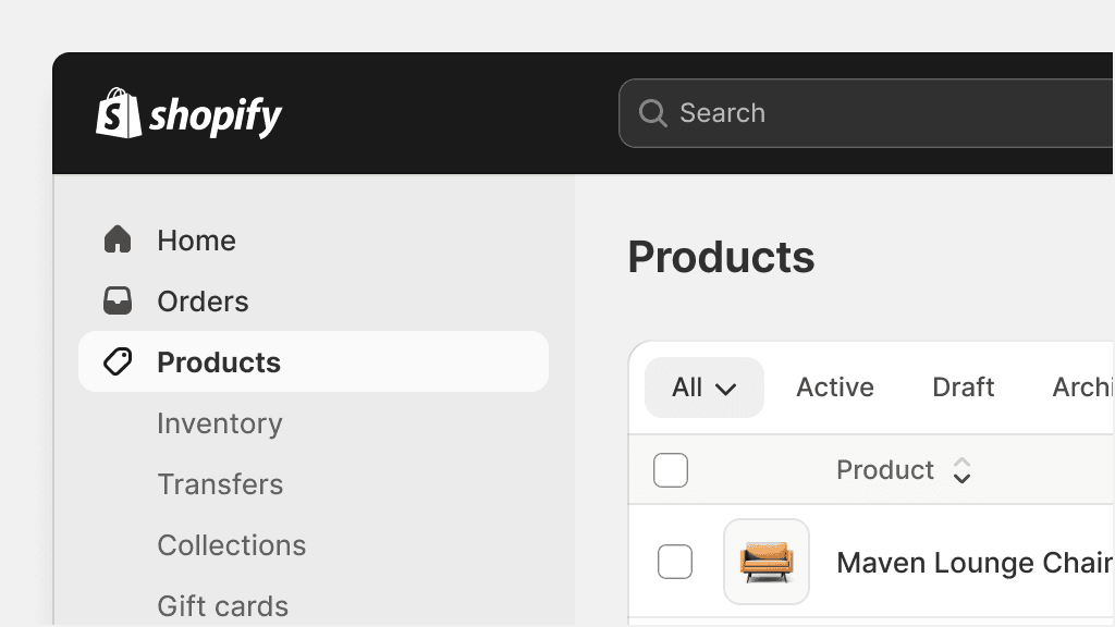
Nav
Nav colors are reserved for the Shopify admin menu. The menu consists of specialized elements that are purpose-built to offer the best navigation experience, and therefore require a specific set of colors defined in the nav color role.

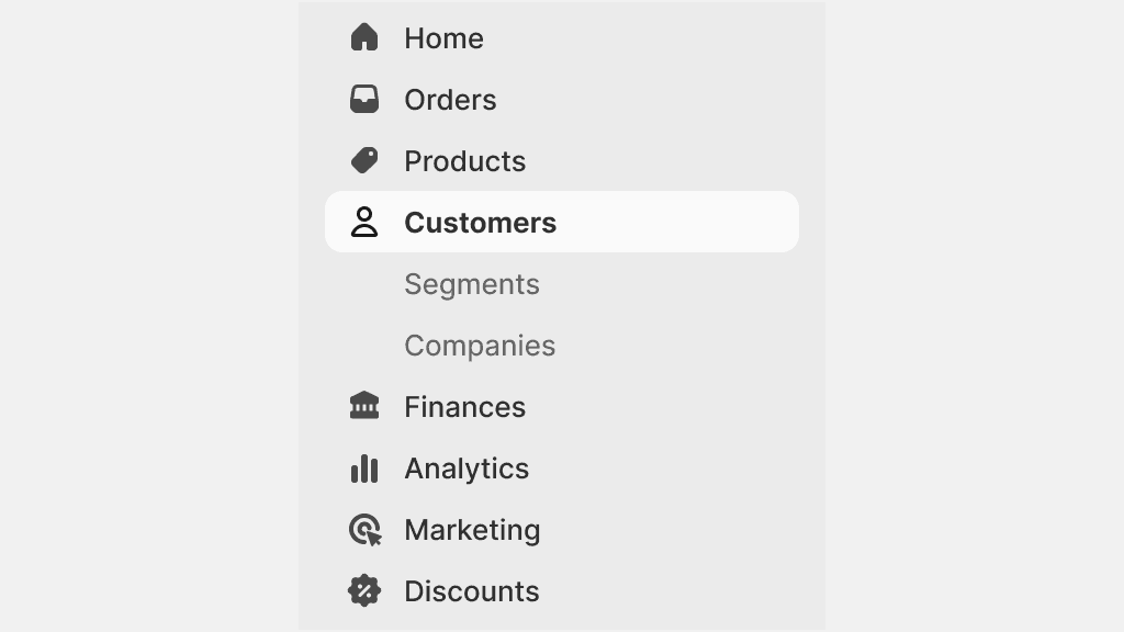
Use nav colors only for the Shopify admin menu, in all levels of navigation.
Use nav colors for other navigational elements, like tabs or links. These should use the default color role.