 Polaris
Color → Using color
Color relationships
While color roles define the value of each concept of UI it styles, color relationships between each one of these concepts define how color is used in the Shopify admin.

Background
Background colors are used as the baseline of all UI in the admin. The admin itself has a background, and some components can also have a background if they are not built within a surface.
Background colors can only have other elements of any other color except for other background colors above them. Multiple background colors can exist in the same viewport only if they exist side by side.

Background color is always used in every admin interface.
Use background color on surfaces or on individual elements.
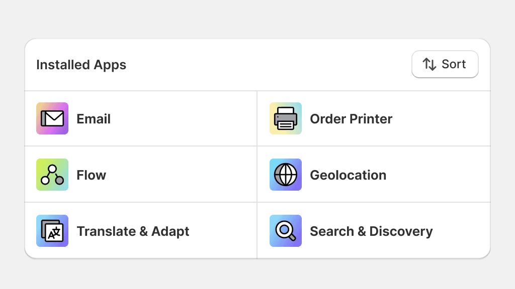
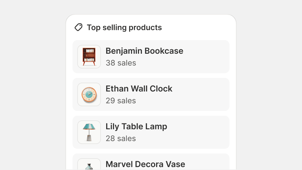
Surface
Surface colors are the most versatile in the color system. Surface is the background color for elements with the highest level of prominence, like a card or a banner. Many elements can sit on top of a surface to create complex components and patterns.
Surface colors also come with various hierarchical levels and can be used to increase or decrease emphasis on specific areas of the UI.

Use surface colors for all surfaces, like cards, tables, banners, modals, and so on.
Mix multiple color role surfaces in the same component. Avoid jarring color combinations when nesting components.
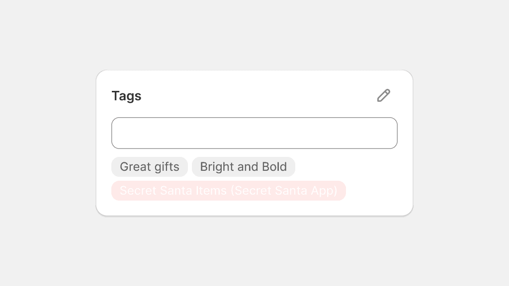
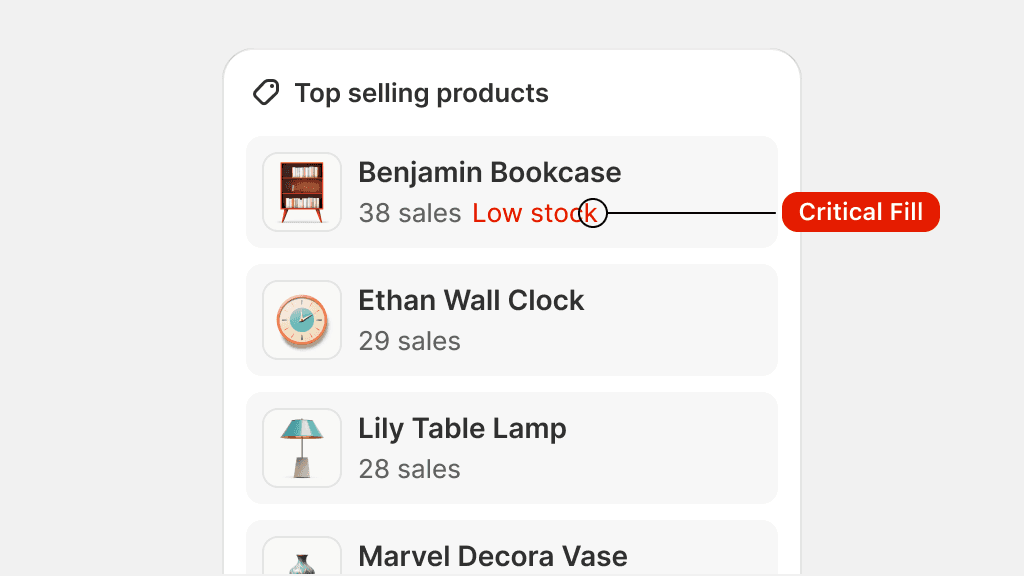
Fill
Fill is the background color for an element with a smaller surface area like a button or a badge. Fills are usually the most vibrant color in an interface. They sit on backgrounds and surfaces and sometimes sit on top of other fills.
Fills also come with their explicit text and icon colors, called on-fill.


Use fills on smaller surface areas and on elements that pull a merchant’s attention.
Use fills on large components or as backgrounds for entire interfaces.
Mix fills with text colors that are not “on-fill”. These combinations might not pass minimum contrast ratio requirements.
Border
Borders are used primarily in data tables to enhance visual structure and organization or large amounts of information. They visually separate and contain elements, and can be used to either delineate rows or define the space of a nested table.

Use borders for tables, and divided surfaces that look like tables, to make data easier to read.
Use borders when a data table is nested within a card.
Use borders to delineate information. Check out Dividing surfaces for guidance.
Text
Text color can be used on any text element and any icon element that accompanies text. Text colors are designed to be fully accessible, in terms of contrast on their corresponding backgrounds and surfaces, and should only be used in tandem with them, but can generally be used on any other background or surface if contrast is sufficient.
Text color that exists on a fill has its own on-fill color. This relationship is strict and on-fill text can only be used on its corresponding fill color.

Use text color to create visual hierarchy by using default, secondary, or tertiary role colors when available.
Use text on-fill colors on anything else but its corresponding fill color. These combinations might not pass minimum contrast ratio requirements.
Use any other color except for text colors for any text that is part of the UI.
Link
Link color is used exclusively for text links that appear in lines and paragraphs of text. Link color follows the same logic as Text color: it can only be used with its corresponding background or surface colors in the same color role, but can generally be used on any other background or surface if contrast is sufficient.

Use link color for text links and text links that include icons.
Use link color to style text buttons. Use the appropriate color role and component instead.
Icon
Icon colors are used exclusively for standalone icons. These colors are tailored to meet color contrast ratios for interactive elements that do not include text. Icon colors should only be used on their corresponding background and surface colors, but can generally be used on any other background or surface if contrast is sufficient.

Use icon colors to style an icon that is standalone.
Use icon colors to style text, as the color contrast might not be enough. Instead, style the entire icon and text composition using the text color.
Combining color roles
Elements with different color roles can coexist alongside each other, enhancing merchants' comprehension of complex patterns when appropriately utilized in component combinations.
In some cases, the superposition of elements with different color roles is necessary, like using a critical icon button on a default card. These combinations may require additional testing to check for proper color contrast.

Meaningful combinations of color roles can enhance a merchant’s experience.
Avoid creating color role combinations that look too jarring or that create visual competition between elements.
Disabled color scheme
Some elements may require a disabled state. The color scheme for disabled elements is intentionally consistent throughout the admin interface, generally avoiding the use of distinct colors for each color role.

Use the disabled color scheme for disabled elements.
Use opacity or any other means to communicate disabled states.
Using other colors
The creation of new color roles is tied to the Shopify admin. Some colors available in the color palette are not yet tied to a color role. Usage of these colors is strictly reserved for illustration work.
More information about what color roles are available and their respective purposes can be found in color roles.

In the case of illustrations, any color of the color palette can be used. Diagrams, however, need to respect color role usage if they represent an abstracted view of the admin.