 Polaris
Layout → Spacial organization
Building layouts
The Shopify admin is built by using a combination of components like cards, popovers, modals, tables and so on. These components define the elevation of different surfaces in the admin and how they can interact with each other.

Surfaces
Surfaces in the admin contain other elements, like badges and text. Cards, popovers, modals and other such components are surfaces that are used to build the admin.

Dividing surfaces
Surfaces can be divided in different ways to offer flexibility when laying out components in the admin.
Nested surfaces can be grouped together within another surface to achieve visual separation between different parts of a component.
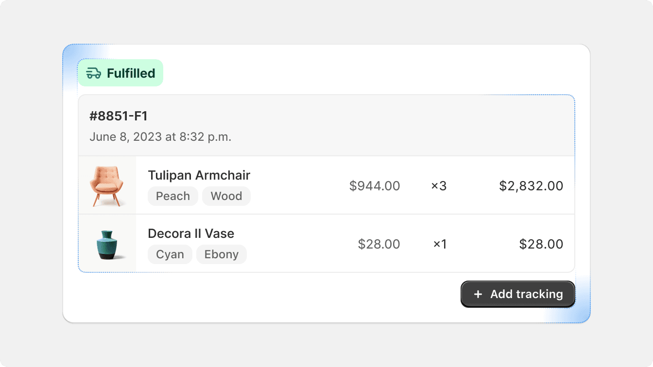
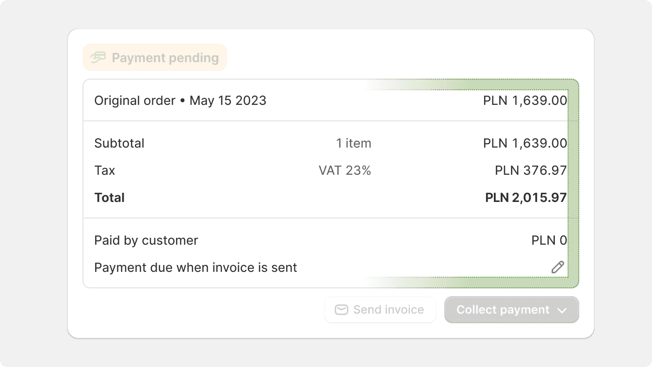
Divider lines are reserved for data and index tables.

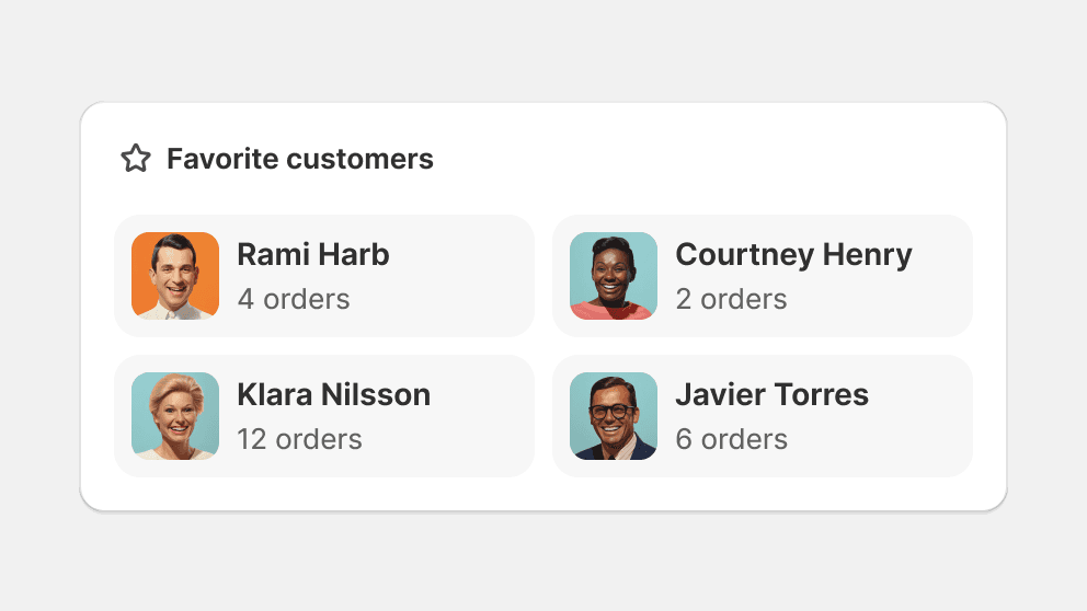
Group nested surfaces together to create visual separation.
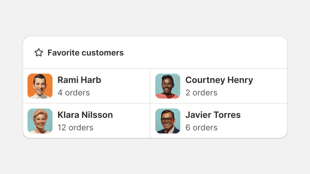
Don’t use horizontal lines to divide a surface that isn’t a data or index table.
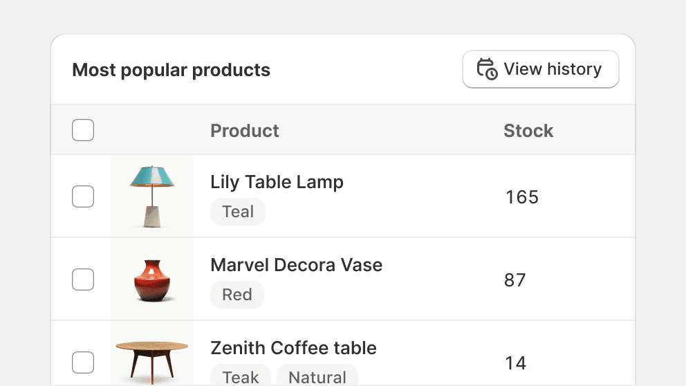
Use horizontal lines to divide a card that acts like a data or index table.
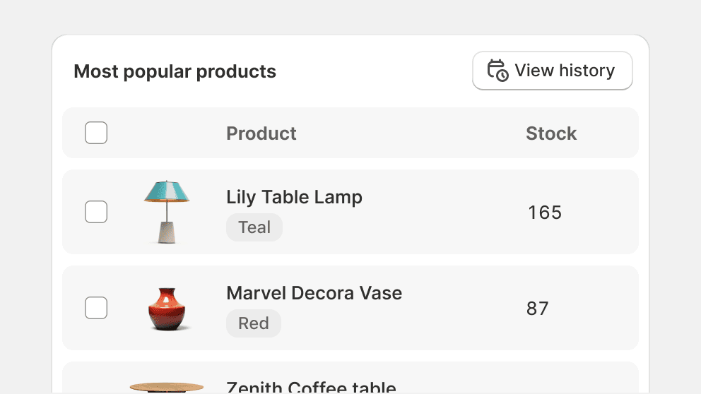
Building data or index tables with nested surfaces can make them feel inefficient.
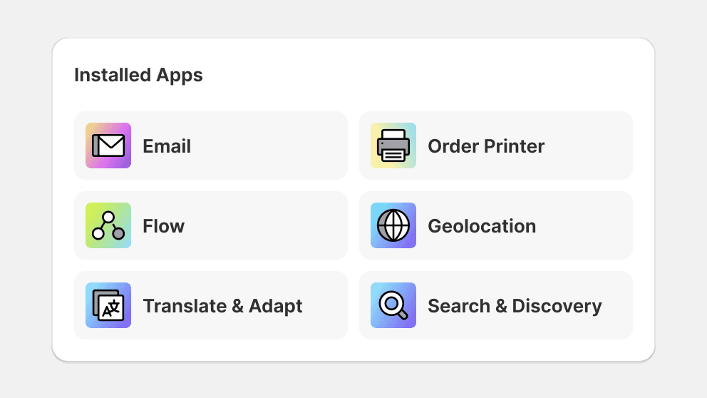
Prioritize a grid or list pattern when dividing surfaces.
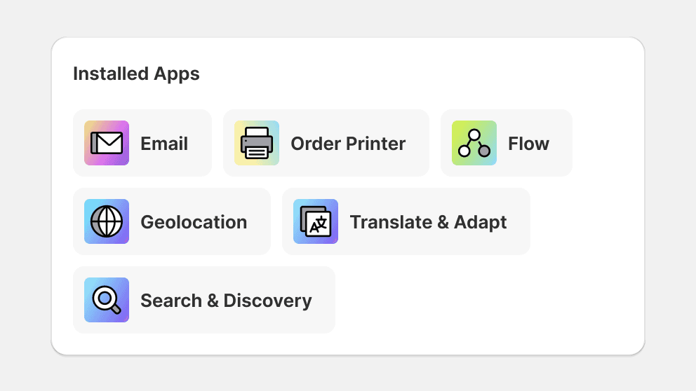
Avoid breaking symmetry when grouping surfaces together.
Nesting
Nesting surfaces and other elements is crucial to the pro-feel of the Shopify admin. Careful consideration should be taken when using elements of varying border radiuses in order to create the feeling that the interface is purpose-built.
Reduce the border radius of inset surfaces in order to create a nested look.
Make all nested elements have the same, or larger, border radius than their parent.
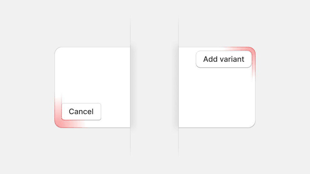
Change the border radius of elements like buttons or badges when nesting them.
Nesting tables
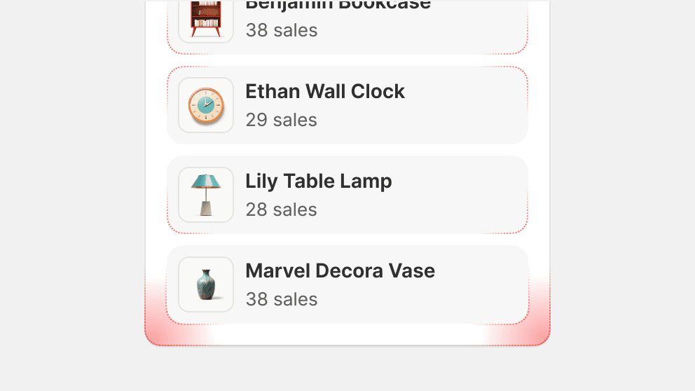
Tables and lists that exist within another container follow slightly different spacing guidelines. Horizontal padding is adjusted to give more space for data, and to avoid having too much empty space overall.
Adjust padding in nested tables to optimize the use of space.
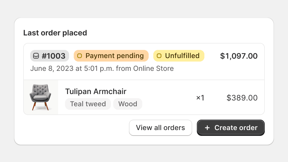
Nest tables in cards or other containers when there’s other content in that card.
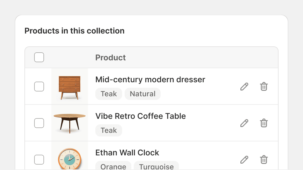
Avoid nesting a table in a card if it’s the only content of that card.
Shaped elements
Shaped elements contain other design elements within a container that has a certain shape. These elements can live on surfaces or on backgrounds and are often smaller and serve a single purpose, like badges.
Shaped elements often do not have an elevation and their shapes are considered to either be target zones if they’re interactive, or serve as a visual indicator to make them easier to scan.

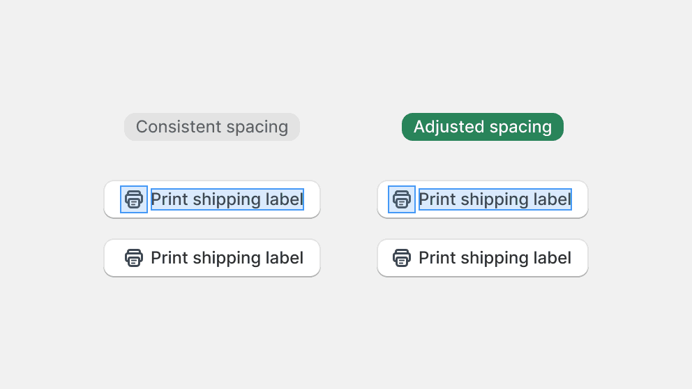
Pay attention to spacing when creating smaller elements. This includes using different sizes per side to achieve visual balance.
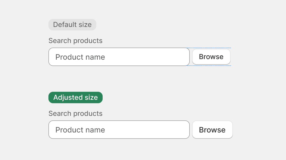
Adjust the size of shaped elements so they work well with their siblings, like in the case of a button next to an input field.
Buttons
Buttons are shaped elements, as their contents can vary their sizing to adjust for visual balance. Sizing of buttons depends on context.
Standalone or grouped, buttons have a default size that is widely used in the admin. Because buttons often pull the most attention to a primary action, their size has been adjusted so as to not overwhelm the visual balance of the admin.

Breaking alignment
Breaking alignment or spacing may be required in some rare instances. Depending on the layout of the page, alignments may be mathematically inconsistent, but will be visually aligned. Make sure to use imaginary keylines to create neatly aligned containers in the UI if spacing is inconsistent within each container.
If required, different alignment should be applied to separate containers, and never within the same container.
