 Polaris
Layout → Density
High density
Information-rich interfaces, like index pages or data tables, require high-density layouts for efficiency. By presenting information in a denser format, merchants can quickly access and compare data, enhancing the effectiveness of the Shopify admin.
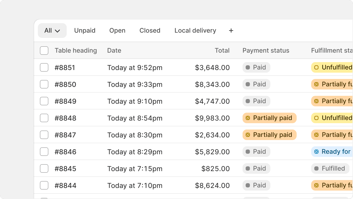
Use divider lines and surface colors to create clear delineation between sections in a high density component.
Another way to create visual zones in high density layouts is to use different surface colors. Secondary colors can be used to create visual hierarchy within a high density component, and to guide merchants to the data that matters most.
Use different surface colors to style inset surfaces and create visual divisions without using lines.
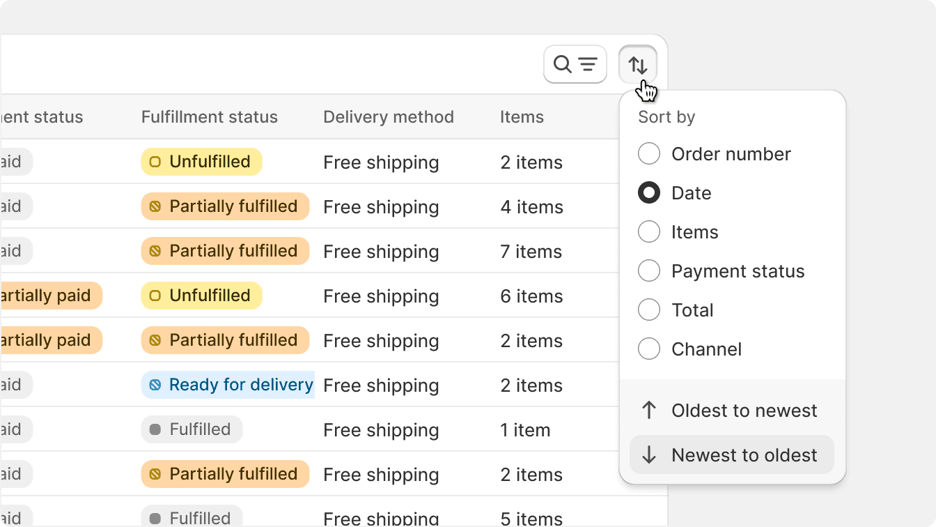
Grid and vertical divisions
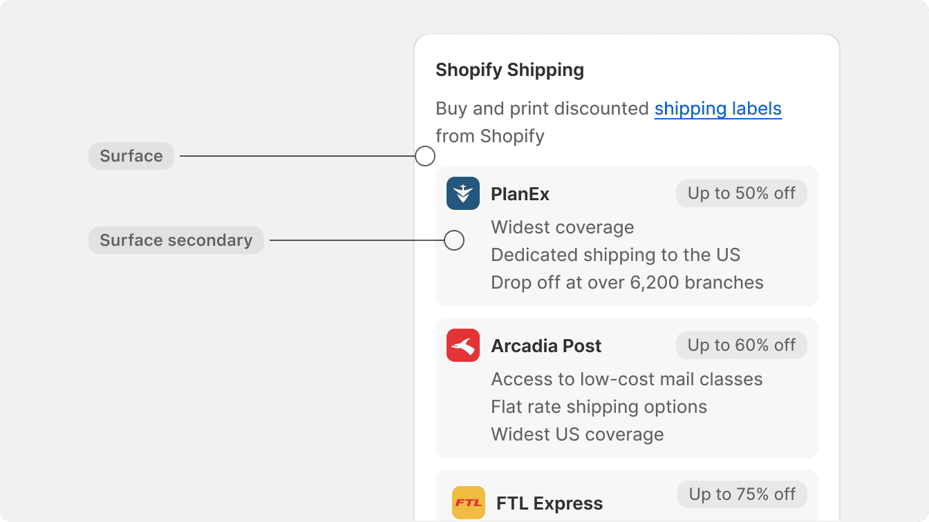
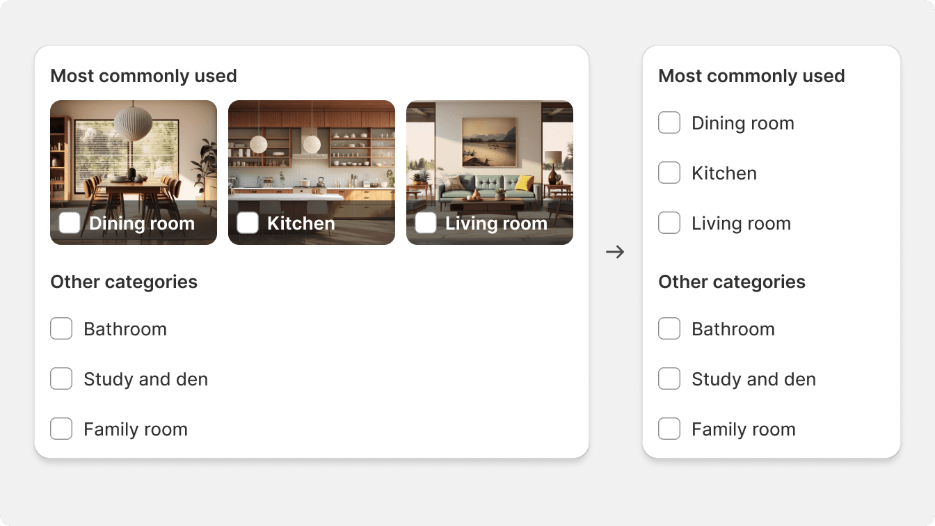
Dividing surfaces vertically and in a grid pattern also offers a way to increase density. This type of visual pattern is better suited for selections or data visualization and should be used accordingly. These divisions are made by using different surface colors instead of using line dividers.
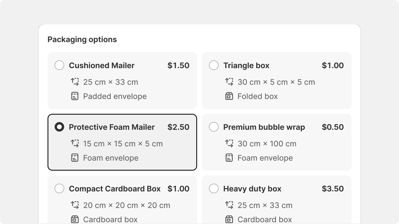
Divide surfaces into a grid pattern for complex components that expect an action, like a selection.
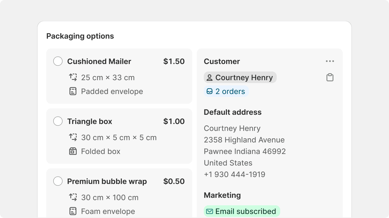
Divide and organize surfaces vertically by creating columns of unrelated content.
Action components use high density
Smaller components, like option lists or popovers, are built with high density in mind. Because their main purpose is to offer a set of actions to the merchant, they need to feel small and efficient.
Effectively designed action components give the feeling of a pro tool in the Shopify admin and increase efficiency when using different features.
Use high density consistently when offering lists of options to choose or select from.
Suddenly change density in an action component. Always offer the most condensed option possible instead.
Low density
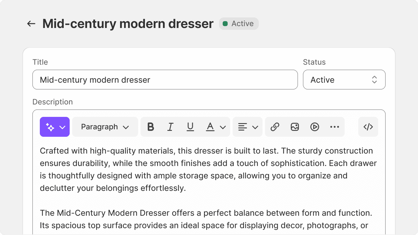
Low density interfaces are best suited for focused editing interfaces, like a product detail page. These interfaces offer larger hit targets, wordier buttons, and are best suited to specialized UI that offers uncommon actions in the Shopify admin.
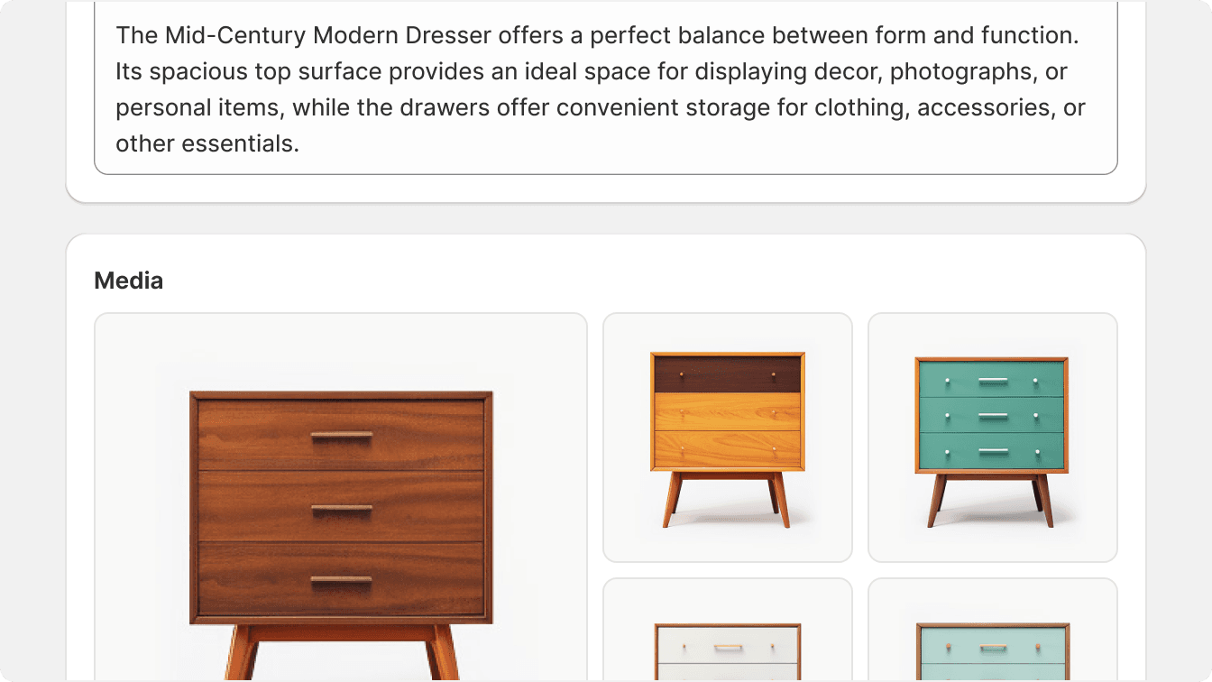
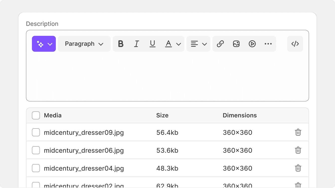
Because low density interfaces offer more space, there is more for the merchant to analyze before taking action. Low density interfaces can also contain high density components, like a complex text editor within a card that serves to edit a product title and description.
Top-to-bottom visual rhythm is often used to create a linear and predictable layout that is easy for merchants to understand.
Low density layouts are useful when switching contexts in the same page often, which happens often in the Shopify admin.
Use grid or vertical dividers to create low density layouts. These can be confusing and hard to understand in a focused editing UI.
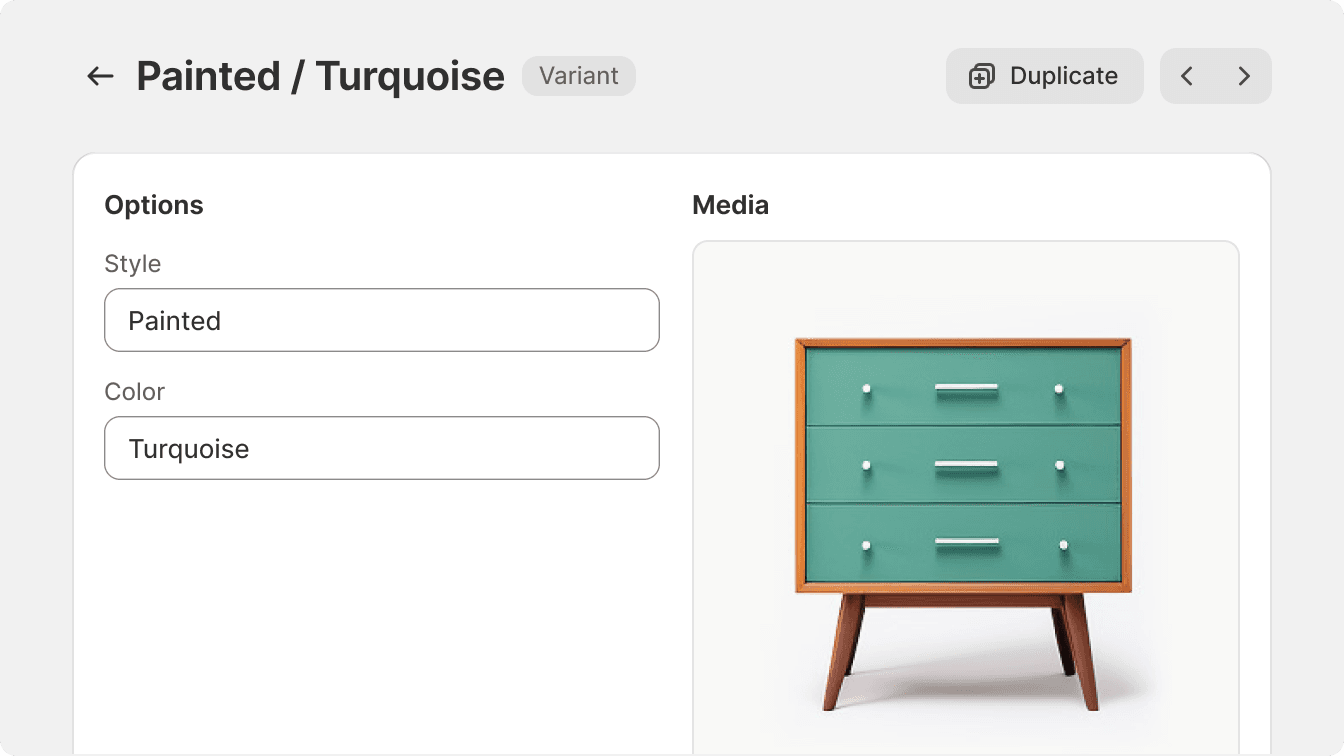
Switching contexts
Cards are the best way to switch context in low density layouts. Each card can be specialized in a set of features that requires the merchant to recenter their focus.
Split each context into its own card.
Mix low-density information with a high-density component in the same card.