 Polaris
Icons → Creating icons
Grid and keylines
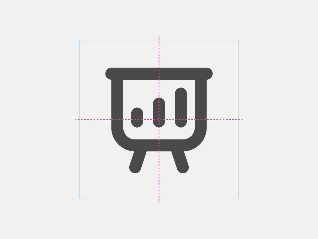
The icon grid and keylines ensure consistent sizing of icons in the Shopify admin.
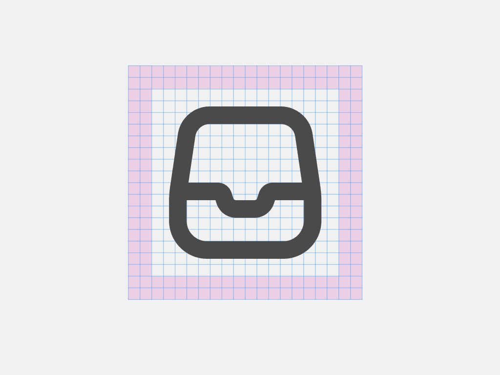
The icon container is 20 × 20 px. The content of an icon should be confined within a safe space of 16 × 16 px.
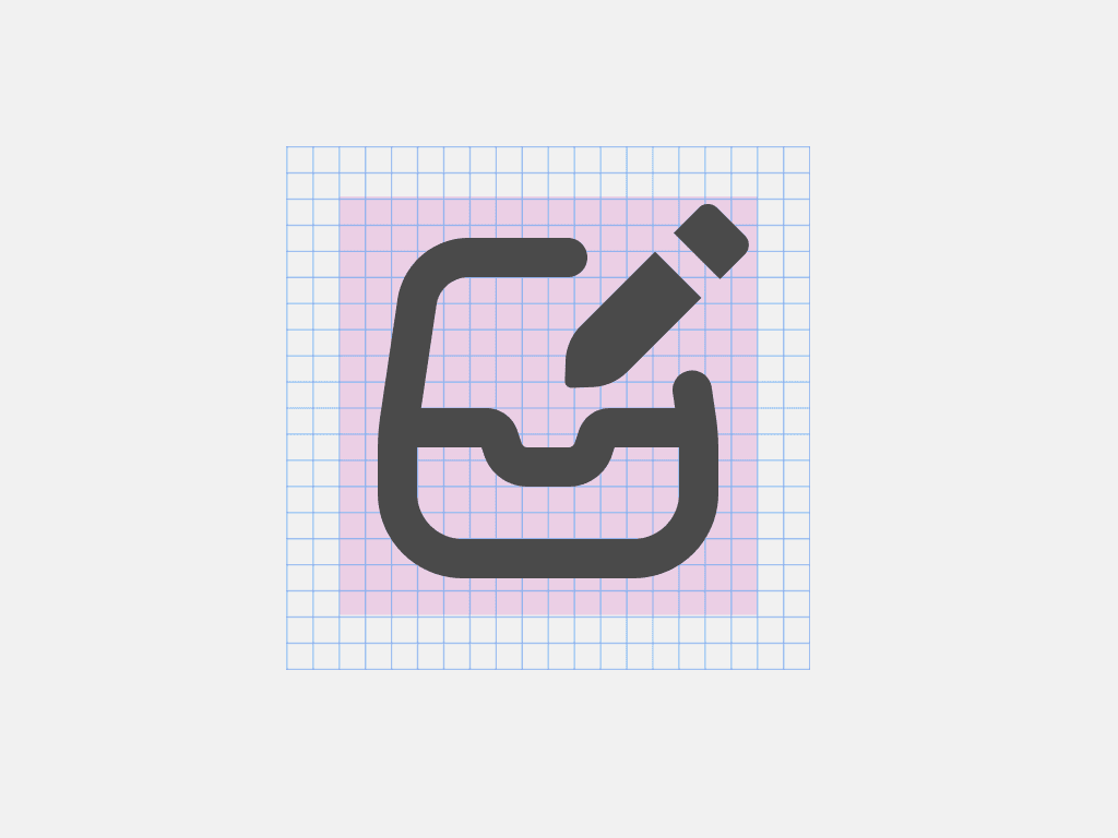
No part of an icon can go beyond the 16 × 16 px safe area. Anything outside it will get clipped when resized for mobile experiences.
The overall shape of an icon can vary from a circle to a square, or from a tall rectangle to a wide one. Always start with the following keylines, so that all icons have the same visual weight.
These guidelines are a starting point, not a hard constraint. If it makes the concept stronger or keeps the icon optically aligned, it’s ok to deviate.
Design guidelines
Consistent use of stroke widths, style and metaphor is necessary for icons to feel streamlined in the admin.
Ensure that icons are two-dimensional, and objects face forward.
Use perspective and 3D objects
Subtle hints of a third dimension are acceptable when necessary for conceptual clarity.
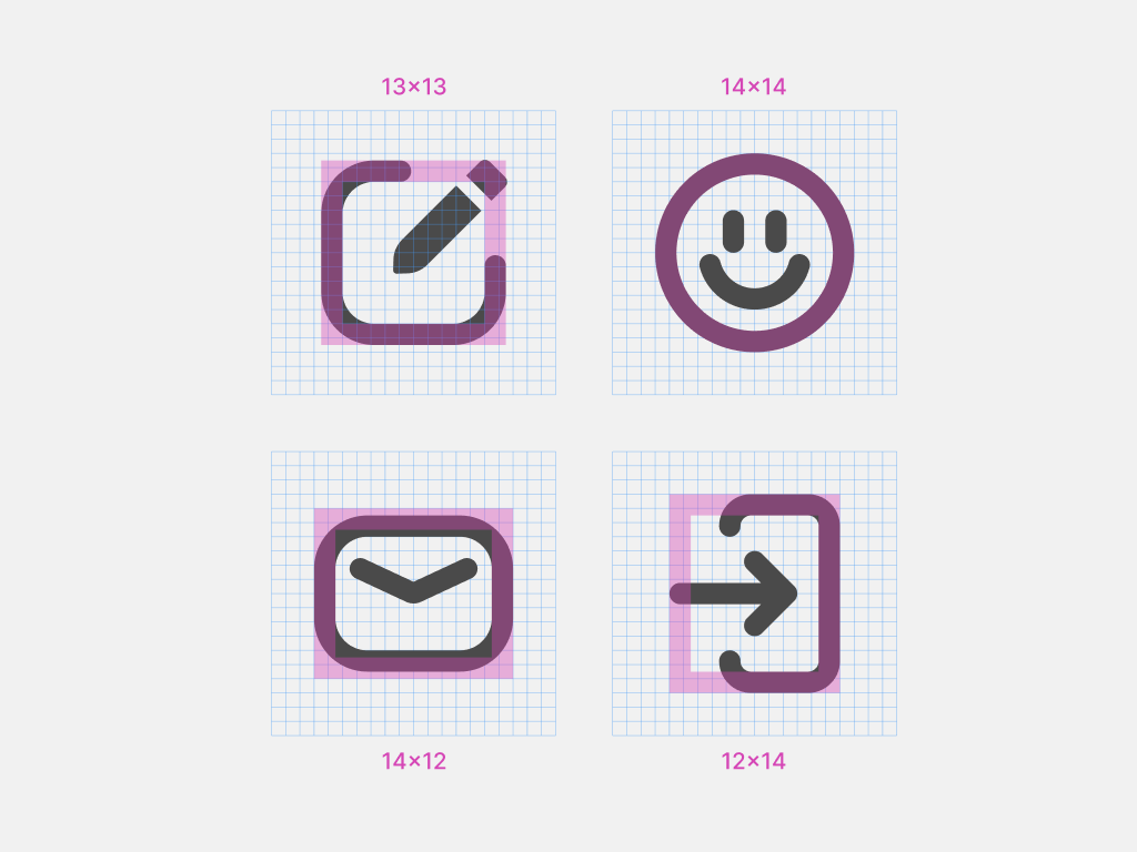
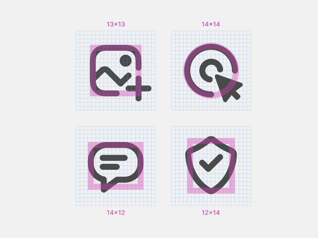
Center icons in their container. Adjust optically if needed.
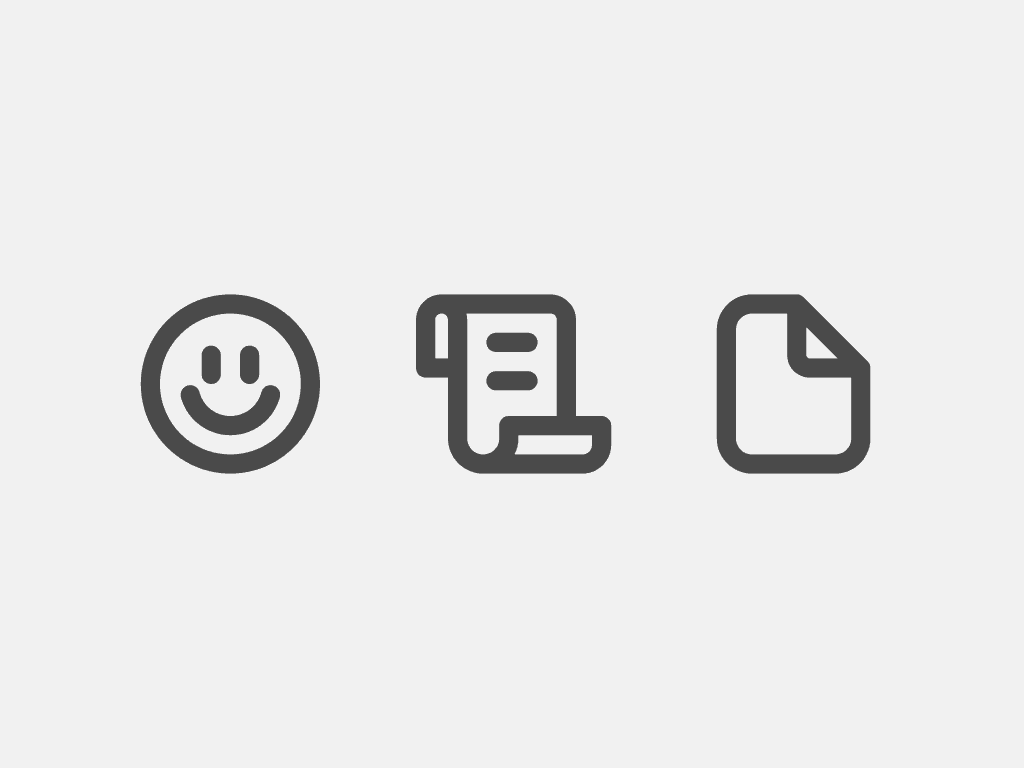
Use simple geometric shapes, angles, and rounded corners.
Use excessive details or organic shapes.
Use a consistent visual style, stroke weight and only one color.
Use transparency.
Filled vs Outlined
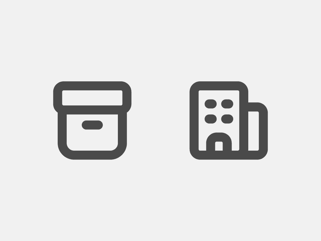
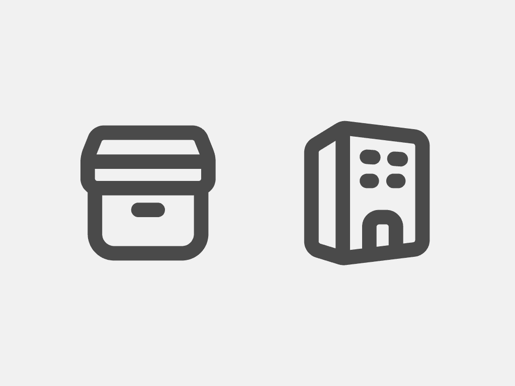
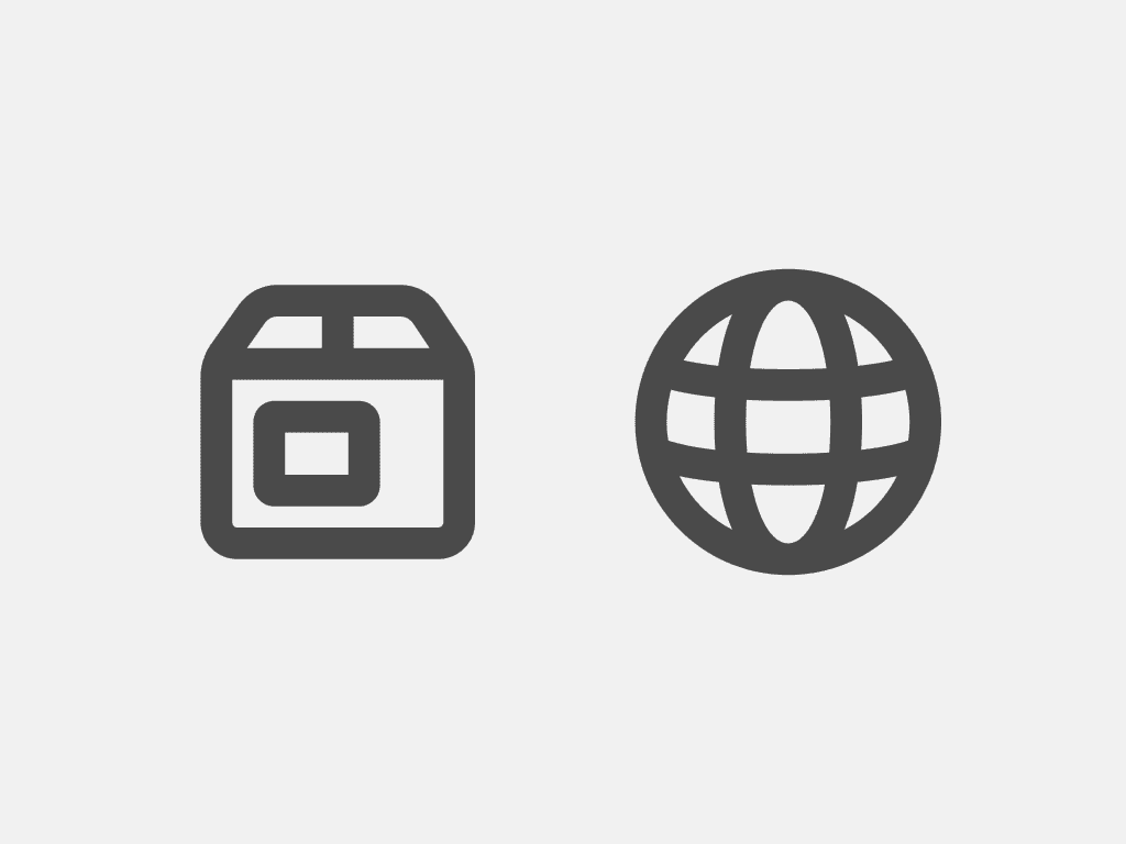
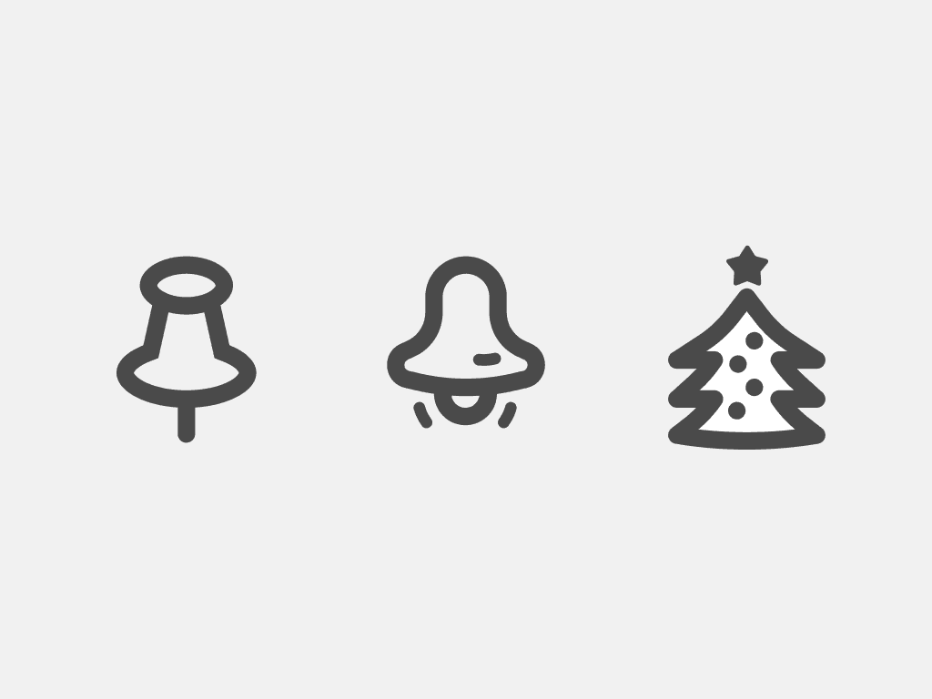
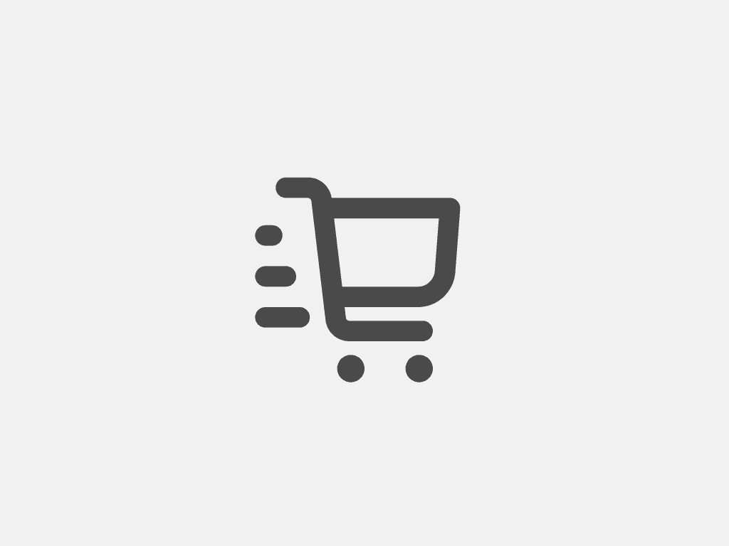
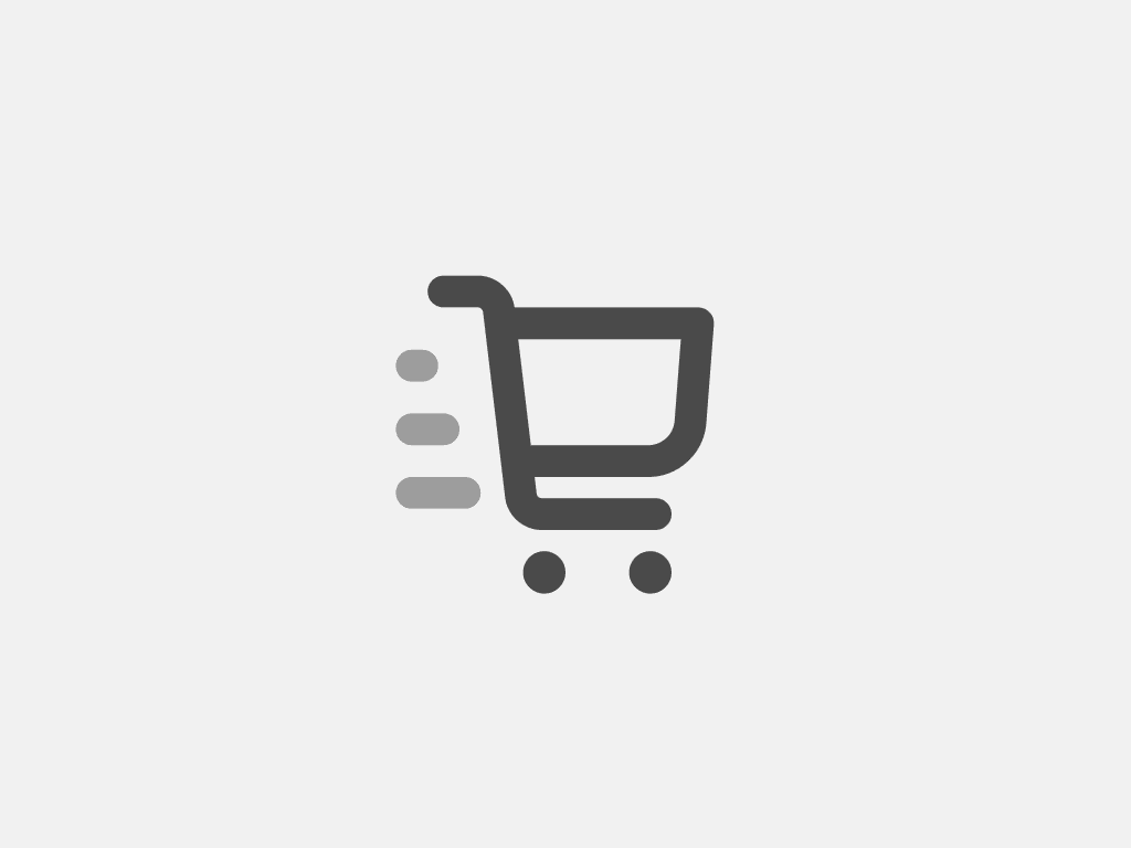
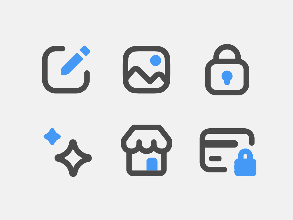
The default style of icons used throughout the admin is outlined. Usage of filled icons is strictly reserved for the main admin navigation and specific, semi-permanent states.
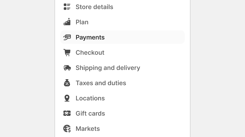
Only use filled icons in the main navigation.
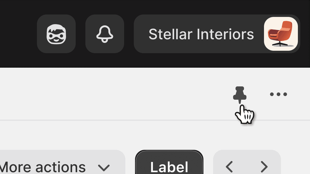
Use filled icons for semi-permanent selected states, like pinning an app.
Use filled icons to create emphasis.
Designing outlined icons
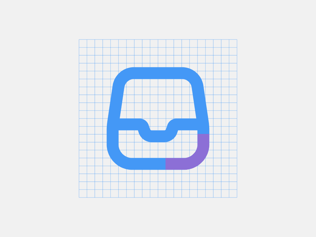
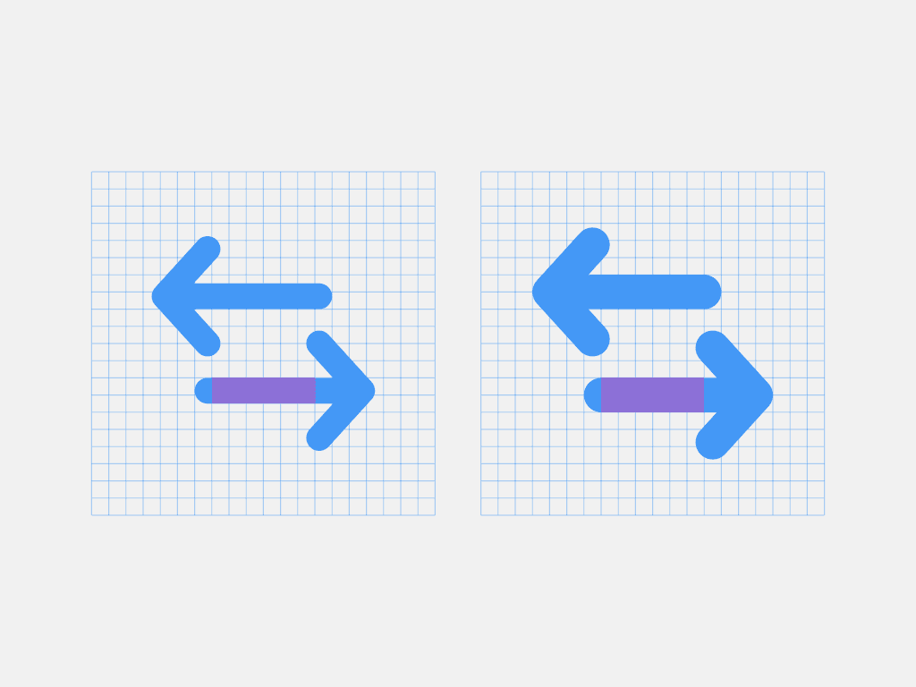
Stroke weight is 1.5px
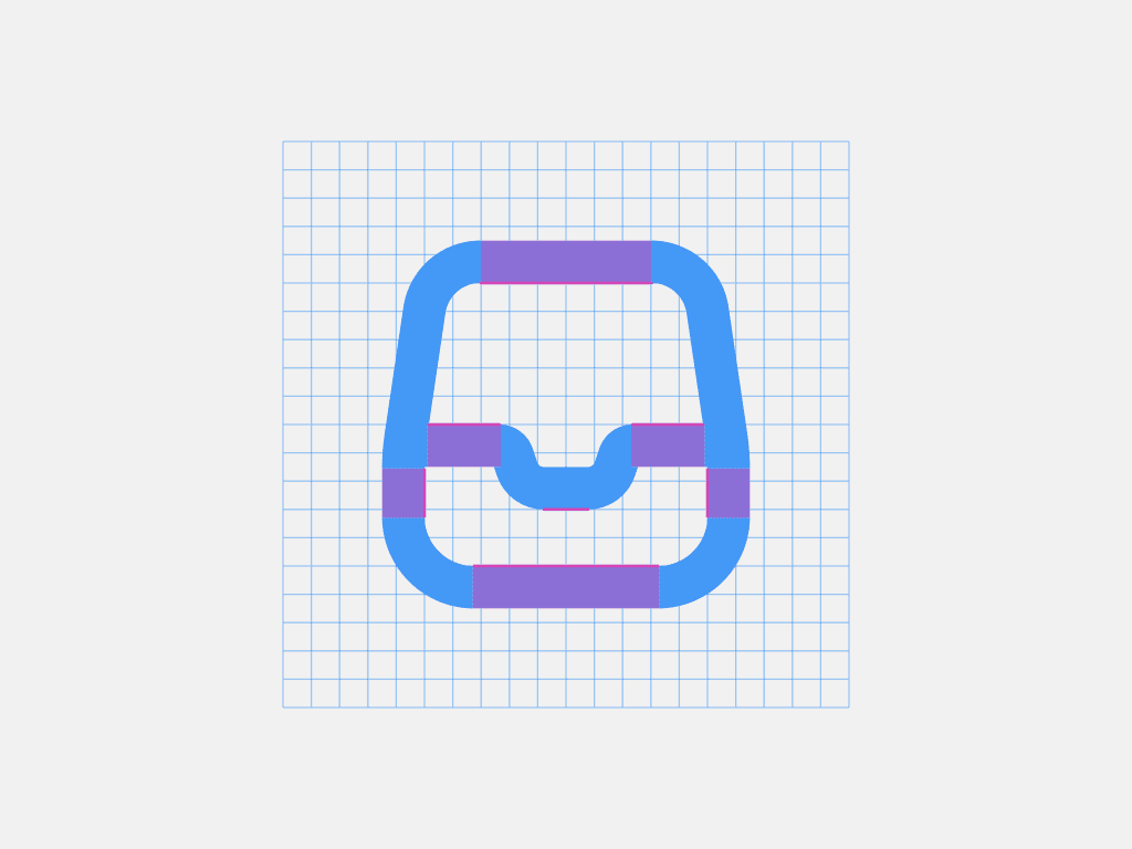
Since the stroke has half a pixel, one side of the stroke should always be aligned with the pixel grid.
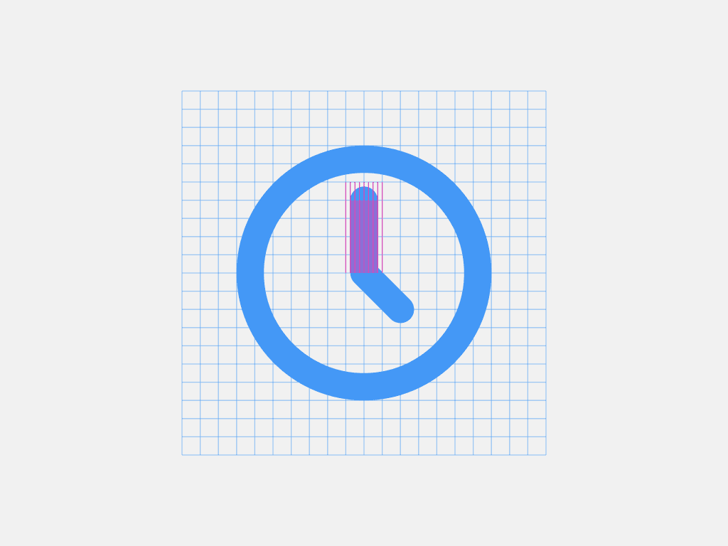
Exceptions are allowed for optical adjustments, as long as they fall on 0.25 px increments.
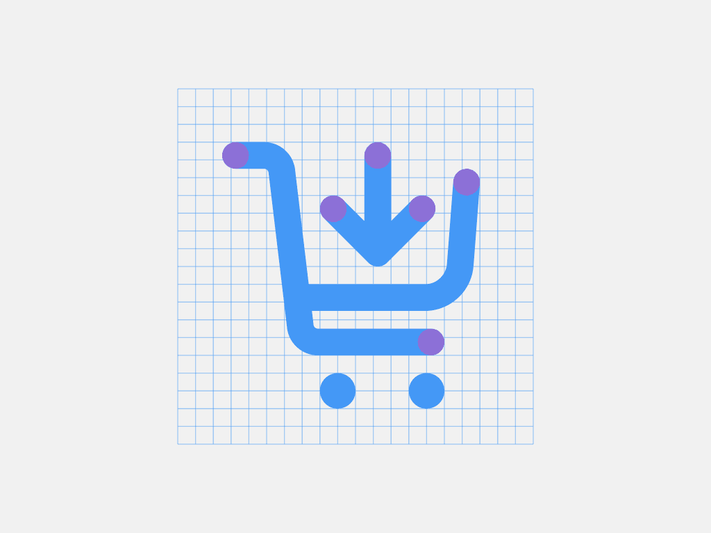
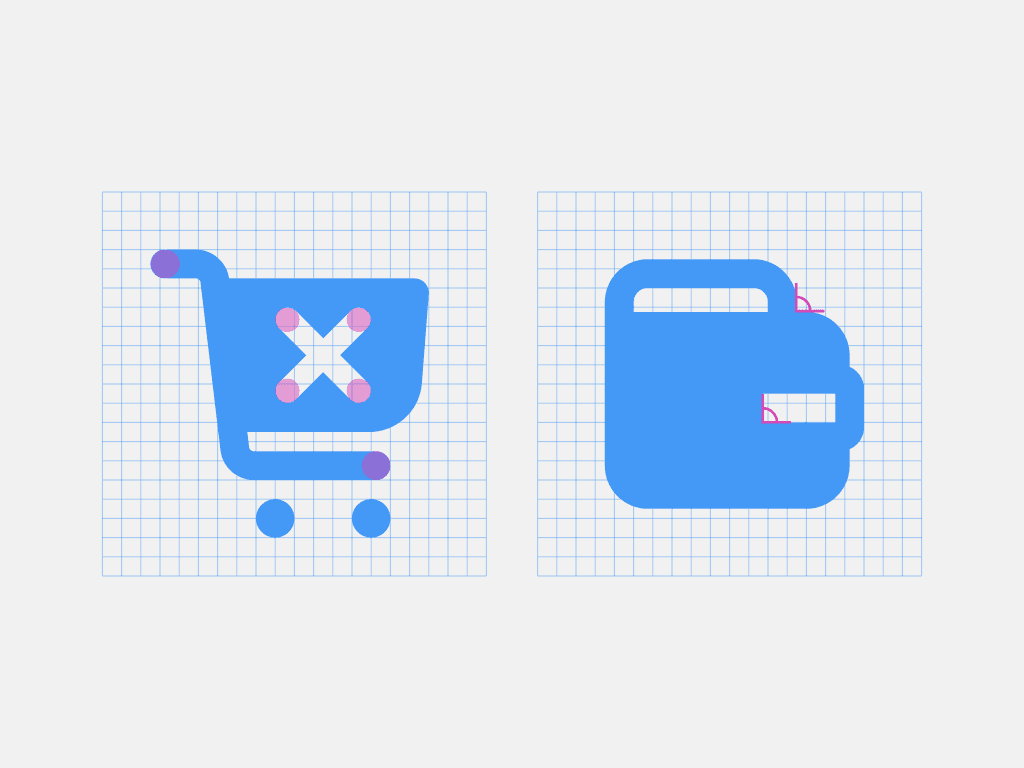
Terminals are round, even when a shape cuts out into another.
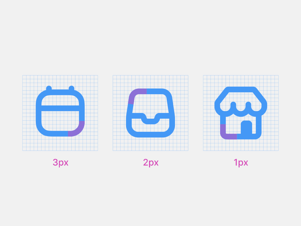
Corner radius can go from 1 px to 3 px, depending on the object roundness. Joints and terminals must be rounded. Sharp corners are not allowed, except for intersections and cutouts.
Filled shapes can be used, only in really small objects, like in the dot of an exclamation point.
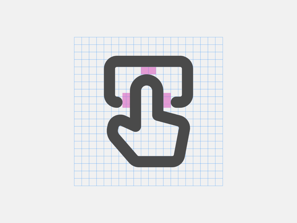
The minimum gap between strokes should never be less than 1px.
Designing filled icons
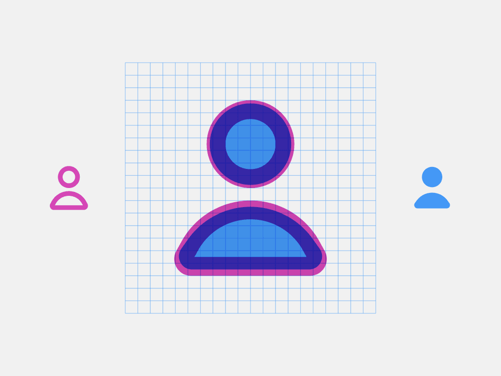
Filled icons should align closely to their outline pairs. They don’t need to be a pixel perfect match, but they must have a similar visual weight, and the transition from one to the other must feel smooth.
Icons are made out of contiguous shapes. Ideally one, but it’s possible to go up to three when required for clarity.
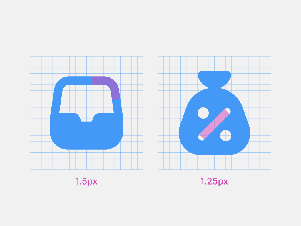
Stroke weight is 1.5 px, but is reduced to 1.25 px when used inside a shape as a cut-out. Shapes must align with the pixel grid.
Exceptions are allowed for optical adjustments, as long as they fall on 0.25 px increments.
Terminals are round.
Corner radius can vary from 1 px to 3 px, depending on the object's roundness. Terminals and joints are rounded. Sharp corners are not allowed, except in intersections and knockouts.
If it’s not possible to fill the outline icon, a 2px stroke can be used as a filled version.
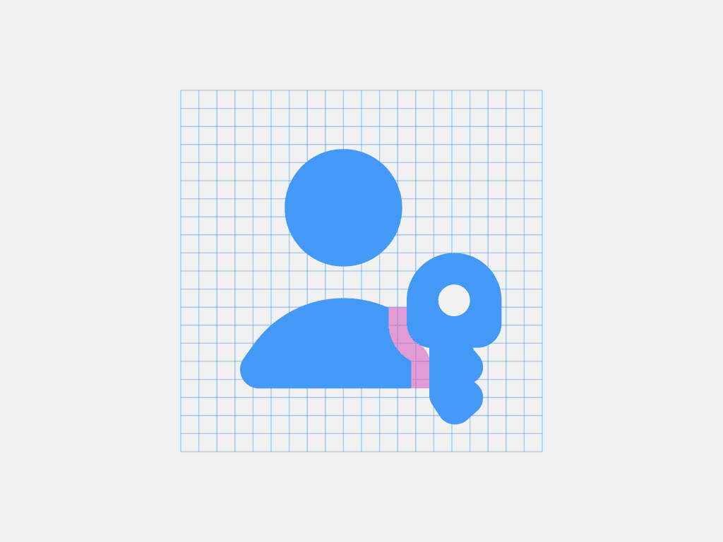
The minimum gap between strokes should never be less than 1px.