 Polaris
Common actions
Add
Add inserts existing or new objects, items, or data into the UI. For example, adding an item to a list or adding an element into a layout.

Default to the circle plus icon for add actions.
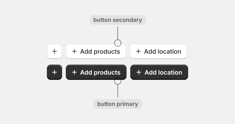
Use the plus icon in secondary and primary button variants. The plus icon supports the action while balancing the weight of the filled shaped element with the rest of the UI.
Place add actions at the bottom of a list unless the list will likely be long. For example, a table or list of selected resources.
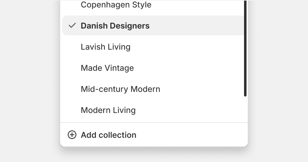
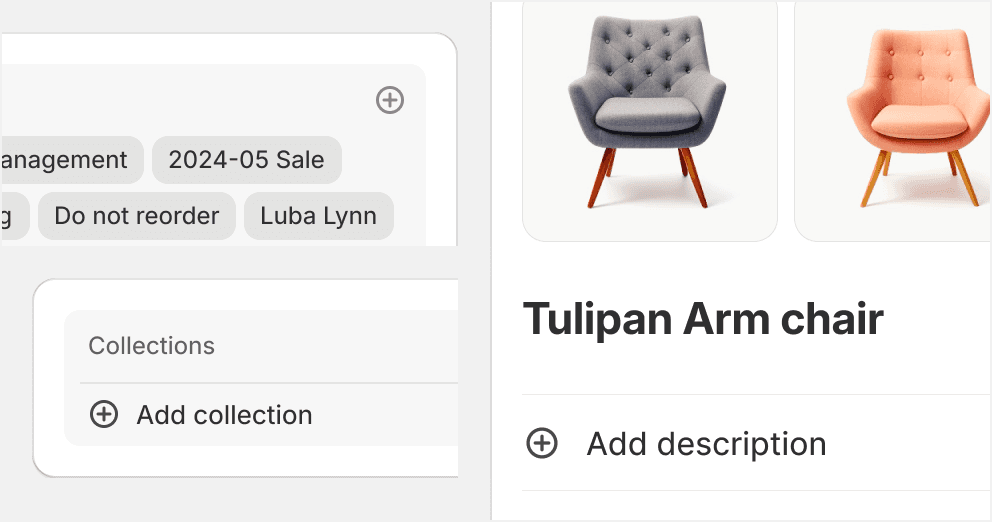
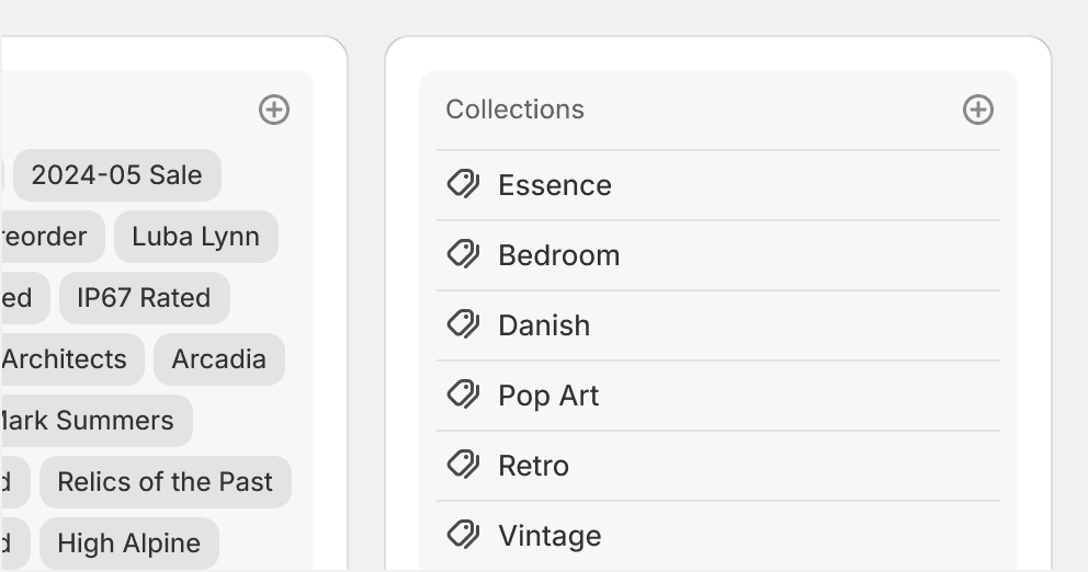
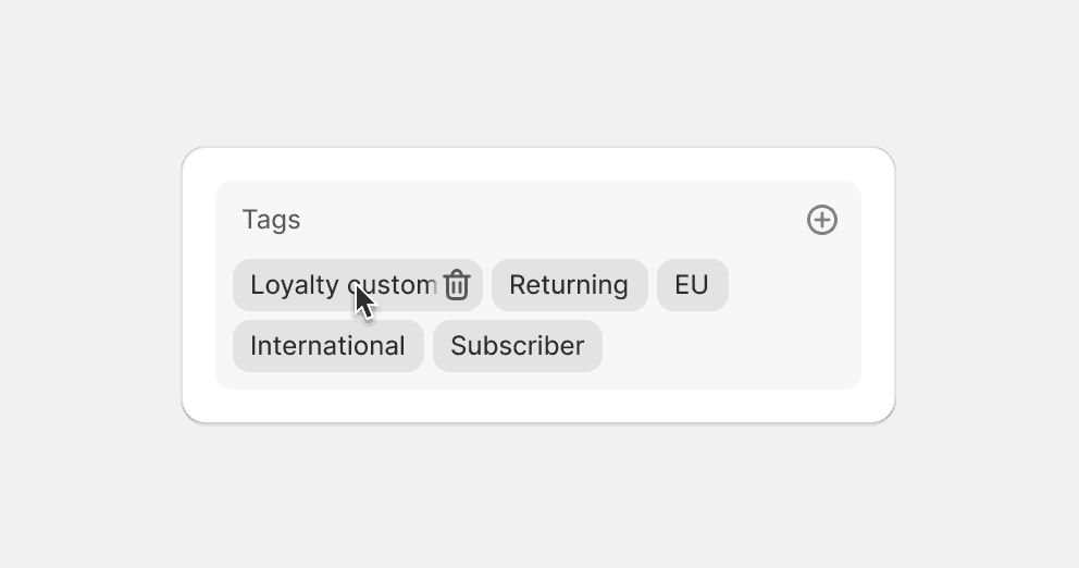
Place add actions at the bottom of a list of selectable options. For example, when picking a collection or tag to add to a product. Keep the action visible by placing it outside of the scrollable area.
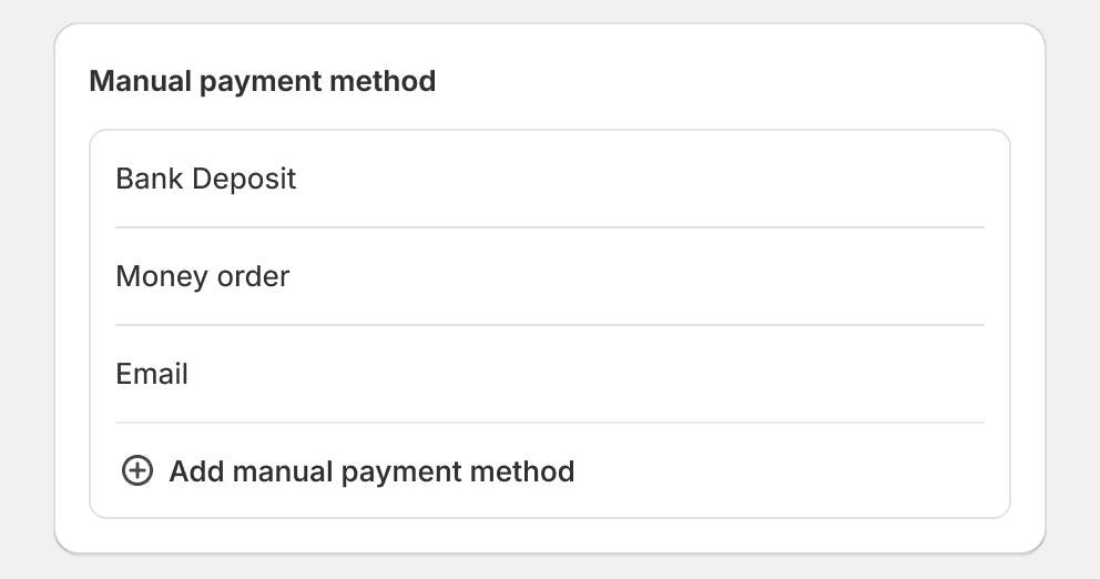
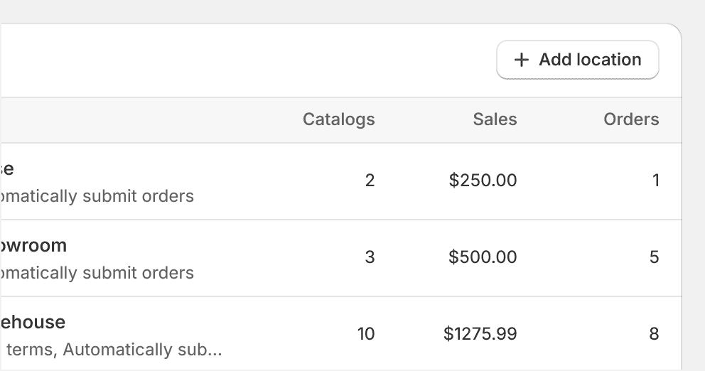
Place add actions in the header in long lists of resources.
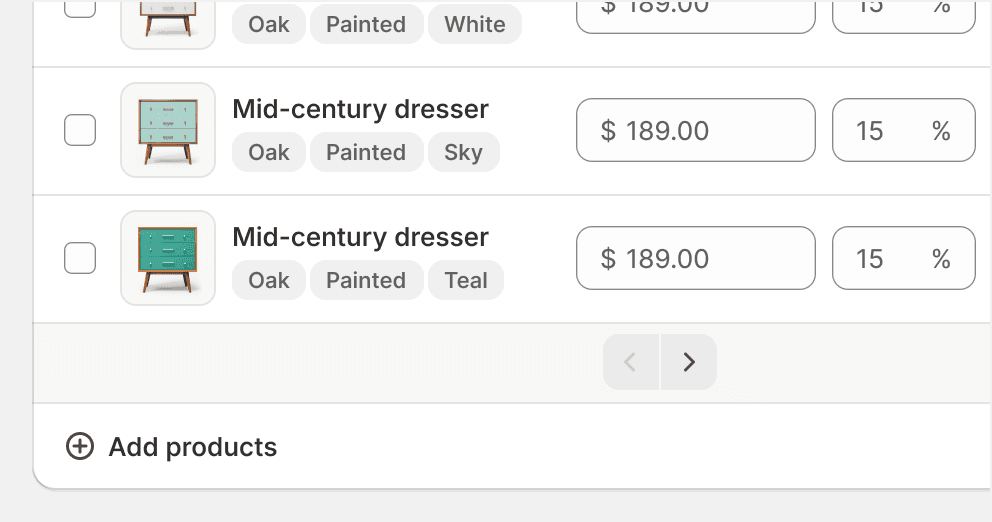
Place add actions associated with a table in the card, table, or page header. Use a secondary button when "Add" is the main action for a card that has a standalone table or list as its content.
Place add actions at the bottom of a table. This risks them getting lost and can cause confusion.

Include intermediary steps during the creation of a resource. Place these configuration options on the newly created page itself.
Copy
Copy duplicates selected content and stores it temporarily in the merchant’s clipboard.
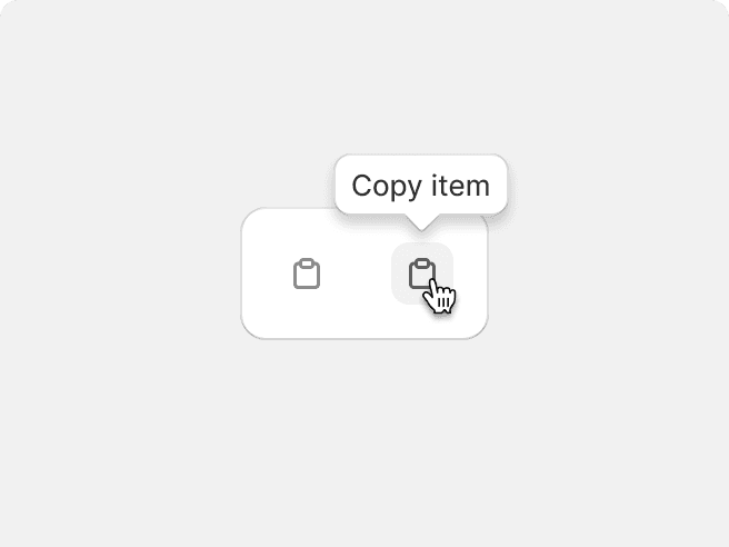
Use the clipboard icon with a tertiary icon button for copying a string of text.
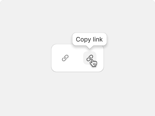
Use the link icon with a tertiary icon button for copying deep links and URLs.
Show copy actions on hover for cursor interactions. See the copy to clipboard example.
Provide feedback inline using a confirmation check icon post-click or tap.
Use a confirmation “copied to clipboard” toast message when the action is within an action list.
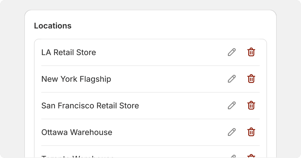
Delete
Delete destroys an item or object and completely erases data from the system.

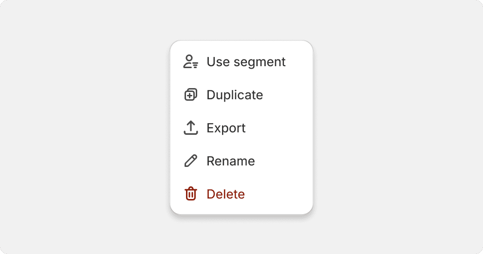
Use the delete icon with a destructive item in an action list.
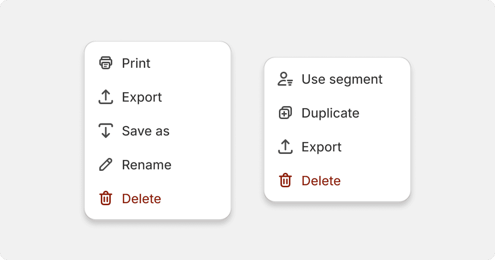
Always place delete actions at the bottom of an action list.
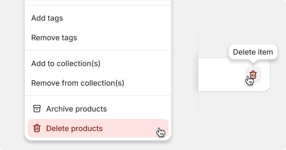
Use the delete icon for delete actions in lists.
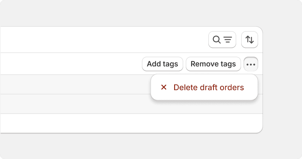
Use the x icon for delete actions.
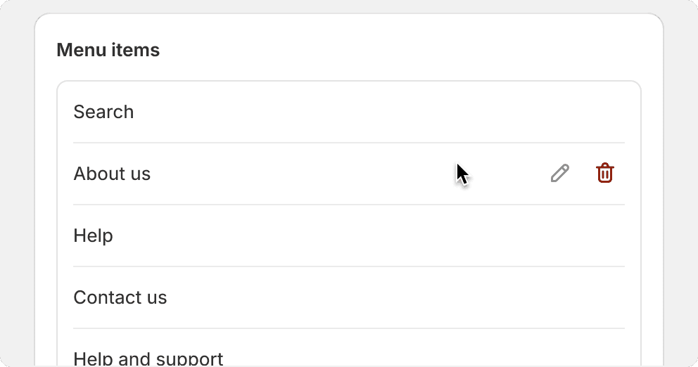
Place list item delete actions inline to the right. Default to a tertiary button with the delete icon.
Display list item delete actions on hover when using a cursor.
Don’t overuse critical styled buttons within a single view as it can dilute the meaning and importance of the action.
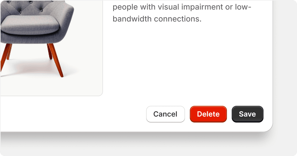
Don’t pair primary critical buttons with other button variants and tones that look jarring and create visual competition between elements.
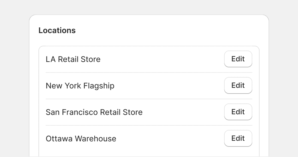
Edit
Edit actions allow merchants to make changes to a piece of content or object that already exists in the system.
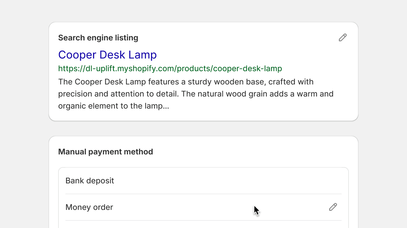
Use edit for modifying, updating or managing an item or object.
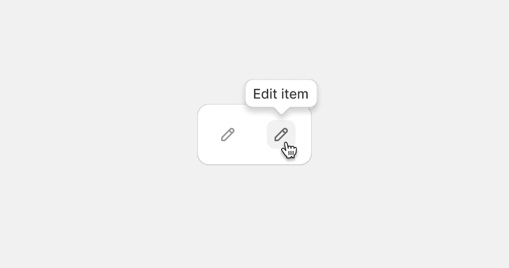
Default to the edit icon with a tertiary icon button.
Avoid using too many buttons with filled or shaped containers in close proximity to each other, as they will make the interface feel cluttered and confusing.
More actions
More actions display available or additional actions for element or item.

Use the menu horizontal icon to indicate available or more actions for an item.
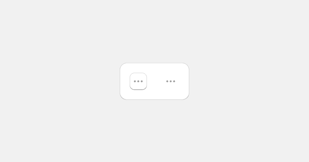
Use a secondary or tertiary icon button.
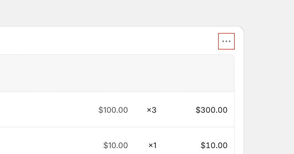
Group actions in the card header by default. Instead, consider alternative solutions that place actions in context or appear within a given flow or task as needed. View card layout patterns for more information.
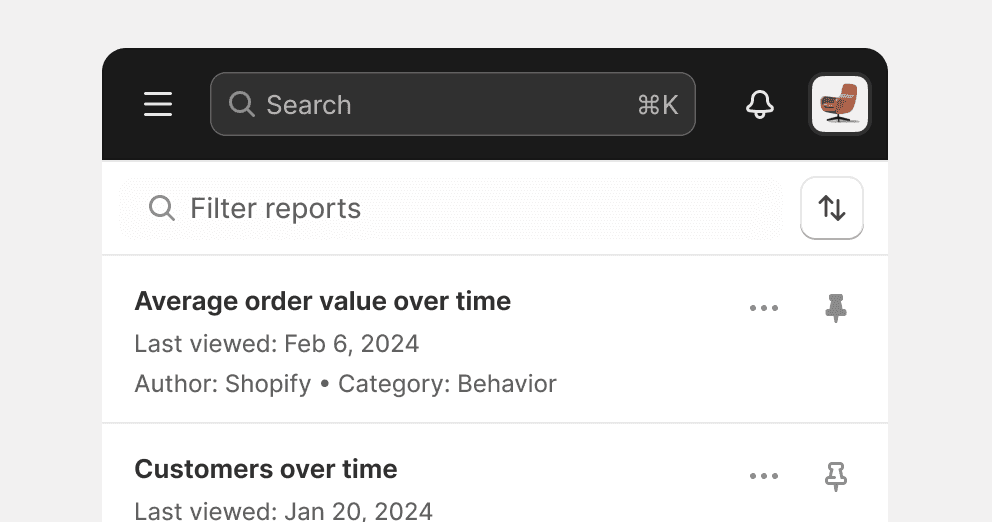
Pin
Pin sticks an object to an easily accessible location within the UI. Pinning allows merchants to keep important items available to quickly access later.
Use the pin icon with a tertiary icon button to communicate an item can be pinned.
Use the pin filled icon on an item to show that it has been pinned.
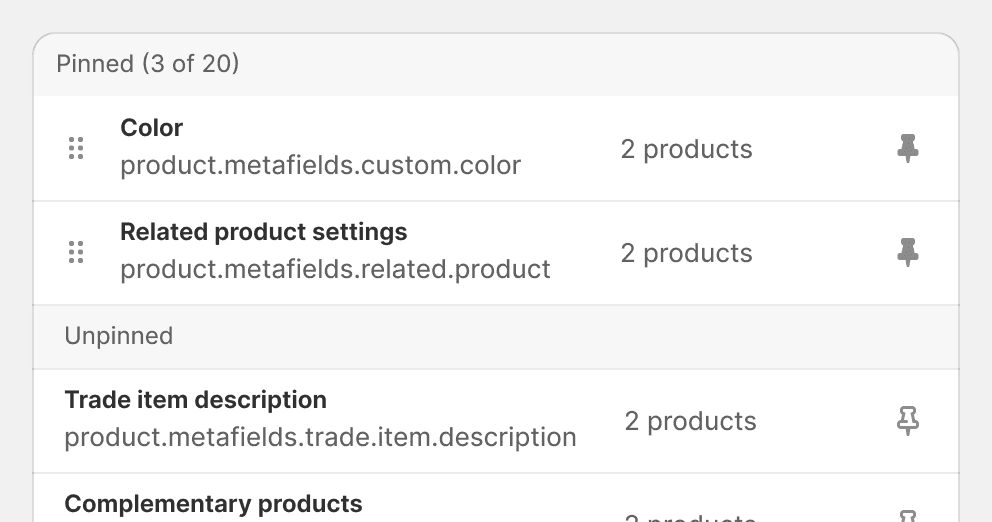
Placed pinned objects together to add clarity to the relationship between items.
Make it easy to unpin an item.
Remove
This action removes an item from a list or breaks the relationship between objects.
When an object is removed, it is taken out of a given context without deleting it from the system. For example, if a product is removed from a collection, it still exists and can be easily added back.

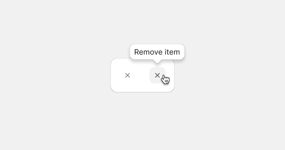
Use the x icon with a tertiary icon button.
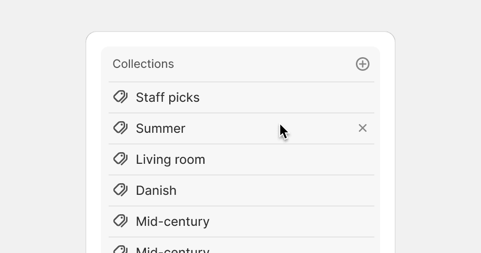
Show remove actions on hover when the merchant is using a cursor to navigate.
Use the delete icon for remove actions.