 Polaris
Card layout
Anatomy
Cards are made up of three main parts: the header, the body, and the footer. Each part has a specific role and should contain content that serves that role.
A standardized structure ensures that common elements can be placed consistently. Consistent placement allows merchants to attach meaning to places, shape expectations, and quickly find what they are looking for.

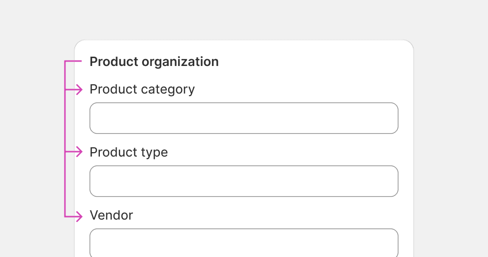
Header
The header represents the whole card. It typically has a card title that makes the card easy to find, and often a header action that allows merchants to modify the card contents or navigate to where they can view more details.
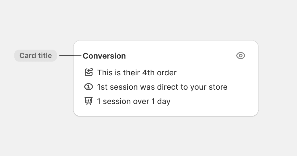
Card titles
The card title represents the whole card. It should describe the purpose of the card and help merchants quickly find it among other cards.

Choose a title that clearly conveys the purpose of the card.
Use the object type as card title when the card is a list of objects.
Choose a title to clarify what the header action does.
Choose a title that represents all sections if a card has multiple sections.
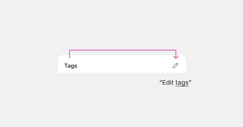
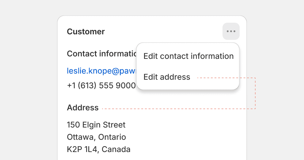
Header actions
Actions in the header should represent the content of the whole card. The most common header action is the "Edit" action, which allows merchants to modify the contents of the card. Another common action is the "View" action, which allows merchants to navigate to the source of the contents.

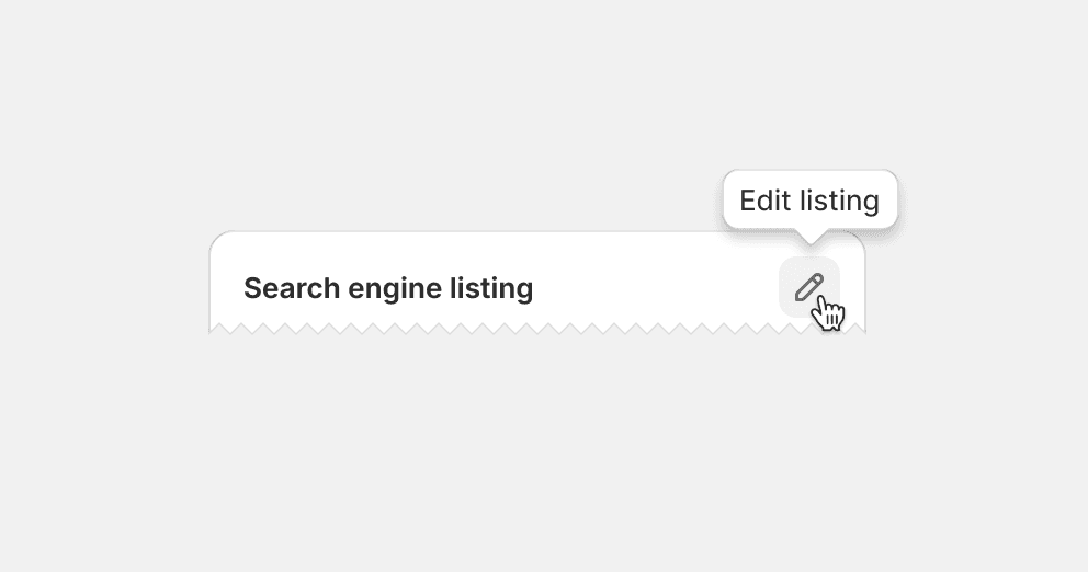
Default to using tertiary icon buttons in the header. Clarify the action with a tooltip.
Place call-to-actions in the card header. Instead, place them in the card footer where merchants typically find actions that progress towards their goals. See footer actions.
Place actions that affect specific list items on the item itself.
Place action in the header unless it represents the entire card. Instead, place the action in proximity to what it represents.
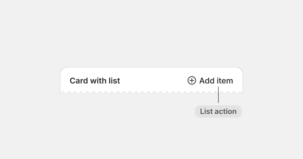
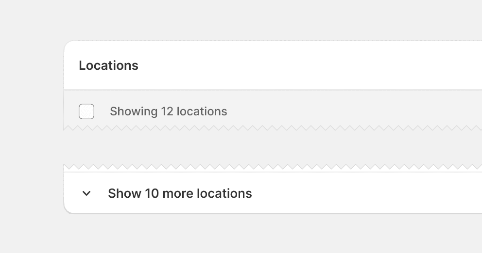
Avoid placing list actions in the card header by default. Default to placing such actions at the end of the list where the added item will appear. If cards only contain a list, then list actions may be placed in the header for merchant convenience.
Group actions in the header by default. Instead, use these guidelines to find placements that have meaning to merchants.
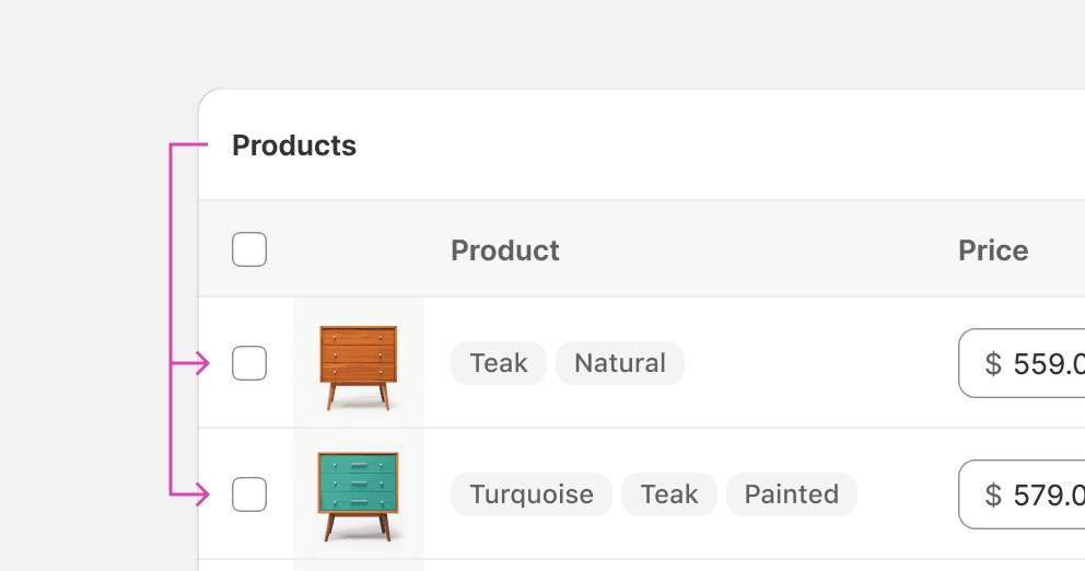
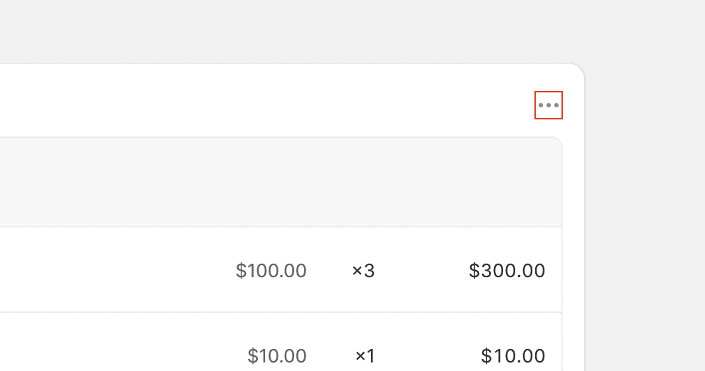
Table actions
Table actions are placed to the right in the header to keep them discoverable. They are typically actions that allow merchants to add item or select items that will display in the table.

Body
The body holds the main content of a card. Common content types, such as lists, tables, and form layouts, are organized into one or multiple card sections.
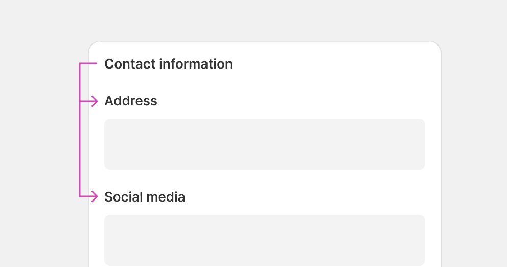
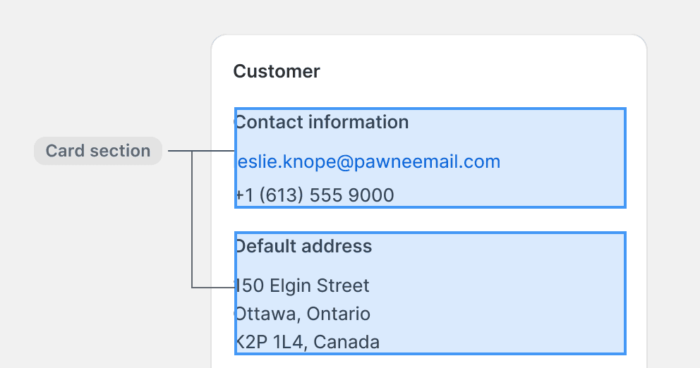
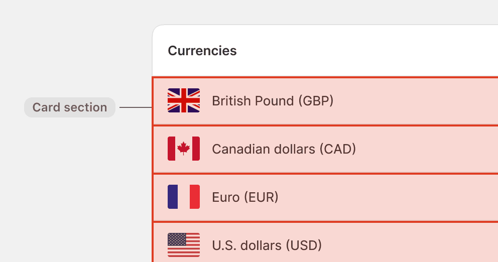
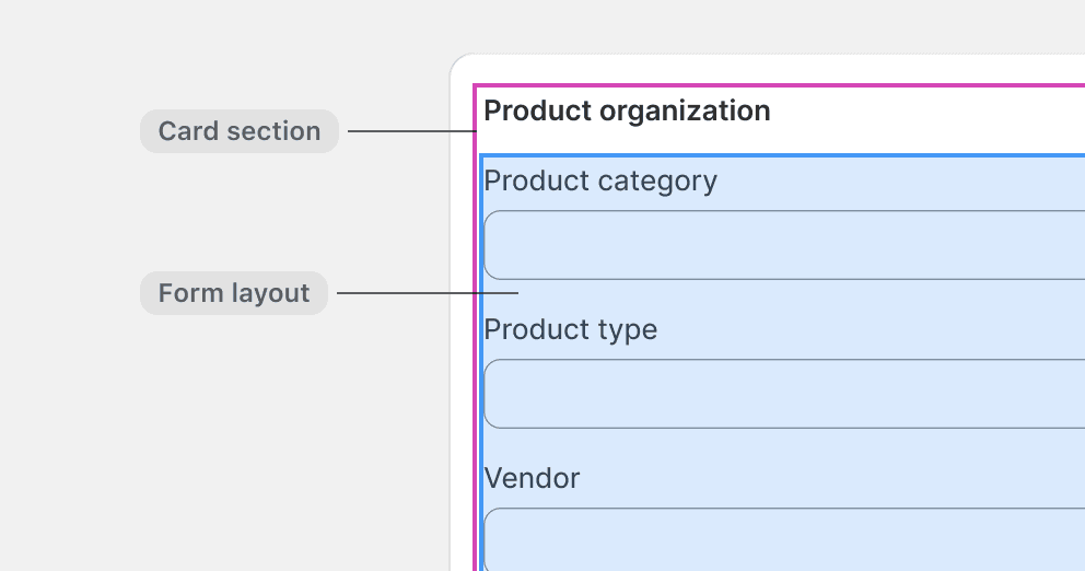
Card sections
Card sections are used to group content in cards, and to separate such groups when there are more than one. A section typically has a heading and a main block of content, such as a list or a form layout.

Use a card with multiple sections to group content that shares purpose.
Use card sections to divide list items. Instead, use the appropriate list component or build a bespoke list structure within a single section.
Omit the section title in cards with a single section. However, maintain the space-200 gap as typically used between section titles and content.
Allow cards to become so tall that they are difficult to overview. Instead, provide a footer action that allows merchants to expand and collapse the content.
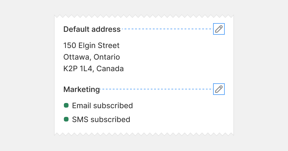
Place section actions in the section header where merchants can associate them to what they control.
Group section actions in the card header, as it disconnects them from what they control. Instead, place such actions in the respective section header.
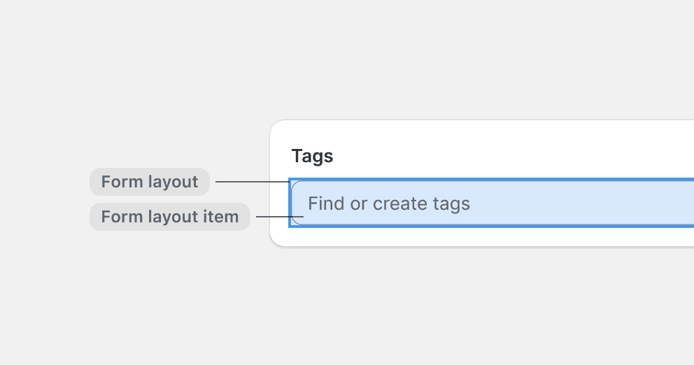
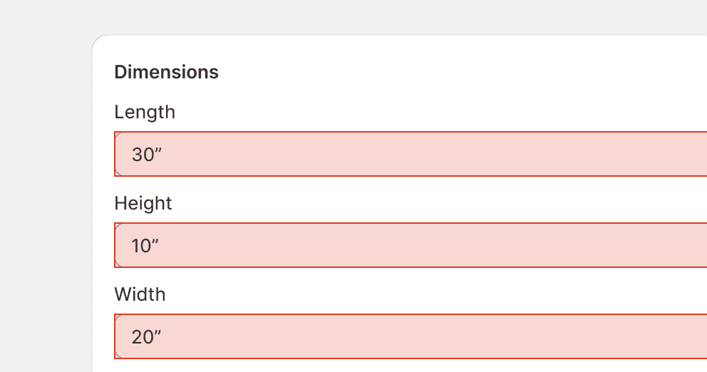
Form layouts
Form layouts are containers that give structure to form elements, or “form layout items”. They often contain multiple items, but can also house a single one.

Form layouts are containers that give structure to form elements, or “form layout items”. They often contain multiple items, but can also house a single one.
Use a form layout even when there is only a single item.
Allow form layout items to be wider than necessary. Instead, use a form layout group to arrange them side-by-side.
Allow large areas of empty space to appear next to choice lists. Instead, find alternatives that make better use of horizontal space.
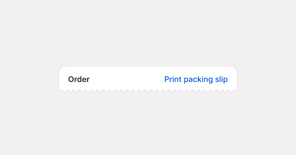
Footer
The footer is placed after the main content, which makes it an intuitive place for content and actions that extends from the card content. For example, call-to-actions that allow merchants to react to the card and continue with their next task.
Call-to-actions
Call-to-actions are specific prompts designed to guide merchants towards a goal. They are placed towards the right to inspire progress. A card can have none, one, or multiple call-to-actions. They are placed in the footer, so that merchants can react to the card contents and easily take the next step forward.

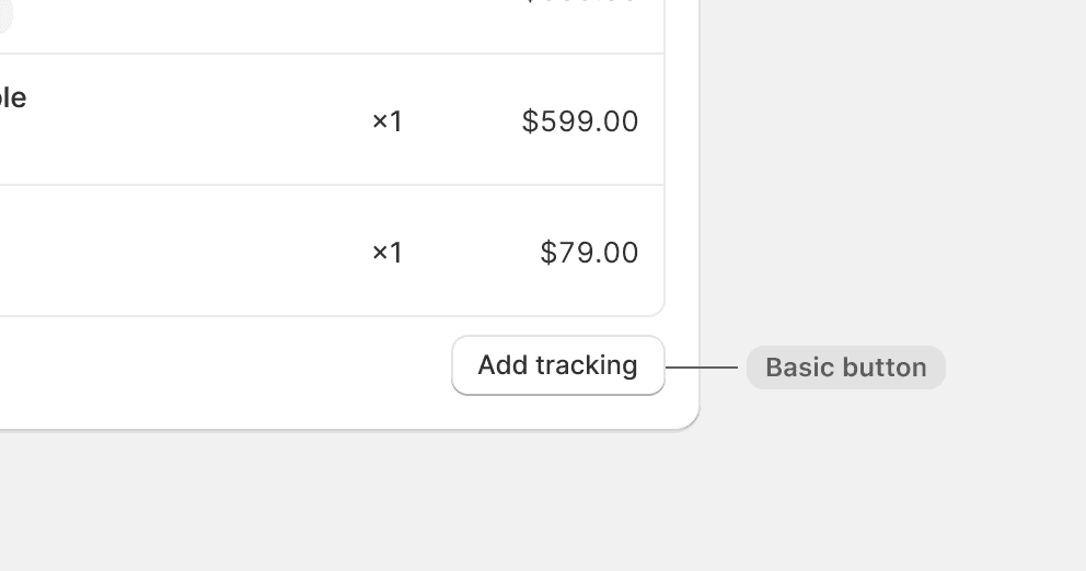
Default to using basic buttons in the footer. Only use a primary button when it’s the most important action on the page.
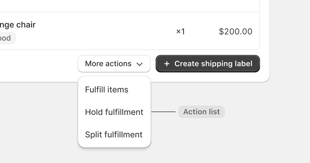
Use an action list if the card has more than two call-to-actions.
Use call-to-actions in the footer to update the content or presentation of the card. Instead, use header actions and list actions.
Use a primary button for actions that aren’t critical to fulfilling the purpose of the page.
List actions
List actions are placed to the left in the footer. They are typically actions that allow merchants to add items to lists or expand and collapse the list.

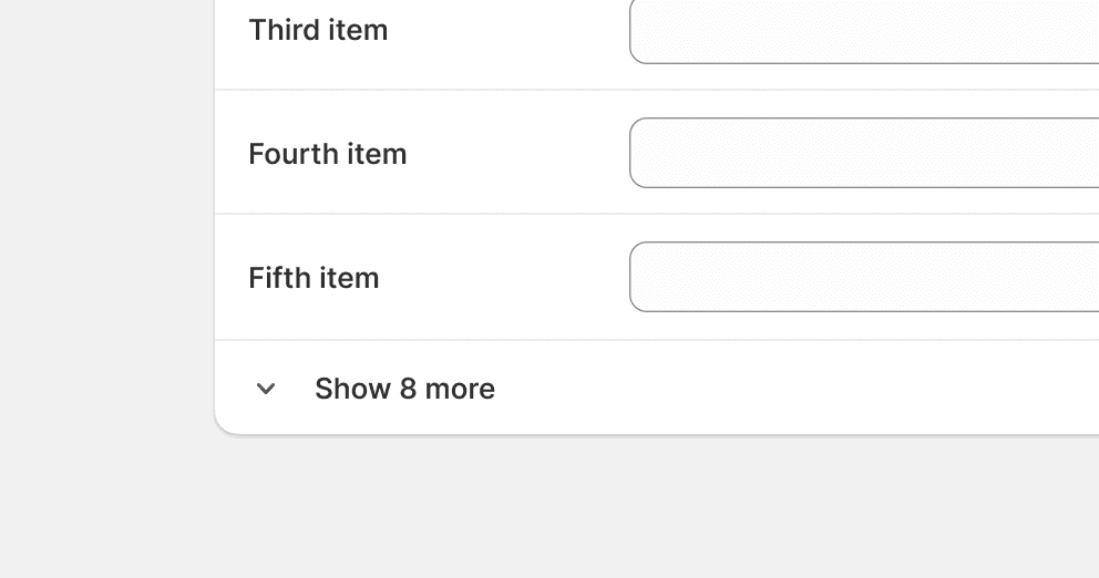
Allow merchants to expand and collapse long lists.
Repeat the object name in the button label. Instead, choose a card title that makes it clear what is being added to the list.
Spacing for merchants
When composing card content, spacing is used to achieve two important visual effects: grouping and hierarchy. When merchants can perceive clear grouping and hierarchy, it’s easier for them to scan a lot of content and faster find what they need.
In the admin, spacing is mainly achieved using padding and stacks.

Padding
Padding is the space between a container’s content and its border. The default card padding is space-400.

Nested padding
It’s common that cards have containers nested inside them. When these containers have visual boundaries, such as with borders or dividers, then padding is used to create space between its content and border.
The general rule is that the deeper an element is nested, the smaller its padding is.

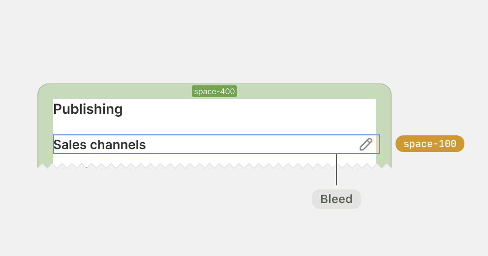
Apply padding to the card by default, and use bleed with a negative margin to optically adjust content if needed.
Use padding to create space between elements. Instead, use block stacks.
Use padding inside visually scoped containers, such as the header of a data table.
Use padding for invisible containers, such as card sections or form layouts. Instead, use block stacks.
Stacks and gaps
Stacks are used to group content and give equal spacing between the elements within the group. The space between the elements is called the gap, and is always the same between each element.

Nested stacks
Stacks can also be nested to apply different gaps between different groups of content. It’s the difference between the gap sizes that creates the effect of grouping and hierarchy. Elements with tighter gaps are perceived as more related than those with a looser gap.

Use nested stacks to help merchants distinguish between closely and loosely related content, such as between sibling items and the content within an item.
Use a flat hierarchy for content that should have different spatial relationships. For example, labels should be closer connected to the element it represents than to the element it doesn’t.
Use nested stacks to clearly associate section titles to the content they represent.
Use a flat hierarchy that causes section titles to float with equal space to sections above and below.
Common stacks
There are a few common stacks that can be used to meet recurring spacing needs. These stacks have gaps that range from space-100 to space-400, and they are purposefully used to create a familiar hierarchy of groups in cards across the admin.

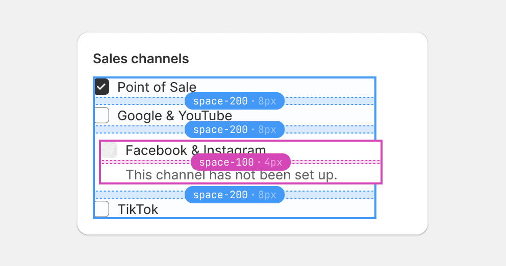
Space-100 is the tightest gap in cards and is used to group the most related elements. The tight spacing makes the grouped elements stand out like a unified item amongst surrounding groups.

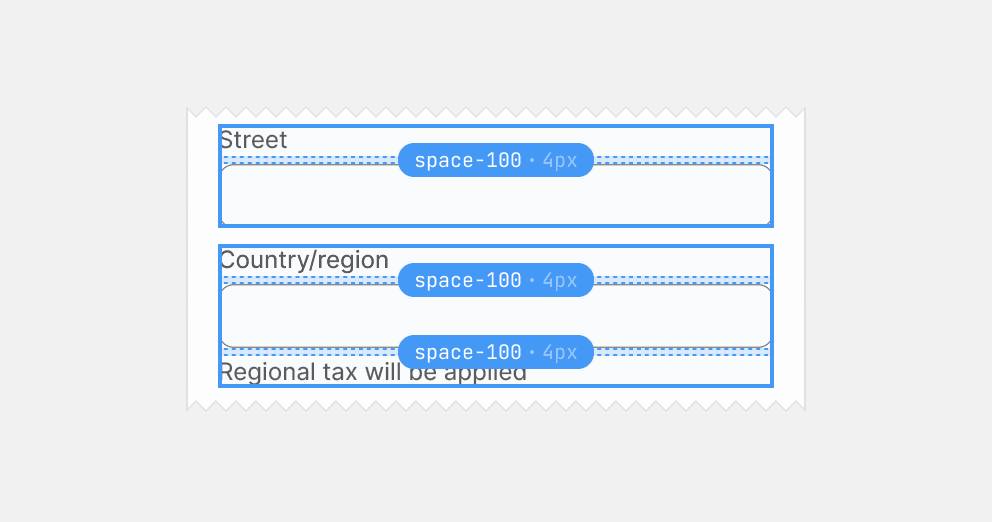
Use space-100 between the elements within a form layout item.
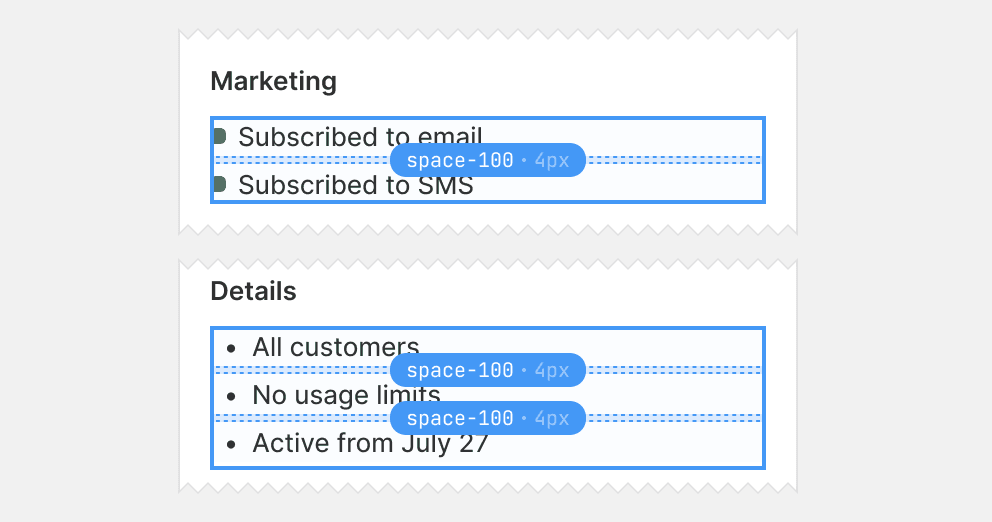
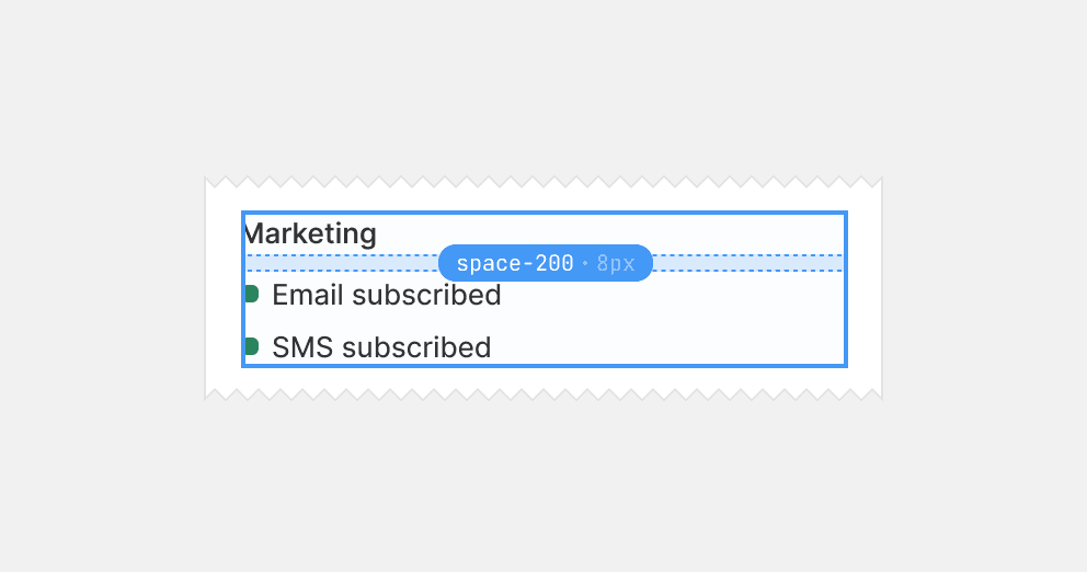
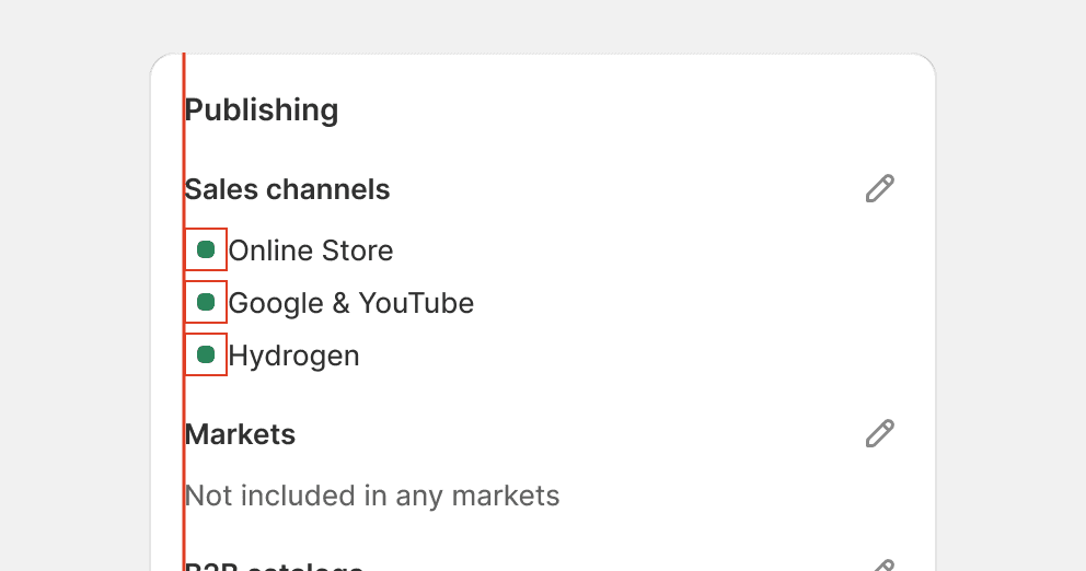
Use space-100 between list items without help text or other types of child elements.
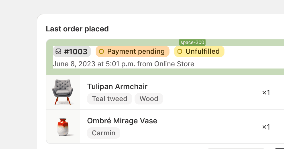
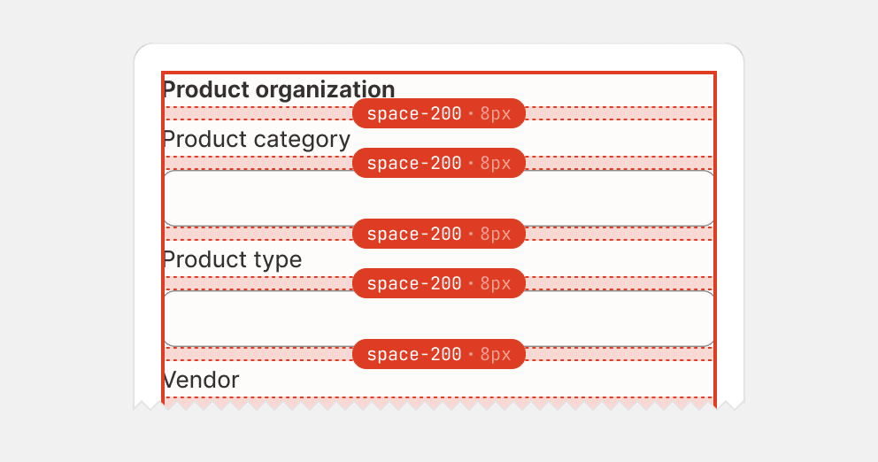
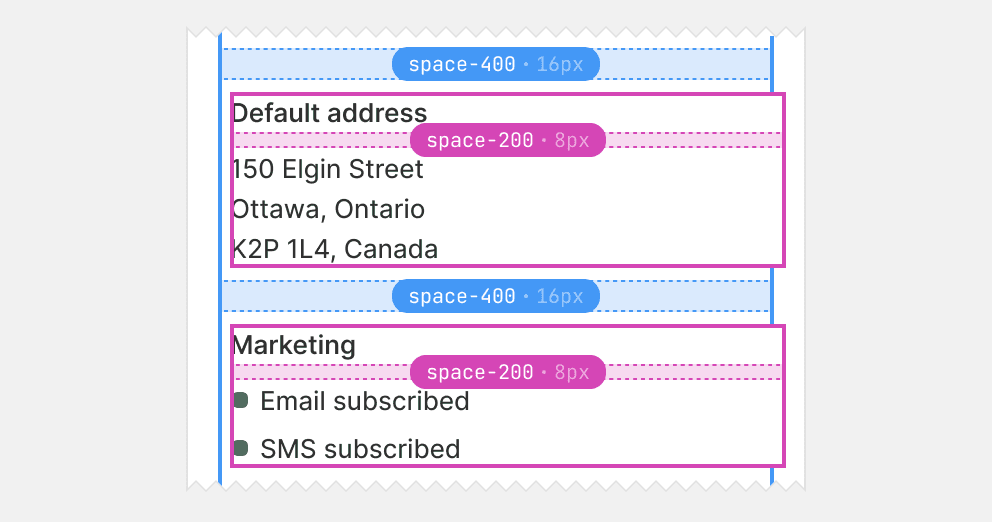
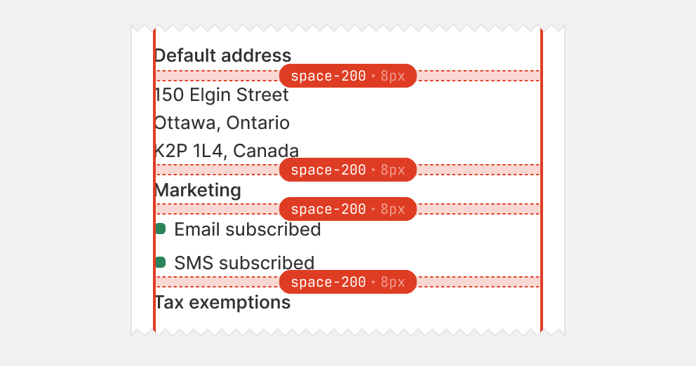
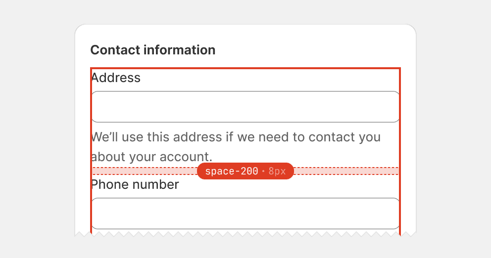
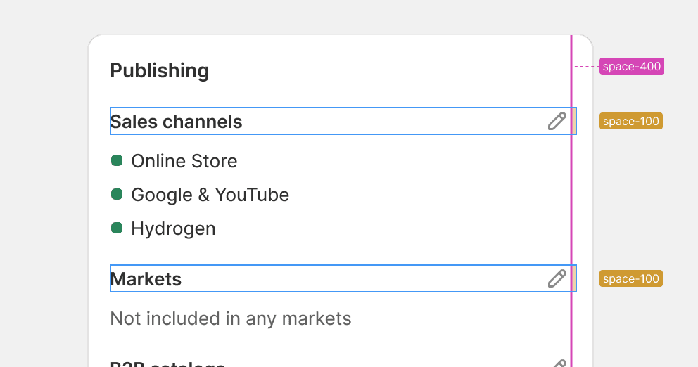
Space-200 is the second tightest gap and is typically used to separate blocks of content inside card sections. Using space-200 is the most common way to space stacks that use space-100 gaps.

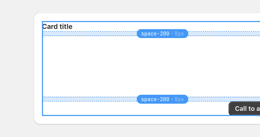
Use space-200 between the header, body, and footer in a card with a single section.
Use space-200 between the heading and content of a card section.
Use space-200 between items that are stacks with space-100 gaps. Grouping such items looser creates a distinguishable contrast to the tighter inner group.
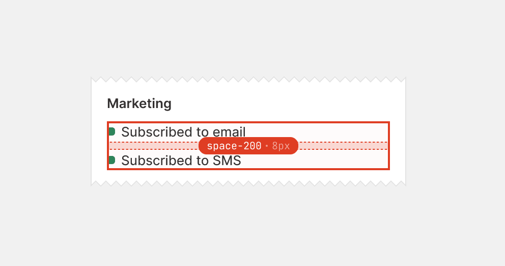
Use space-200 between simple list items. Instead, use space-100 as these are the innermost groups.
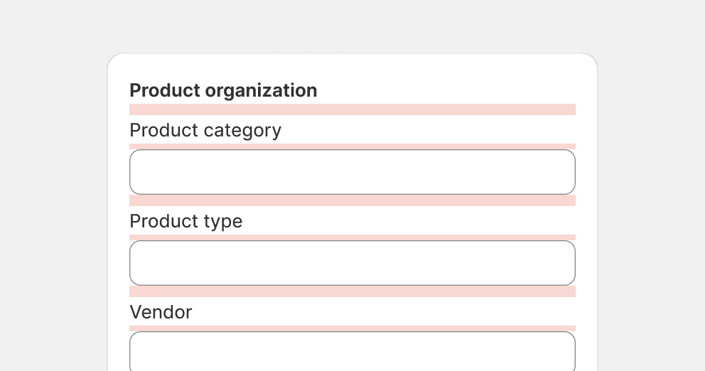
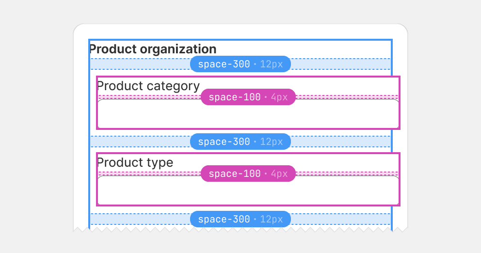
Space-300 gaps are typically used to ensure clear separation between blocks containing closely related but irregularly shaped content, such as form layout items.
While space-200 gaps might seem logical around stacks with space-100 gaps, a smaller gap size often obscures groupings when block boundaries are hard to discern. This is particularly true for form layout items, where labels, inputs, and help text all exhibit variable size, shape, and weight. By increasing the gap size, content blocks can be more readily perceived as unified, discrete items.

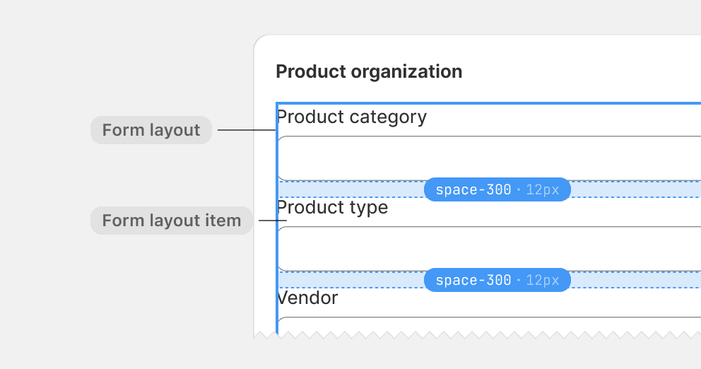
Use space-300 between form layout items.
Use too tight spacing between groups of elements that have variable weight and shape, such as form layout items.
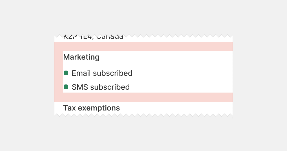
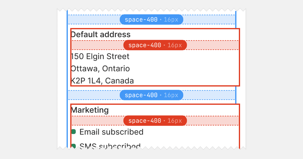
Space-400 is the loosest card gap and is typically used to space cards with multiple sections. The gap size is the same as the card padding, which structures sections as neatly merged cards.


Use space-400 to separate card sections inside cards.
Use space-400 inside card sections, as it can disconnect content that belongs together. Instead, default to space-200 and upsize to space-300 if the former seems too tight.
Alignment
Content alignment makes cards more balanced and easier for merchants to scan. Content should be vertically aligned along both the left and right edge of the card. It’s always more important to align content optically, so that it appears to be aligned rather than technically being aligned.

Use space-400 to separate card sections inside cards.
Use space-400 inside card sections, as it can disconnect content that belongs together. Instead, default to space-200 and upsize to space-300 if the former seems too tight.