 Polaris
Version 10 Typography

This is an Alpha release of the new type system. That means we’re making the new Text component and Figma text styles available but there could still be significant developments made. Our goal is to share the work so that you can: understand what’s changing, start using the typography updates, and provide feedback to help us improve.
🚧 Please note: Since significant changes could still be made, please work with your team and the Polaris team to determine what's best for your situation.
Want more details? Let’s dive in!
Why are we making changes?
As more merchants use the Shopify admin to run their businesses, we need to evolve it to feel less like a website and more like a power tool. To do this, we need to establish a strong foundation at the center of our design system and typography plays an important role.
Earlier this year, we invested a lot of time in building up our design tokens as a first step in strengthening the foundation and increasing Polaris token coverage. After that release, we saw that there was still only ~8% coverage of typography in custom components in shopify/web. We discovered that teams were creating new components or hard coding css values for type to work around the system.
Here are key reasons for this divergence:
- A lack of flexibility in our 6 typography components (DisplayText, Heading, Subheading, Caption, TextStyle, and VisuallyHidden)
- Little guidance on how to design with typography
- A lack of range in font weights and sizes
Simplifying our type components and improving our foundation will add the flexibility that will help product teams quickly make significant changes across Shopify’s admin.
What's changing
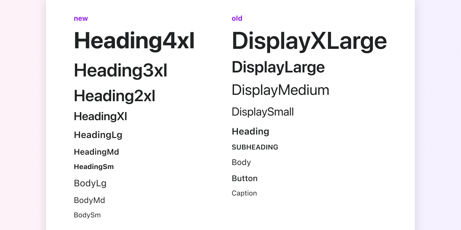
Type styles
Polaris typography is getting a refresh. Currently, there are 4 Display, 1 Heading, 1 Subheading, 1 Button, 1 Body, and 1 Caption variants.
The updates will simplify type into two categories: Heading and Body. Each has a default set of variants along with a set of options to allow for flexibility and a wide range of applications within the UI.
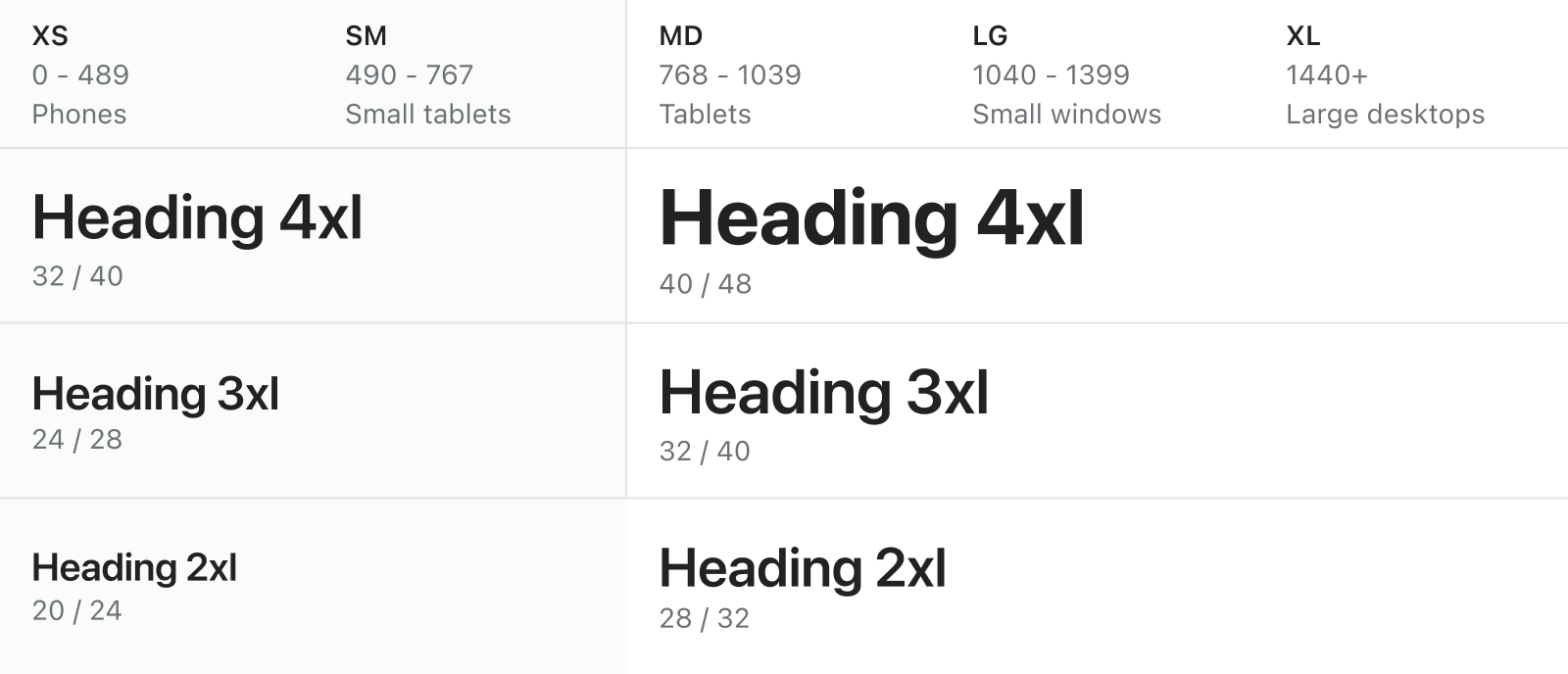
Type scale
We’ve updated the type scale and we’re moving from two scales to one for both desktop and mobile web. Some values have been removed and others added to cover a wide range of uses in the UI.
All font sizes have a ratio of 1.2, known as the major third type scale. This means that each size is multiplied or divided by 1.2 from the previous size, starting with the base size, and rounded to a multiple of 4px. For example, if I take my base value of 14px and multiply it by 1.2, I get a value of 16px as the next increment in the scale.
| New scale | Old scale | |
|---|---|---|
| 12px | 12px | 13px |
| 14px | 14px | 15px |
| 16px | 16px | 16px |
| 20px | 20px | 17px |
| 24px | 26px | 21px |
| 28px | 28px | 24px |
| 32px | 42px | 27px |
| 40px | - | - |
Why were values changed or removed?
The smaller sizes in the scale have largely stayed the same with the majority of the changes made to the larger values.
Changing values The first change we made was updating the values of both size and line-height to be multiples of 4 with the exception of the 14px base size. This helps us be critical about the size values we use for other elements in the UI. This is important because it affects the rhythm of the page.
Adding values We added 32px to have an extra step at the larger end of the scale. We made this decision after looking at what font sizes are being used across the different pages in the Shopify admin. Pages that are geared towards learning or celebrating key moments often use the larger sizes. We also found that additional sizes were being added or adjusted to fill in the gaps.
We considered those common values that we were noticing being added and adjusted the scale to work for those different pages.
Why one type scale?
We looked at how type changes between the different screen sizes and found that it’s often a difference of 1px. While 1px can make a visual difference, after talking to designers and developers, we came to the conclusion that the added complexity of having two distinct scales and two sets of text styles just wasn’t worth it. They often didn’t even realize a change in size happened or expected the size to actually decrease instead of increase as it does now.
However, for the larger sizes in the scale, we believe, in most cases, it makes sense for those sizes to adjust automatically so the sizes look appropriate for the screen size they’re being displayed on. This behavior hasn’t been added yet but, in the next release, we’ll update the larger styles to respond automatically at certain breakpoints with all other sizes staying the same unless specified otherwise.
Typography components
We’re moving from 6 components (DisplayText, Heading, Subheading, Caption, VisuallyHidden, TextStyle) to a singular Text component.
Why one component?
To start, the team prototyped both a singular and multiple component approach. We then tested these prototypes with developers and the response was overwhelmingly in favor of the singular Text component.
Overall, developers perceived the singular component as easier to use and understand. They could type in a property and see all the possible options right from their code editor. They didn’t have to import 6+ components and figure out the right one to use.
Other benefits of the singular component:
- One component to learn and read documentation on
- Autocompleting props helps developers to learn the different typography options quickly
- Less complexity in code which results in improved performance
- Decouples layout from type
- Easier to make sweeping changes to type
- Provides us with a more flexible way to control type within components
- Sets us up for future style override work to provide even more flexibility
- Provides one way to control typography
- There is low usage of a lot of the old typography components
Typography tokens
We have updated and streamlined token values, and updated token names to reflect a token naming convention that makes tokens easier to use and understand.
Font-size tokens
We updated the size tokens to use increments of 100 for the variants. This allows us to set --p-font-size-100 as the base and go lower ( --p-font-size-75 ) or higher (--p-font-size-200) as needed numerically.
| New token | Old token | px value | rem value |
|---|---|---|---|
| --p-font-size-75 | --p-font-size-1 | 12 | 0.75 |
| - | --p-font-size-2 | 13 | 0.8125 |
| --p-font-size-100 | --p-font-size-3 | 14 | 0.875 |
| - | --p-font-size-4 | 15 | 0.9375 |
| --p-font-size-200 | --p-font-size-5 | 16 | 1 |
| - | --p-font-size-6 | 17 | 1.0625 |
| --p-font-size-300 | --p-font-size-7 | 20 | 1.25 |
| - | --p-font-size-8 | 21 | 1.3125 |
| --p-font-size-400 | --p-font-size-9 | 24 | 1.50 |
| - | --p-font-size-10 | 26 | 1.625 |
| - | --p-font-size-11 | 27 | 1.6875 |
| --p-font-size-600 | --p-font-size-12 | 28 | 1.75 |
| --p-font-size-500 | - | 32 | 2 |
| --p-font-size-700 | - | 40 | 2.5 |
Line-height tokens
| New token | Value | Old token | Value |
|---|---|---|---|
| --p-line-height-1 | 16 | --p-font-line-height-1 | 16 |
| --p-line-height-2 | 20 | --p-font-line-height-2 | 20 |
| --p-line-height-3 | 24 | --p-font-line-height-3 | 24 |
| --p-line-height-4 | 28 | --p-font-line-height-4 | 28 |
| --p-line-height-5 | 32 | --p-font-line-height-5 | 32 |
| --p-line-height-6 | 40 | --p-font-line-height-6 | 36 |
| --p-line-height-7 | 48 | --p-font-line-height-7 | 44 |
Using the typography updates
The new Text component and Figma text styles are available in alpha. You can start using the new component and styles now but be aware they’re still in development and there could be breaking changes. The existing type components will continue to be available for use until the new Text component is finalized.
As you start to use the new component, please share feedback with the Polaris team to help us continuously improve the type system.
What’s next?
Next, we’ll be releasing the beta version of the component. The beta release will include:
- Updating Polaris components to use the new Text component
- Adding a deprecation warning to the old type components
- Adding responsive styles
- Updating components in the Figma UI Kit to use the new text styles
- Updating design and API documentation
Don’t worry, we’ll also provide a timeline and guidance for migration.