 Polaris
Building with Polaris

At Shopify, we often say, “Polaris is the floor, not the ceiling.” The design system provides you with building blocks, and it’s up to you to construct them in a way that best meets your user’s needs. The idea behind Polaris not being a ceiling is that you shouldn’t limit your ideas to fit into existing system pieces too early. Zoom out, figure out the best design solution to the problem, and then see if Polaris has all the pieces for you to design that solution. If there’s a gap, then contribute to the system to make it better.
Zoom out
No matter what problem you’re solving, zooming out allows you to get a better understanding of the problem, and its sphere of influence. A problem rarely exists in isolation, so understanding context and contributing factors is key before getting into solutions. Practically speaking, this means that you should understand the product as a whole, not just the product area you’re working on.
For instance, if you work on Orders, you should have a holistic understanding of the Shopify admin so you can leverage existing patterns and mental models. You can also gain context and empathy for merchants through research.
Merchants don’t care about Shopify’s internal organization. They use the admin as a whole, so we must design with the whole experience in mind.
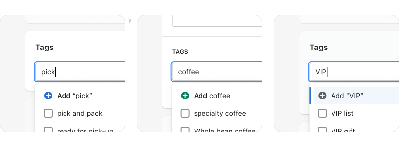
The Deliver team identified a need to consolidate 6 different tag components with varying UX that were doing the same job in different sections of the admin. The redundancy in components was causing a fractured user experience.
Explore freely
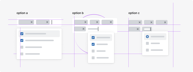
When you understand the product as a whole, you should be well equipped to explore without constraints. That means don’t start from our UI kit, component library, or patterns you see in the product---start with a blank sheet of paper instead. Solve the problem, preferably in more than one way, before you start worrying about consistency.
As the Deliver team was working on consolidating the 6 components, they also identified an opportunity to improve the overall usability for adding tags. The team explored several different ideas and approaches to understand which approach would best solve the problem.
Calibrate
Once you understand the problem and potential solutions, you can start aligning more closely with the design system.
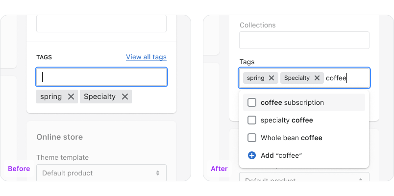
The team made updates to the Polaris foundational pieces like the tag, icon, and interactions so that they could use those pieces to build a more opinionated component.
If you have initial questions about contribution, reach out in #polaris if you work at Shopify, or the Shopify Partners Slack if you’re an open source contributor. To get help with the strategy for a larger contribution, start a GitHub discussion with the system community.