Internationalization
We want our merchants to experience Shopify in a way that’s appropriate and meaningful to them, no matter where they are in the world.
We aim to build one experience that works for all merchants in all of our markets. However, when a certain experience doesn’t fit a specific market, we should tailor it.
Definitions
Internationalization
Building your product and interface so they can be used in different locales. This includes creating flexible interfaces that allow for text expansion and changes to word order.
Localization
Adapting your product and interface for different locales to make them a good cultural fit. This includes adapting features, changing visuals, and translating text.
Translation
Converting text from one language to another. Not to be confused with localization, translation is just one part of localizing a product.
Locale
A linguistic region defined by both its language and country. Examples: French-France (fr-FR); French-Canada (fr-CA); Portuguese-Brazil (pt-BR). Note that languages and countries won’t always have a 1:1 mapping.
Plan for text expansion
When interfaces are localized, the content will often expand in length. In most languages, text is up to 50% longer on average than English. Some non-Latin languages, such as Japanese, take up more vertical space. For character-based languages, text wrapping and line breaking can’t always rely on spaces to separate words. Your interface needs to be flexible enough to accommodate language-specific formatting and text expansion without changing its context of use.
Lay out your elements in a way where text expansion doesn’t hinder your information hierarchy.
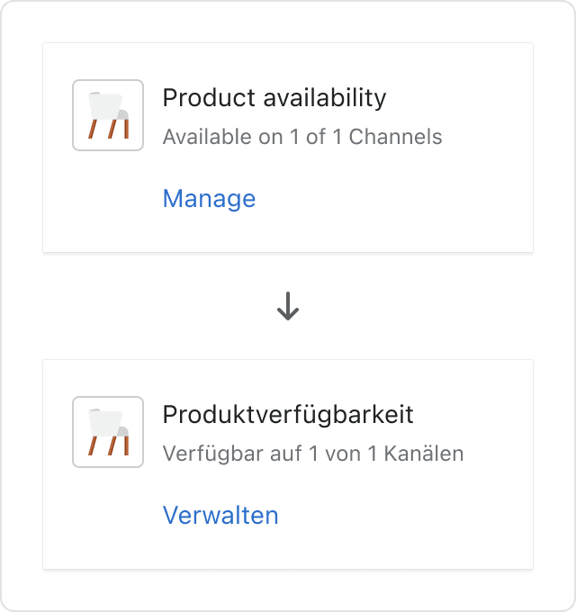
Don’t rely on responsive stacking alone. It can often change the hierarchy of information of the layout. In this case, the text expansion causes the line break at the wrong spot, placing the button in the middle of the heading and content of this card.
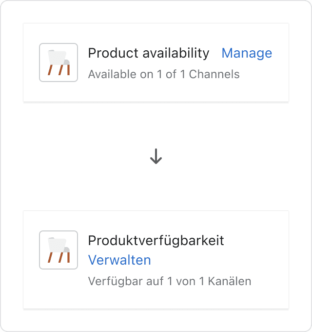
Use single columns to stack elements flexibly to accomodate for text expansion.
Avoid using narrow columns in smaller components. Ensure the right amount of padding for a clean interface.
Tips
- Always assume the worst-case scenario for text length, especially on mobile and in layouts such as tables and columns. Avoid using narrow columns.
- Pay particular attention to content elements that only have a few words. In English, labels and buttons exclude words such as “a” or “the”, but many other languages need to include them. Overall these small pieces of text may expand up to 300%.
- Our components are designed to be expandable, but you should still test them in your designs and builds. Check the CSS layout to make sure text doesn’t overflow when the screen size is reduced.
- Work with linguistic experts to review line breaks and word wrapping for character-based languages, like Chinese or Japanese, to ensure they don’t break sentences.
Plan for changes in word order
Word order can change dramatically in translation. If the layout and functionality of your interface is dependent on a certain word order, it’s likely to break when localized.
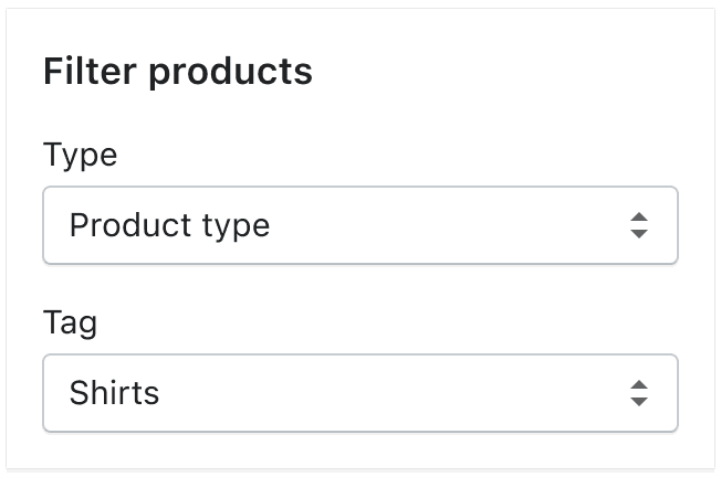
If content elements need to stay in a certain position on the page, implement them as separate labels, outside of sentences.
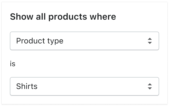
Don’t place elements with a fixed position inside a sentence. The order of this sentence would often need to change in translation, which is impossible to do if the interface is built this way.
When including links in body text, only use a single and descriptive term or a small part of a phrase as the link. Find out more about links.
Don’t use full phrases as links. Word order changes might break the link into several parts when translated.
Tips
- Assume the word order of every sentence in your interface will change when translated.
- Avoid using UI components to build sentences.
- Avoid splitting one sentence into several strings, known as concatenated strings. If you use concatenated strings, translators won’t be able to change the word order and their translations won’t make sense.
- Avoid using variables in your strings as it will translate differently.
Plan for cultural differences
Merchants in each locale have different cultural sensibilities. Use visuals, content, and interface formats that are useful and meaningful to merchants in all parts of the world.
When possible, use universally known icons. Be mindful of when you use country-specific icons and where they are surfaced. Find out more about icons.

Be mindful of using colors to represent meaning. Colors can hold discrete connotations in different cultures. For example, in North America, green is used to indicate success and red for failure, as opposed to China, where red symbolizes prosperity and good fortune.
Tips
- When using photos, illustrations, icons, or emojis, make sure the visuals you’re using are not offensive or culturally insensitive. If you’re unsure about a visual you’re using, research it or ask someone with local knowledge.
- When naming features, be mindful of connotations in other cultures, especially for evocative names and acronyms. Find out more about naming.
- Avoid colloquial words, idioms, and references to popular culture. It’s difficult to translate them in a meaningful way.
- In some cultures, a person’s given name comes first, whereas in other cultures the family name comes first. Let merchants choose how they want to enter, read, and sort names, especially in text fields and lists.
- Many types of information, such as addresses, dates, numbers, and currencies, are shown in different formats in different locales. For example, some locales display currency symbols before the number, others display them after. Make sure these can be translated appropriately. Find out more about formatting localized currency.
- Some cultures expect more guidelines and instructions when filling in long or critical forms. Consider using asterisks to mark mandatory fields in a form to match that expectation.
- Work with people that have local knowledge if possible.
Internationalize Polaris components
- When designing with a Polaris component, test the localized versions to make sure it still works with the rest of your interface. If you need a certain component to adapt, but it hasn’t yet been internationalized in Polaris, you can open a feature request in GitHub.