Information architecture
Defining IA
Information architecture is the practice of organizing, structuring, and labeling content in an effective and sustainable way. Whether you’re creating an app, part of the Shopify admin, a new feature, or an editorial page, these IA principles are here to help you make content usable and findable.
Why we do IA
- Simplify complexity: Information should be structured and managed in the simplest way possible.
- Support scalability: Good IA practices will help us avoid overhauling our previous work whenever the product grows or changes.
- Create familiarity: Regardless of how our merchants access Shopify, it should feel like the same product. Creating a common experience goes beyond design and extends to how we structure Shopify’s content.
Our IA principles
These principles will help you make good IA decisions no matter what you’re working on.
Show your audience where they are
Successful wayfinding happens when your audience can make navigation decisions that fulfill their goal. For navigation to enable wayfinding:
- Establish multiple navigation schemes
- Use task-based navigation
- Integrate secondary navigational support (like breadcrumbs)
Navigation is a tool that serves a number of wayfinding purposes. Good navigation allows our merchants to explore a topic in depth, switch tasks easily, and filter information.
In the Shopify admin, merchants can find their way using multiple navigation schemes:
- Structural: main navigation, local navigation, breadcrumbs
- Associative: contextual links to other features or help documentation
- Utility: linked avatars to access your account, search
In the Shopify admin, merchants can find their way to the blog posts page using the side navigation (nav) and search. They can use the breadcrumb to go up to the main level in the Online Store section of the nav. They can also access related help documentation through the contextual “learn more” footer at the bottom of the page.

Give content one home and many doors
All people are unique and have different information-seeking behaviors. For example, one person might start their experience from various points in a product or shift their focus midway through a task. They might also begin a task on one device and finish it on another. To facilitate these behaviors, all screens should have meaningful navigation and bridge content to other parts of the product.
The content on the Shopify Help Center’s shipping page only lives in the Help Center—we don’t duplicate it in the Shopify admin or on our marketing pages. But even though it only lives in one place, we give merchants access to it when it’s likely that they’ll need more context on shipping (like through a link on our shipping settings page in the Shopify admin).

Avoid information overload
Although we want to give our merchants all the information they need to complete a task, we need to avoid overloading them with information. Don’t over-simplify, but don’t burden your user with choice. To do this in design, we use progressive disclosure, but this principle also applies to information architecture. To practice progressive disclosure in IA:
- Gradually reveal information as it’s requested
- Provide multiple access points to information
- Eliminate redundant content
The content on the Shopify Capital page on Shopify.com summarizes the benefits of receiving capital from Shopify at a high level. After scanning the summary, merchants have the option to access more information about the program with a link to the docs on the Shopify Help Center. By progressively disclosing information in this way, we help merchants reach decisions faster and avoid the frustration and disorientation of front-loading with too much detail.

Plan for growth and change
Information architecture, like design, is not set in stone. It should change with your product. As such, the IA decisions you make need to leave room for growth while also continuing to promote consistency across the experience.
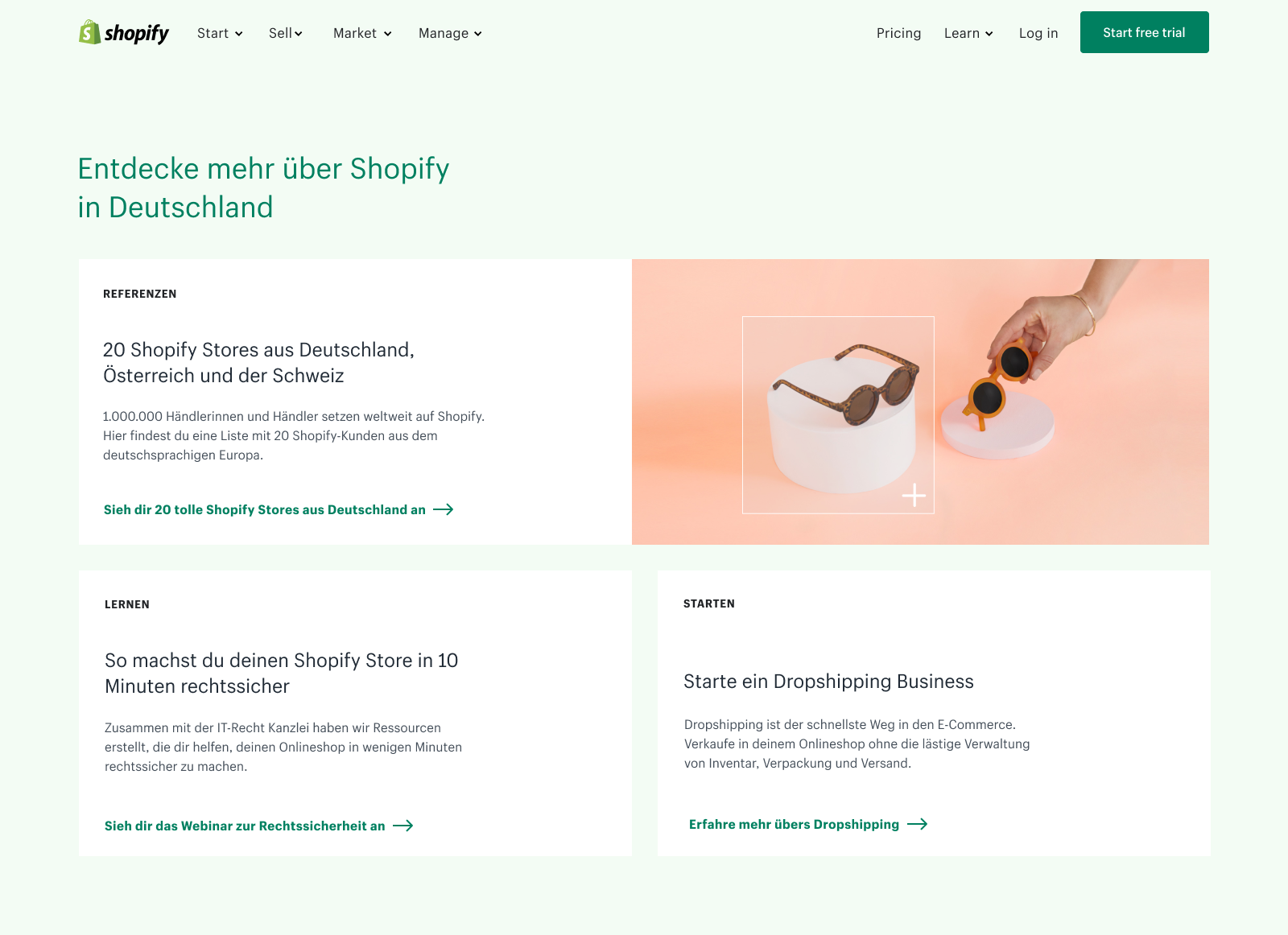
The Shopify.com homepage takes a scalable approach to page architecture—the structure was designed to adapt as Shopify expands to different locations. This was done by taking a modular approach.
Each locale can customize the homepage to meet their needs. For example, for 2 stories, they can use 2 banners. For 3, they can use 1 banner and 2 tiles.


To make sure your IA decisions are scalable:
- Communicate early and often, within and outside of your team. Open the lines of communication when doing IA work and make sure your work aligns with the work of other areas of the product.
- Think about the future and how the work you’re doing will intersect with other projects.
- Create content groups that are flexible enough to accommodate growth, while being meaningful to the user.
- Consider how your IA will adapt to multiple environments and their existing patterns (for instance, iOS, Android, desktop browsers, chat bots, retail products like Point of Sale).