 Polaris
Text fields can be grouped in a form or placed individually in the UI. Placeholder text should generally be avoided in text fields. Help text can be used below the text input area to guide the user on acceptable inputs.

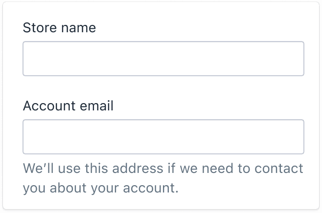
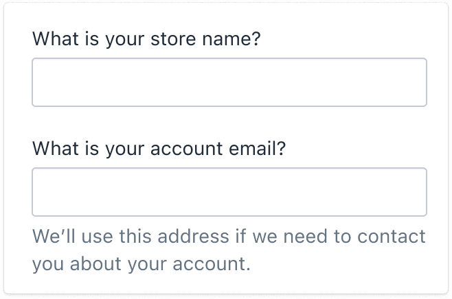
Field labels
Field labels act as a title for the text field. Labels should typically be short and in noun form. For example, “Name”.

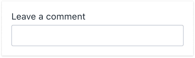
Edge case: When a text field isn’t part of a form and is placed individually on a page (like a comment field), then you can write the field label as a call to action. For example, “Leave a comment”. This is because there’s no surrounding context and using “Comment” alone could be confusing.
Placeholder text
In general, avoid using placeholder text in text fields. It can pose a range of accessibility problems, like:
- Low color contrast, making the text hard to read
- Inconsistent behavior between browsers and screen readers
- Text disappearing when the user starts typing, which can be confusing to people with cognitive impairments
- Limited space available for additional context, due to field size
Exception: Read the guidelines on search fields.

Help text
Help text provides extra guidance or instructions to people filling out a form field. It can also be used to clarify how the information will be used.
Use help text:
- when the text field label doesn’t clearly explain the purpose of the text input
- to provide guidance or instructions on the type of information needed
- to show examples of the required format for modeled text inputs
Best practices:
- Avoid repeating the field label. If the field label provides sufficient context for completing the action, then you likely don’t need to add help text.
- If there’s not enough room to include both instructions and an example, then only include the example.

Text input types
There are three types of text inputs:
Modeled text inputs
These are fields that require a specific format to be valid. They’re often used for tags, dates, and some tracking numbers. Modeled text is highly structured, so providing examples is useful. Read more

Free text inputs
These are fields that accept short strings of text. They’re often used for SKUs, barcodes, and titles. Only provide example text if you know how the text should be structured, such as a tracking number or discount code. Read more

Multiline text inputs
These are fields that are rendered as multiline textarea elements, as well as text input elements that accept long strings of text. They’re often used for product descriptions, order comments, and customer notes. Users can write whatever they want, so providing example text is less useful. Read more

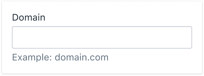
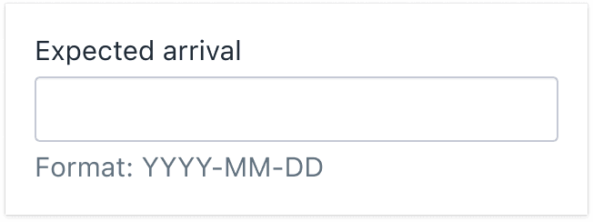
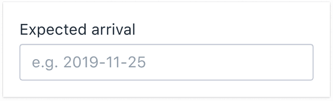
Modeled text inputs
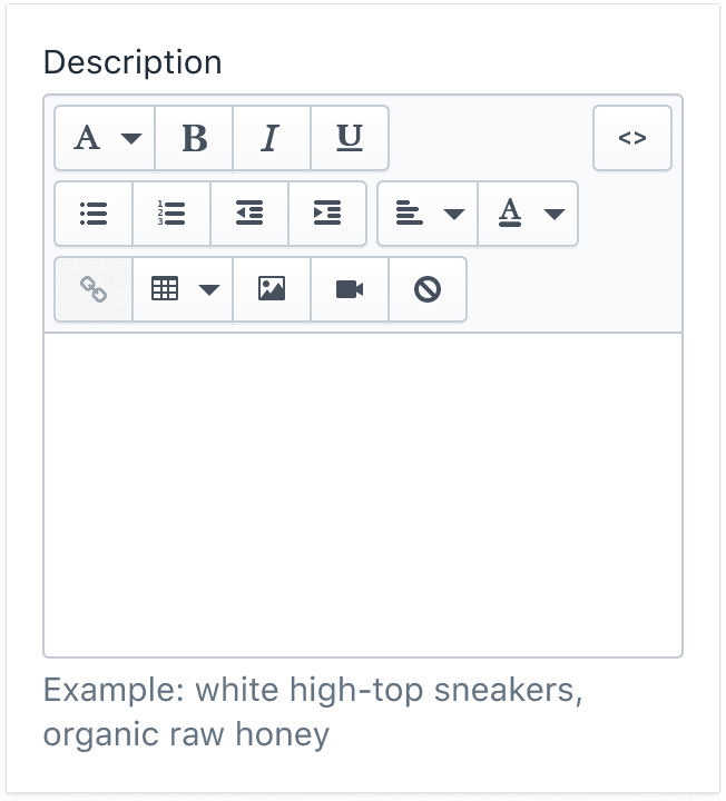
Modeled text inputs are text field inputs that require text to be formatted in a specific way. For instance, tags need to be separated by commas, and dates need to be typed in YYYY-MM-DD format. Because modeled text inputs require a particular structure, always include examples that demonstrate how the user should enter the information.
- Use help text to include an instructional call to action and an example that shows the required text format
- If there’s not enough room to include both an instructional call to action and an example, then include only the example
- Use the word “Example” followed by a colon to introduce the example (instead of e.g.)
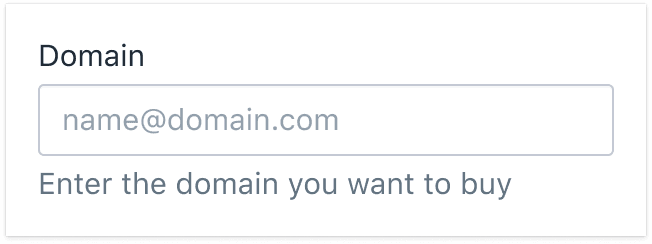
Free text inputs
Free text inputs accept a single string of text, without any particular structure. Use the field label to clearly indicate what should go in the text field.
Don’t provide an example for free text inputs. The text doesn’t follow a specific format, and we shouldn’t assume what belongs in the field. If more context is needed, use help text.
Avoid redundancy
If a text field label has a call to action, there's no need to repeat it in the help text. Instead, add a sentence that provides extra context.
For example, when a free text input is located independent of a form and has no surrounding context, you can make the field label a call to action.

Point in the right direction
If the text field label isn’t clear about where the user can find the information, use help text to guide them.

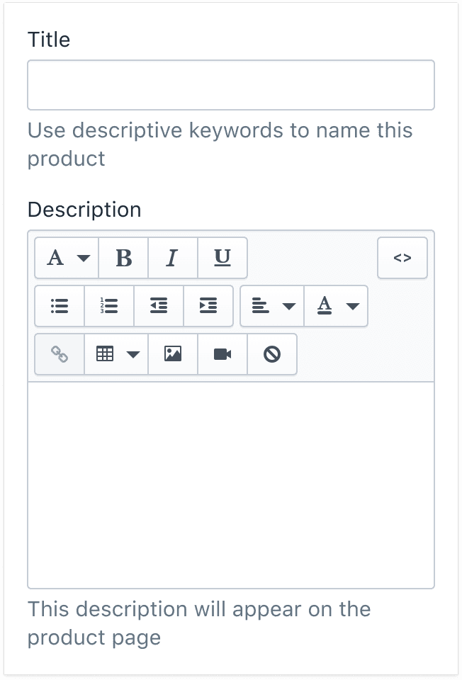
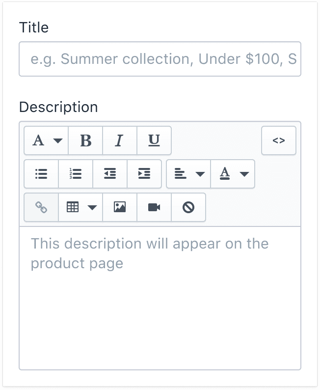
Titles, names, and descriptions
Don’t use placeholder text for free input titles, names, and descriptions; use help text instead.
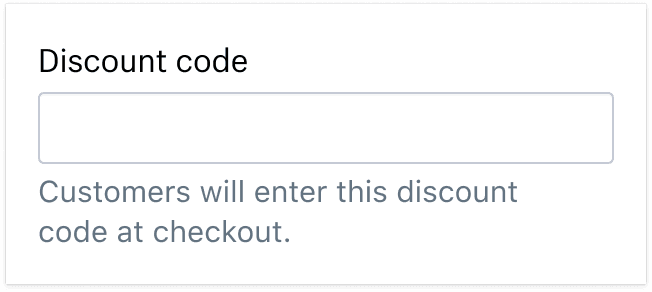
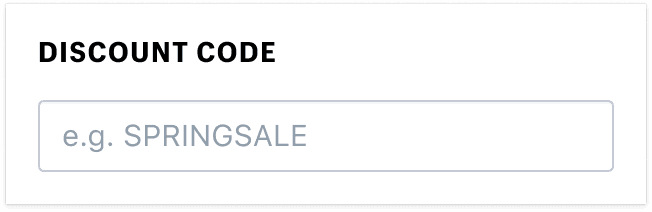
Codes and tracking numbers
Don’t use placeholder text for codes or tracking numbers; use help text instead. If the code follows a standardized format, include an example, using the same format as help text for modeled content. If not, omit the example since the field’s contents can vary.
Choose clear names for the field label, and don’t repeat it in the help text if possible. Instead, offer context that will help the user understand and complete the task quickly.
Multiline text inputs
Multiline fields let merchants type long blocks of text. There are a few different versions:
- Plain textarea elements with no formatting options
- Formatted textarea elements with what-you-see-is-what-you-get (WYSIWYG) menus
- Plain text input elements that accept long strings of text
- Plain text input elements that accept long strings of text and expand as the user types
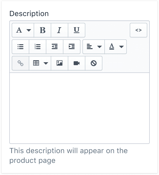
Multiline inputs hold things like product and collection descriptions, notes about an order that only store staff can access, notes that the customer can access, and anything else the merchant wants to type into them.
We usually don’t know what will go in multiline fields, so providing example text isn’t helpful. Instead, include help text that explains how the text will be used and who can view it.
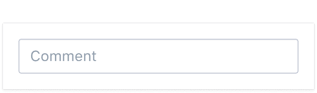
Comments and notes
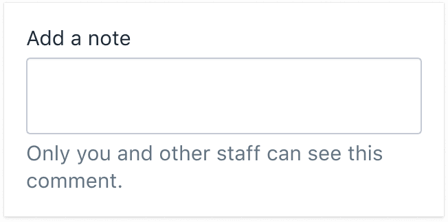
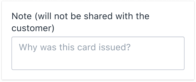
Don’t use placeholder text for comments and notes; use help text instead. Comments and notes help merchants keep track of unstructured information they may need about an order or a buyer.
Some comments and notes are not visible to customers, but some are. In the help text, describe clearly who will be able to view the note.
Search and email fields
For standard text fields, avoid placeholder text. However, regular or floating placeholder text can be used for:
- Search fields
- Filter fields
- Email entry fields
Placeholder text is a common, recognizable pattern for these field types. Moving the placeholder text outside of the text field box may seem out of place and negatively impact the visual design of some marketing pages.
To make search, filter, and email entry fields more accessible, always move the placeholder text above the cursor while the field is in focus. This lets the user read the placeholder text as soon as they select the field.

Minimalist page design and placeholders
There are some cases where help text clutters a page. For example, the minimalist design of pages like the admin login page would be significantly changed by adding another line of text.
As with standard placeholder text, the placeholder should float above the text entry once the field has been selected. It’s not easy for everyone to read the small print of the floating text, so use this method sparingly.
