
Illustrations
This section is currently being reworked to provide better guidance aligned with Polaris v12. Stay tuned!
Principles
Always be useful
Illustration adds information. It provides context, adds clarity, or leads to the next step. It gives merchants a deeper understanding of what they’re working on.
Keep it in the family
Illustrations are all part of the same visual family. Inconsistencies lower the overall quality of the experience, and can distract merchants or make them feel like they’re in the wrong place.
Be considerate
Illustration should understand and support the merchant’s experience. Each illustration needs to feel appropriate for whatever situation it shows up in.
Stay focused
Each illustration conveys one thing. The story is easy to understand, so merchants intuitively know how to accomplish whatever they came here to do.
Elements of style

Color
Illustrations use a special set of colors designed to work well in the places where they show up. The palette is limited: individual illustrations use whites, grays, and two or three colors each. Colors are also less saturated than the surrounding UI, so they don’t distract from core interactions.

Shape
Objects have realistic proportions so they’re easy to recognize. Simple geometric shapes with rounded corners build images that are clear and approachable. Representations of people use more organic shapes.

Space
The perspective is flat and two-dimensional so the entire area of the illustration is of equal importance. Drop shadows give things subtle depth when necessary. An additional side of an object can be added if things aren’t easily recognizable from a single side.
Each illustration has negative space around it so it feels balanced in the place it lives, and so its visual weight is the same as other illustrations that live in the same places.

Line
Line makes and arranges shapes in the space. All illustrations have smooth lines without texture. Smaller objects have straighter lines, while larger objects can have more detailed, curved lines.
Intersecting and continuous lines are a key element of the admin illustration style, but they aren’t forced. They make a simple illustration feel elegant and visually interesting without being distracting.

Detail
Illustrations need some detail to make sense, but too much can be noisy. They have the minimum amount of detail necessary to make them feel realistic but still simple. Fine details are rarely smaller than 4px in height or width.
Where illustrations live
There are places where illustrations always appear, and places where they’re used only sometimes.

Empty states
Merchants see an empty state illustration the first time they access a new part of the experience, before they’ve had the chance to do anything there yet. It introduces what they can do here, and sets expectations for what’s ahead.

Onboarding
Onboarding tasks help new merchants set up their store. Illustrations frame what each task is for. And by changing in appearance, they reinforce when a task is complete.

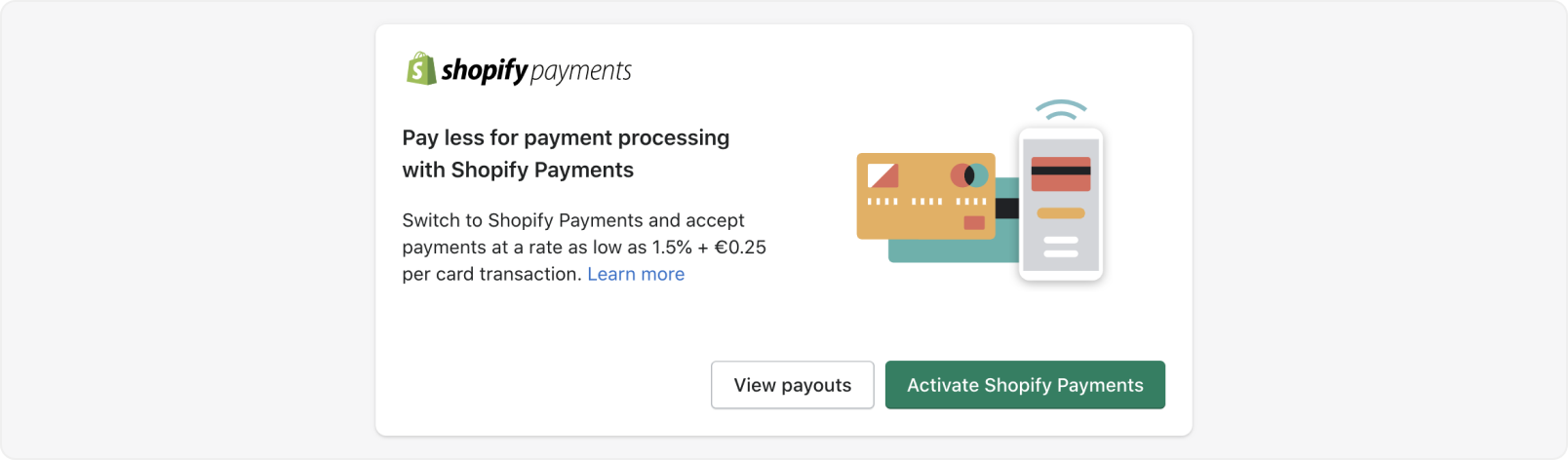
Announcements
Announcements let merchants know about something that might help their business. When the announcement celebrates a major merchant milestone or introduces an important product, illustration helps make it special or noticeable.
Spot illustrations
In some rare instances, unique spot illustrations can be used to achieve a specific goal, like to draw attention to something important on a busy page, or to explain a technical concept.